
In defense of polyfills
A highly influential spec editor expressed the opinion that polyfilling is harmful. I beg to differ.
If you’re a web developer, you may find the title baffling. “Polyfills need defending? Who’s against them?!” you might ask.
Two weeks ago, I’d be in the same boat.
Polyfills and I go way back. I dug up a JSConf EU talk of mine from 2011 on exactly this topic.
One of the few opinions I have held strongly over the years is that polyfills are a net positive for the Web, and the good outweighs the rare failure cases where polyfills became too popular, too soon, and restricted the design space for the native API.
As with most things in life, it’s all about the cost-benefit. We don’t stop flying planes because crashes happen. We do a post-mortem and figure out how we can prevent the same accident from happening again. And crucially, the point of a post-mortem is to find the root cause — not to ground the entire fleet.
Don’t get me wrong, concerns about polyfills are well-intentioned. They come from implementors and standards folks who want to preserve the design flexibility to build the best API surface possible — a goal I share deeply. Being both a spec editor and a library author, striking that balance is something I navigate all the time.
Still, I was under the impression that seeing polyfills as a net positive was the consensus view of the web standards community as a whole. That while we may not have consensus on the specific tradeoffs or solutions, we see polyfilling as a good thing and we generally do want web platform features to be polyfillable.
So, you can imagine my surprise when in a recent WHATWG meeting where I presented a proposal for extending mutation observers to observe shadow root attachment, Anne van Kesteren expressed the view that polyfilling is harmful.

It’s important to note that Anne is not some rando. He is the main active editor of most WHATWG specs (HTML, DOM, Fetch, import maps, etc.), a WebKit engineer at Apple, and has tremendous overall influence on the direction of the Web platform.
I had to find out if Anne’s comment reflected broader committee consensus, so I brought the topic up in the WHATWG Matrix and asked some folks privately.
Thankfully, it became clear that no, Anne’s comment did not reflect broader consensus (😮💨), but some of the views expressed about polyfills were more ambivalent than I’d have expected.
As I said, these concerns are well-intentioned — but I believe they are generally misplaced. Most fail to consider the system holistically, and especially the human factors that drive developer behavior.
Let me explain.
It’s not the polyfills
Authors want to use native behavior when it exists, without breakage when it doesn’t. That’s the crux of it. That’s what restricts design flexibility.
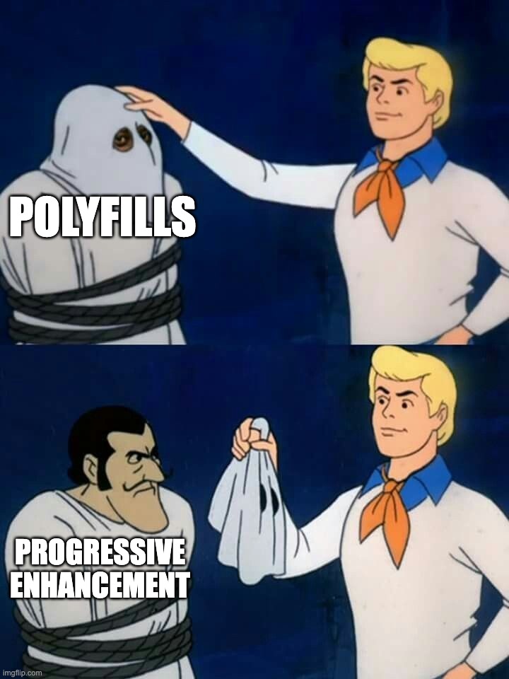
Whenever this happens too early, by too many people, you can have a problem. It doesn’t matter whether the code using it is a polyfill, a fallback, “progressive enhancement” or “graceful degradation”.
Fundamentally, every pattern that uses the native feature when it exists and a userland implementation (or even nothing) when it doesn’t risks breakage if the feature changes in a way that is incompatible with that usage.
This includes:
- Using CSS properties for progressive enhancement, accepting that they won’t work everywhere
- CSS fallbacks via the cascade or
@supports - Conditional imports after feature detection
- Using a modern HTML element, with a script that converts it to (or wraps it with) a web component if not supported
- Build tools that include fallbacks alongside the native feature
- JS
let foo = nativeThing?.() ?? fallbackThing() - etc etc
In all of these cases, if the native API were to change in a way incompatible with the fallback usage, stuff could break.
Eliminating polyfills does not eliminate the need for them.
The benefit of polyfills over the techniques above is author-facing: polyfills are portable, maintainable, and typically more correct than ad-hoc fallbacks.
When a bug is identified in a polyfill, it can be fixed centrally. When a bug is identified in an ad-hoc fallback strategy, good luck finding all the callsites and fixing them.
Bottom line: eliminating polyfills does not eliminate the need for them and all other avenues of satisfying that need are measurably worse.
Polyfills decouple API design from implementation
Standardized APIs have intrinsic value, independently of browser implementations.
We think of polyfills as a toggle: use a polyfill, leave it in there, and later when all browsers implement the feature natively, it gets removed.
This misses out on one of the biggest benefits of polyfills: decoupling API design from implementation.
If a userland library isn’t working well, you must weigh the tradeoffs of refactoring your codebase to use a different library, and educating your team about the new library.
With a polyfill, the API itself is not within the purview of the polyfill. The polyfill supplies only implementation, while the API is externally decided by the standards. Thus, swapping a misbehaving polyfill for another has near-zero cost.
The benefits of API standardization are far greater when we consider the broader ecosystem. A dependency isn’t aware what your userland implementation may be for certain functionality. Either it needs to provide a way to pass it via configuration (expanding its API surface), or it needs to implement its own version of the functionality, which may be incompatible with that of the host.
Standardized APIs are the town square of the Web, uniting all consumers (developers, agents, tooling, etc) around a shared vocabulary.
For example, suppose we’re using:
- a data binding framework that synchronizes JS data with form controls
- a library that reads form control values and stores them in
localStorageuntil the form is submitted - a custom command invoker for copying the value of an arbitrary form control to the clipboard
As long as these are implemented in an element-agnostic way, reading element.value [1] and listening to input and change events, they will work with any form control that implements the same API, whether it’s a native HTML element or a custom element, allowing for loose coupling.
But without this standardized API, we need to specify how every custom element expresses its data and what event(s) it uses to notify for changes to each and every one of these libraries. This is user effort on the magnitude of O(M × N) on the number of consumers and producers that must know about each other. Standardized APIs collapse it to O(1).
Are separate namespaces the solution?
From the same WHATWG discussion:
Anne: I would much rather people write a library that demonstrates the need for something as opposed to something that attempts to mimic the exact API shape of a proposal while simultaneously trampling all over our design flexibility.
Anne: You want to enable people using the amount element? Fine, but call it [something]-amount.
Stephen: I see “library that implements some feature” and “polyfill” as synonymous, but I can also see that fails to capture everything.
Anne: When I hear polyfill I think specifically of things that attempt to occupy the exact same API space and tend to cause issues, such as we had recently with Scoped Custom Element Registries. We ended up with a much worse standardized API because of that.
The topic of polyfilling often comes up in discussions about CSS and HTML polyfilling, which are currently much harder to polyfill than JS features.
Many people are of the opinion that the solution is to have a separate namespace for polyfills, so they cannot conflict with native implementations.
For example, instead of polyfilling <amount>, you’d create a web component that polyfills <polyfill-amount>.
Instead of polyfilling the CSS property border-shape, you’d write a polyfill that makes --border-shape work the same way.
At first glance, this seems ideal: the benefits of polyfilling without the risk of syntax lock-in! But we’ve tried it before.
Who remembers vendor prefixes?
Their core premise was exactly the same: if we experiment in a separate namespace, the native implementation can change without breaking any existing deployed experiments!
But remember, humans want to use the native feature when it’s there. And they don’t want to go back and edit their code when that happens. So what do they do? They use both! Even if the native feature has no implementations yet, pre-emptively.
We know exactly how this plays out, because it already has: stylesheets everywhere declared -webkit-border-radius with an unprefixed border-radius right below it — before any browser shipped the unprefixed property, and before its syntax was final.
So authors get worse DX, and web standards get no more design flexibility. Everybody loses.
Is dropping feature detection the solution?
As another attempt to mitigate the issues, some have started recommending polyfills that skip feature detection entirely and always use the fallback implementation, even when the native feature exists.
This is extremely wasteful. Polyfills add weight, are typically slower than native implementations, less accessible, less i18nclusive, and rarely handle edge cases. As their name implies, they are meant to temporarily cover a gap. They were never meant to be a long-term solution. The whole point is planned obsolescence: they eventually become dormant, even in a codebase that is no longer actively maintained. Feature detection and conditional loading are essential for that to work.
Authors accept these costs because they are temporary: every browser update quietly moves more of their users onto the native implementation, until the polyfill fades into a no-op. Remove feature detection, and the costs become permanent. Every user pays the download forever, and no user ever gets the native implementation’s performance, accessibility, or i18n — even when it’s sitting right there in their browser.
This approach does preserve the advantages of a standardized API, but at what cost? It trades away real, tangible benefits, felt by every user of the Web, to prevent a rare, largely theoretical risk. Every economist would be pulling their hair out at this cost-benefit!
Are ponyfills the solution?
Ponyfills, as originally envisioned by Sindre Sorhus, are basically userland libraries that closely track the native API, but do not modify the global environment and may intentionally diverge from the spec.
They are often suggested as a better alternative to polyfills.
For example, a polyfill for RegExp.escape() might look like this:
if (!RegExp.escape) {
	RegExp.escape = function (s) {
		return s.replace(/[.*+?^${}()|[\]\\]/g, '\\$&');
	};
}
Whereas a ponyfill might be:
export function regexpEscape(value) {
	return value.replace(/[.*+?^${}()|[\]\\]/g, '\\$&');
}
Note that this does not use the native implementation at all. It is not meant to be removed later. Its link to the native API is purely psychological.
I can see ponyfills being helpful for iterating on and getting feedback on an API while the standard is still being developed, or even to motivate a new proposal. But then again, so are userland libraries.
But for a mature feature, that has shipped in at least one browser, their appeal is much weaker.
They lack all strengths of polyfills:
- They don’t use the native implementation, even when it exists.
- They cannot be removed without refactoring
- Without a standardized API, a ponyfill cannot be swapped for another without further refactoring.
- They introduce a new userland dependency that needs to be evaluated, learned, documented, and maintained, just the same as if no standard existed at all.
IMO ponyfills are just userland libraries with better marketing.
Even their only advantage, not modifying the global environment and thus not trampling on the spec, is typically negated by actual usage: as a sort of …deconstructed polyfill.
See this post where the author is using a ponyfill for Number.MAX_SAFE_INTEGER as part of a makeshift polyfill:
const MAX_SAFE_INTEGER = Number.MAX_SAFE_INTEGER || require('number-max-safe-integer');
This is the norm, not some lone author failing to grok the concept of ponyfills. In fact, many people would call something like this a ponyfill as well:
export function regexpEscape(value) {
if (RegExp.escape) {
return RegExp.escape(value);
}
return value.replace(/[.*+?^
This combines the disadvantages of both approaches, while getting you the benefits of neither!
In the end, the usage hasn’t changed, because the human need hasn’t changed.
Do polyfills discourage native implementations?
Stephen: […] polyfills can reduce the need for all browsers to implement something in a timely fashion.
Do they?
Yes, the existence of high-quality, lightweight polyfills can reduce the urgency for browsers to be the last to implement. But even then, the pressure never drops to zero: polyfills are slower and heavier than native implementations, and it’s the lagging browser’s own users who feel the difference. Without polyfills, authors wouldn’t use the feature at all — every browser would be equally fast at not supporting it, and the laggard could drag its feet indefinitely, consequence-free.
More importantly though, being last is not what’s critical for the Web’s evolution.
Check out my specs page. What is the average time from spec to first implementation, from that to the next, and from that to the last?
| Milestone | Proposals | Mean time | Median time |
|---|---|---|---|
| Spec → first implementation | 9 | 1y 9m | 7m 1d |
| First → second implementation | 10 | 5m 10d | 3m 5d |
| Second → last implementation | 8 | 6m 14d | 4m |
The first implementation is the hardest.
A Web platform without polyfills would be a stagnant platform.
What is the motivation for a browser to be the first to implement if authors cannot use the feature until all others implement it as well? Would you sink millions of dollars of engineering time into something your competitors can render moot, by means of simply …doing nothing?
We cannot A/B test reality, so this is purely a thought experiment, but I think if polyfills, fallbacks, and progressive enhancement suddenly disappeared, it would slightly increase motivation for those shipping last, but would significantly reduce motivation for shipping first. And since nobody can be last without someone else being first, a Web platform without polyfills would be a stagnant platform.
Additionally, often the biggest blocker in getting browsers to implement new features is demonstrating developer demand. A popular polyfill does that beautifully.
In fact, there is already plenty of precedent that if a feature cannot be used conditionally, browsers are reluctant to implement it. For example, decorators consistently top the list of missing JS features, but because JS syntax cannot be reasonably polyfilled, they are nontrivial to implement, and they are so widely used via transpilers, no browser has shipped them. “Let them use build tools” seems to be the general unspoken consensus.
Polyfills only get in the way when the standards process fails
I did some digging; Anne’s view traces back to a 2025 whatwg/html discussion where an API around scoped custom element registries had to be renamed due to conflicts with two existing polyfills that implemented a different behavior (emphasis mine):
We have prototyped a solution that seems to work and preserves the API pretty much as-is (still unfortunate though; please stop polyfilling and deploying polyfills)
To be fair, the underlying concern is real, so let me steelman it. Once a library squatting a proposed API name becomes popular enough, its exact behavior — bugs and all — becomes a web compat constraint. Standards groups then face a choice between adopting the library’s semantics or breaking deployed sites, and sometimes the only way out is renaming or redesigning the native feature, which is what happened here. That is a real cost, borne by the very people designing the platform.
But let’s be clear: none of the libraries that caused this problem was actually a polyfill, since there was no standardized API to polyfill.
At worst, they were naughty userland libraries, much like MooTools’ Array.prototype.flatten() that caused the smooshgate fiasco.
At best, they were speculative polyfills (aka prollyfills) — an imagined API occupying the same namespace as a future builtin so authors can experiment with an emerging standard.
Prollyfills are (rightly) more controversial, and not what this post is about.
Assigning blame to polyfills is like blaming car accidents on the ambulances that show up on the scene.
But when you examine the failure cases more closely, they all have something in common: In every single one, standards groups and/or browsers failed to react to a strong user need in a timely fashion.
Assigning blame to polyfills is like blaming car accidents on the ambulances that show up on the scene. A popular polyfill is a consequence. Polyfills should never become too popular in the first place: the feature should be widely implemented by then!
If a polyfill (or prollyfill) becomes so popular that it can create a compat problem, that is a symptom that a pervasive user need went unmet for too long. Whether it’s a polyfill or a prollyfill only changes which entity failed to react in time.
And even in the failure cases, consider the counterfactual. When a prollyfill constrains the design space, the damage is a worse name or a compromised API shape — bounded, and known before shipping. When an API ships without real-world validation, the damage is unbounded, and only discovered once the design is frozen into the platform by web compat. Remember AppCache? It shipped natively with no userland trial run, turned out to be fundamentally wrong, and took a decade to deprecate and replace with Service Workers. A prollyfill that surfaces design problems while the spec can still change is far cheaper than deploying the wrong API.
Developers don’t use polyfills in vain. Every dependency has a cost. If we see a polyfill becoming wildly popular, that should be a signal for urgent prioritization, not a reason to complain that authors are naughty.
Instead of blaming the user (“please stop polyfilling and deploying polyfills”), we should be doing a post-mortem on how to avoid such process failures in the future.
“If one user gets it wrong, it might be them. If two users get it wrong, it’s definitely you” — Ancient UX proverb[2]
When web platform design follows the priority of constituencies, and prioritizes end-user and author needs above implementors and standards authors, the failure cases are practically nonexistent, even when polyfills jump the gun and ship too early.
The WHATWG process invites these failures
Why did scoped registries take so long to ship? The web components community had been asking for years!
Part of this is that the WHATWG process is designed to be reactive rather than proactive. Even if there is a strong, demonstrated author need, WHATWG will refuse to flesh out a feature until at least two implementors express interest in implementing it. “needs implementer interest” is where so many good ideas go to die.
This made sense when WHATWG was founded as a reaction to the increasingly academic W3C HTML Working Group, which had been designing XHTML 2 in a vacuum, speccing features that no browser was willing to implement.
But having spent 15 years in the CSS WG and having proposed and/or helped drive several features to Baseline, I cannot imagine gating spec development on implementor interest. That’s putting the cart before the horse!
Demonstrating developer need is exactly what drives implementor interest in the first place! And that’s much easier to do with a feature that is actively being worked on.
For one, researching use cases and prior art to flesh out the feature often demonstrates author need in itself. But also, users have a lot of trouble expressing abstract pain points. It is much easier to point to an existing feature and say “I want browsers to support this” than to express a need for which no feature exists.
In a way, polyfills are to the web platform what user testing is to product design — and the prototype part isn’t even an analogy: a polyfill literally is a prototype of the feature. Real user feedback, without baking technical debt into the platform. One could even argue that browsers should be funding — or outright developing — these polyfills, precisely so they can gather this feedback before an API is frozen into the platform by web compat. Yes, there is some risk they may constrain the ergonomics of the eventual API — but if high-demand features actually ship at a reasonable pace, that risk shrinks dramatically.
Polyfills restore power balance in the ecosystem
Who remembers IE7.js? Or html5shiv?
For nearly a decade, IE was the boat anchor of the Web: dominant market share, no meaningful competition, and no incentive to implement anything new. Without polyfills, the rational strategy for many authors was to target IE and call it a day — and the rational strategy for every other browser would have been to stop investing in features nobody could use.
Instead, polyfills allowed authors to adopt modern standards years before IE supported them. That kept demand for standards alive, sustained pressure on IE, and gave end-users reasons to switch browsers. The fact that we were finally able to move away from IE6 and IE7 is in large part thanks to polyfills.
A browser lagging behind is not always a matter of will, either — release cadence matters. IE, and EdgeHTML after it, was bound to the Windows release schedule, just as Safari is tied to the macOS and iOS release trains today — a constraint the engineers working on these engines have no say in. A slow release train stretches exactly the gap that polyfills exist to cover: even once a feature ships, it reaches users in OS-update time, not browser-update time. If every engine could ship at the cadence of Chromium and Firefox, the need for polyfills would shrink significantly. Until then, polyfills are how authors deliver the benefits of native APIs — performance, accessibility, i18n — without being held hostage to the slowest release train.
Without polyfills, a single browser has undue power to hold back the Web.
Without polyfills, fallbacks, and progressive enhancement, a single browser has undue power to hold back the Web — whether by choice or by circumstance. I’m far more concerned about that than about the occasional smooshgate.
Polyfills make the Web faster, inclusive, and more robust
Native features are typically more performant, more accessible, more i18nclusive, and handle more edge cases than any userland implementation.
A userland library can cut corners, exclude locales, declare that a11y is out of scope, and fail to consider edge cases. A web standard cannot.
A polyfill inherits some of these limitations while it’s active, but unlike a userland library, it is graded against a spec: its target behavior has already been through accessibility and i18n review, so its gaps are well-defined, visible, and centrally fixable. A userland library gets to define its own bar.
Developers being able to use web features before wide availability is a win for the Web as a whole.
Can we stop trying to solve the wrong problem?
Cost-benefit analysis is a fundamental part of human decision-making.
We get in cars, even though there is a risk of accidents.
We go outside, even though we may catch a cold — or worse.
We swim, even though there is a small risk of drowning.
We weigh the extent of the risk, the probability of it happening, and the cost of mitigating it, against the extent and frequency of the benefits, and decide accordingly. We do this all the time, whether consciously or not.
When it comes to the Web, the benefits of polyfills are tangible and felt by everyone who develops for it.
Historically, failure cases have been few, and generally have been mitigated well.
Even smooshgate resulted in array.flat(), which to me is not obviously worse than array.flatten().
We are spending so much collective energy trying to mitigate a largely theoretical problem, that has only been a significant issue a handful of times in the 30+ years of the Web’s history. And yet, many are willing to sacrifice significant, tangible, far-reaching benefits to do so. This is an emotional reaction to a few high-profile incidents, not a rational cost-benefit tradeoff.
Instead of trying to eliminate polyfills, we should be more proactive in discovering and reacting to developer needs, so polyfills never become so popular that they threaten the design space of a native API.
Starting from polyfilling itself. [3]
Huge thanks to Greg Whitworth and Cassondra Roberts for reviewing an earlier draft of this post.