
In the economy of user effort, be a bargain, not a scam
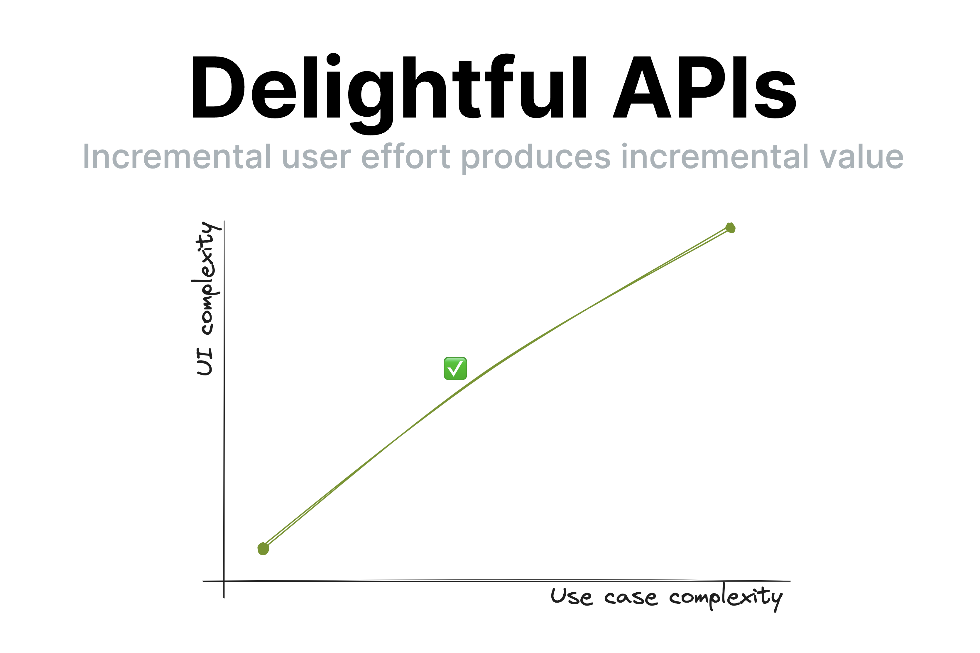
Treat user effort as a currency. To create a product users love, design the tradeoff curve of use case complexity to user effort with the same care you design your pricing scheme.
Treat user effort as a currency. To create a product users love, design the tradeoff curve of use case complexity to user effort with the same care you design your pricing scheme.
A few days ago, I gave a very well received talk about API design at dotJS titled “API Design is UI Design” [1]The video is now available on YouTube: API Design is UI Design . One of the points I made was that good UIs (and thus, good APIs) have a smooth UI complexity to Use case complexity curve. This means that incremental user effort results in incremental value; at no point going just a little bit further requires a disproportionately big chunk of upfront work [2]When it does, this is called a usability cliff. .
Observing my daughter’s second ever piano lesson today made me realize how this principle extends to education and most other kinds of knowledge transfer (writing, presentations, etc.). Her (generally wonderful) teacher spent 40 minutes teaching her notation, longer and shorter notes, practicing drawing clefs, etc. Despite his playful demeanor and her general interest in the subject, she was clearly distracted by the end of it.
It’s easy to dismiss this as a 5 year old’s short attention span, but I could tell what was going on: she did not understand why these were useful, nor how they connect to her end goal, which is to play music. To her, notation was just an assortment of arbitrary symbols and lines, some of which she got to draw. Note lengths were just isolated sounds with no connection to actual music. Once I connected note lengths to songs she has sung with me and suggested they try something more hands on, her focus returned instantly.
I mentioned to her teacher that kids that age struggle to learn theory for that long without practicing it. He agreed, and said that many kids are motivated to get through the theory because they’ve heard their teacher play nice music and want to get there too. The thing is… sure, that’s motivating. But as far as motivations go, it’s pretty weak.
Humans are animals, and animals don’t play the long game, or they would die. We are programmed to optimize for quick, easy dopamine hits. The farther into the future the reward, the more discipline it takes to stay motivated and put effort towards it. This applies to all humans, but even more to kids and ADHD folks [3]I often say that optimizing UX for people with ADHD actually creates delightful experiences even for those with neurotypical attention spans. Just because you could focus your attention on something you don’t find interesting doesn’t mean you enjoy it. Yet another case of accessibility helping everyone! . That’s why it’s so hard for teenagers to study so they can improve their career opportunities and why you struggle to eat well and exercise so you can be healthy and fit.
So how does this apply to knowledge transfer? It highlights how essential it is for students to a) understand why what they are learning is useful and b) put it in practice ASAP. You can’t retain information that is not connected to an obvious purpose [4]I mean, you can memorize anything if you try hard enough, but by optimizing teaching we can keep rote memorization down to the bare minimum. — your brain will treat it as noise and discard it.
The thing is, the more expert you are on a topic, the harder these are to do when conveying knowledge to others. I get it. I’ve done it too. First, the purpose of concepts feels obvious to you, so it’s easy to forget to articulate it. You overestimate the student’s interest in the minutiae of your field of expertise. Worse yet, so many concepts feel essential that you are convinced nothing is possible without learning them (or even if it is, it’s just not The Right Way™). Looking back on some of my earlier CSS lectures, I’ve definitely been guilty of this.
As educators, it’s very tempting to say “they can’t possibly practice before understanding X, Y, Z, they must learn it properly”. Except …they won’t. At best they will skim over it until it’s time to practice, which is when the actual learning happens. At worst, they will give up. You will get much better retention if you frequently get them to see the value of their incremental imperfect knowledge than by expecting a big upfront attention investment before they can reap the rewards.
There is another reason to avoid long chunks of upfront theory: humans are goal oriented. When we have a goal, we are far more motivated to absorb information that helps us towards that goal. The value of the new information is clear, we are practicing it immediately, and it is already connected to other things we know.
This means that explaining things in context as they become relevant is infinitely better for retention and comprehension than explaining them upfront. When knowledge is a solution to a problem the student is already facing, its purpose is clear, and it has already been filtered by relevance. Furthermore, learning it provides immediate value and instant gratification: it explains what they are experiencing or helps them achieve an immediate goal.
Even if you don’t teach, this still applies to you. I would go as far as to say it applies to every kind of knowledge transfer: teaching, writing documentation, giving talks, even just explaining a tricky concept to your colleague over lunch break. Literally any activity that involves interfacing with other humans benefits from empathy and understanding of human nature and its limitations.
To sum up:
“Show, don’t tell”? Nah. More like “Engage, don’t show”.
(In the interest of time, I’m posting this without citations to avoid going down the rabbit hole of trying to find the best source for each claim, especially since I believe they’re pretty uncontroversial in the psychology / cognitive science literature. That said, I’d love to add references if you have good ones!)
The video is now available on YouTube: API Design is UI Design ↩︎
When it does, this is called a usability cliff. ↩︎
I often say that optimizing UX for people with ADHD actually creates delightful experiences even for those with neurotypical attention spans. Just because you could focus your attention on something you don’t find interesting doesn’t mean you enjoy it. Yet another case of accessibility helping everyone! ↩︎
I mean, you can memorize anything if you try hard enough, but by optimizing teaching we can keep rote memorization down to the bare minimum. ↩︎