Last week, the CSS WG resolved to add an inline if() to CSS.
But what does that mean, and why is it exciting?
Last week, we had a CSS WG face-to-face meeting in A Coruña, Spain.
There is one resolution from that meeting that I’m particularly excited about:
the consensus to add an inline if() to CSS.
While I was not the first to propose an inline conditional syntax,
I did try and scope down the various nonterminating discussions into an MVP that can actually be implemented quickly,
discussed ideas with implemenators,
and eventually published a concrete proposal and pushed for group resolution.
Quite poetically, the relevant discussion occurred on my birthday, so in a way, I got if() as the most unique birthday present ever. 😀
This also comes to show that proposals being rejected is not the end-all for a given feature.
It is in fact quite common for features to be rejected for several times before they are accepted: CSS Nesting, :has(), container queries were all simply the last iteration in a series of rejected proposals.
if() itself was apparently rejected in 2018 with very similar syntax to what I proposed.
What was the difference? Style queries had already shipped, and we could simply reference the same syntax for conditions (plus media() and supports() from Tab’s @when proposal) whereas in the 2018 proposal how conditions would work was largely undefined.
I posted about this on a variety of social media, and the response by developers has been overwhelmingly positive:
I even had friends from big companies writing to tell me their internal Slacks blew up about it.
This proves what I’ve always suspected, and was part of the case I made to the CSS WG: that this is a huge pain point.
Hopefully the amount and intensity of positive reactions will help browsers prioritize this feature and add it to their roadmaps earlier rather than later.
Across all these platforms, besides the “I can’t wait for this to ship!” sentiment being most common,
there were a few other recurring questions and a fair bit of confusion that I figured were worth addressing.
Can we emulate the upcoming CSS contrast-color() function via CSS features that have already widely shipped?
And if so, what are the tradeoffs involved and how to best balance them?
Out of all the CSS features I have designed,
Relative Colors aka Relative Color Syntax (RCS) is definitely among the ones I’m most proud of.
In a nutshell, they allow CSS authors to derive a new color from an existing color value by doing arbitrary math on color components
in any supported color space:
--color-lighter: hsl(from var(--color) h s calc(l * 1.2));
--color-lighterer: oklch(from var(--color) calc(l + 0.2) c h);
--color-alpha-50: oklab(from var(--color) l a b / 50%);
The elevator pitch was that by allowing lower level operations they provide authors flexibility on how to derive color variations,
giving us more time to figure out what the appropriate higher level primitives should be.
Even if my prediction is off, it already is available to 83% of users worldwide,
and if you sort its caniuse page by usage,
you will see the vast majority of the remaining 17% doesn’t come from Firefox,
but from older Chrome and Safari versions.
I think its current market share warrants production use today,
as long as we use @supports to make sure things work in non-supporting browsers, even if less pretty.
Most Relative Colors tutorials
revolve around its primary driving use cases:
making tints and shades or other color variations by tweaking a specific color component up or down,
and/or overriding a color component with a fixed value,
like the example above.
While this does address some very common pain points,
it is merely scratching the surface of what RCS enables.
This article explores a more advanced use case, with the hope that it will spark more creative uses of RCS in the wild.
One of the big longstanding CSS pain points is that it’s impossible to automatically specify a text color that is guaranteed to be readable on arbitrary backgrounds,
e.g. white on darker colors and black on lighter ones.
Why would one need that?
The primary use case is when colors are outside the CSS author’s control.
This includes:
User-defined colors. An example you’re likely familiar with: GitHub labels. Think of how you select an arbitrary color when creating a label and GitHub automatically picks the text color — often poorly (we’ll see why in a bit)
Colors defined by another developer. E.g. you’re writing a web component that supports certain CSS variables for styling.
You could require separate variables for the text and background, but that reduces the usability of your web component by making it more of a hassle to use.
Wouldn’t it be great if it could just use a sensible default, that you can, but rarely need to override?
GitHub Labels are an example where colors are user-defined, and the UI needs to pick a text color that works with them.
GitHub uses WCAG 2.1 to determine the text color, which is why (as we will see in the next section) the results are often poor.
Even in a codebase where every line of CSS code is controlled by a single author,
reducing couplings can improve modularity and facilitate code reuse.
The good news is that this is not going to be a pain point for much longer.
The CSS function contrast-color() was designed to address exactly that.
This is not new, you may have heard of it as color-contrast() before, an earlier name.
I recently drove consensus to scope it down to an MVP that addresses the most prominent pain points and can actually ship soonish,
as it circumvents some very difficult design decisions that had caused the full-blown feature to stall.
I then added it to the spec per WG resolution, though some details still need to be ironed out.
Glorious, isn’t it?
Of course, soonish in spec years is still, well, years.
As a data point, you can see in my past spec work that with a bit of luck (and browser interest), it can take as little as 2 years to get a feature shipped across all major browsers after it’s been specced.
When the standards work is also well-funded,
there have even been cases where a feature went from conception to baseline in 2 years,
with Cascade Layers being the poster child for this:
proposal by Miriam in Oct 2019,
shipped in every major browser by Mar 2022.
But 2 years is still a long time (and there are no guarantees it won’t be longer).
What is our recourse until then?
As you may have guessed from the title, the answer is yes.
It may not be pretty, but there is a way to emulate contrast-color() (or something close to it) using Relative Colors.
In the following we will use the OKLCh color space, which is the most perceptually uniformpolar color space that CSS supports.
Let’s assume there is a Lightness value above which black text is guaranteed to be readable regardless of the chroma and hue,
and below which white text is guaranteed to be readable.
We will validate that assumption later, but for now let’s take it for granted.
In the rest of this article, we’ll call that value the threshold and represent it as Lthreshold.
We will compute this value more rigously in the next section (and prove that it actually exists!),
but for now let’s use 0.7 (70%).
We can assign it to a variable to make it easier to tweak:
--l-threshold: 0.7;
Let’s work backwards from the desired result.
We want to come up with an expression that is composed of widely supported CSS math functions,
and will return 1 if L ≤ Lthreshold and 0 otherwise.
If we could write such an expression, we could then use that value as the lightness of a new color:
--l: /* ??? */;
color: oklch(var(--l) 0 0);
How could we simplify the task?
One way is to relax what our expression needs to return.
We don’t actually need an exact 0 or 1
If we can manage to find an expression that will give us 0 when L > Lthreshold
and > 1 when L ≤ Lthreshold,
we can just use clamp(0, /* expression */, 1) to get the desired result.
One idea would be to use ratios, as they have this nice property where they are > 1 if the numerator is larger than the denominator and ≤ 1 otherwise.
The ratio of is < 1 for L ≤ Lthreshold and > 1 when L > Lthreshold.
This means that will be a negative number for L < Lthreshold and a positive one for L > Lthreshold.
Then all we need to do is multiply that expression by a huge (in magnitude) negative number so that when it’s negative the result is guaranteed to be over 1.
One worry might be that if L gets close enough to the threshold we could get a number between 0 - 1,
but in my experiments this never happened, presumably since precision is finite.
The last piece of the puzzle is to provide a fallback for browsers that don’t support RCS.
We can use @supports with any color property and any relative color value as the test, e.g.:
In the previous section we’ve made a pretty big assumption:
That there is a Lightness value (Lthreshold) above which black text is guaranteed to be readable regardless of the chroma and hue,
and below which white text is guaranteed to be readable regardless of the chroma and hue.
But does such a value exist?
It is time to put this claim to the test.
When people first hear about perceptually uniform color spaces like Lab, LCH or their improved versions, OkLab and OKLCH,
they imagine that they can infer the contrast between two colors by simply comparing their L(ightness) values.
This is unfortunately not true, as contrast depends on more factors than perceptual lightness.
However, there is certainly significant correlation between Lightness values and contrast.
At this point, I should point out that while most web designers are aware of the WCAG 2.1 contrast algorithm,
which is part of the Web Content Accessibility Guidelines and baked into law in many countries,
it has been known for years that it produces extremely poor results.
So bad in fact that in some tests it performs almost as bad as random chance for any color that is not very light or very dark.
There is a newer contrast algorithm, APCA that produces far better results,
but is not yet part of any standard or legislation, and there have previously been some bumps along the way with making it freely available to the public (which seem to be largely resolved).
Some text
Some text
Which of the two seems more readable?
You may be surprised to find that the white text version fails WCAG 2.1,
while the black text version even passes WCAG AAA!
So where does that leave web authors?
In quite a predicament as it turns out.
It seems that the best way to create accessible color pairings right now is a two step process:
Use APCA to ensure actual readability
Compliance failsafe: Ensure the result does not actively fail WCAG 2.1.
I ran some quick experiments using Color.js
where I iterate over the OKLCh reference range (loosely based on the P3 gamut)
in increments of increasing granularity and calculate the lightness ranges for colors where white was the “best” text color (= produced higher contrast than black) and vice versa.
I also compute the brackets for each level (fail, AA, AAA, AAA+) for both APCA and WCAG.
I then turned my exploration into an interactive playground where you can run the same experiments yourself,
potentially with narrower ranges that fit your use case, or with higher granularity.
Calculating lightness ranges and contrast brackets for black and white on different background colors.
Note that these are the min and max L values for each level.
E.g. the fact that white text can fail WCAG when L ∈ [62.4%, 100%] doesn’t mean that every color with L > 62.4% will fail WCAG,
just that some do.
So, we can only draw meaningful conclusions by inverting the logic:
Since all white text failures are have an L ∈ [62.4%, 100%],
it logically follows that if L < 62.4%, white text will pass WCAG
regardless of what the color is.
By applying this logic to all ranges, we can draw similar guarantees for many of these brackets:
0% to 52.7%
52.7% to 62.4%
62.4% to 66.1%
66.1% to 68.7%
68.7% to 71.6%
71.6% to 75.2%
75.2% to 100%
Compliance WCAG 2.1
white
✅ AA
✅ AA
black
✅ AA
✅ AAA
✅ AAA
✅ AAA
✅ AAA
✅ AAA+
Readability APCA
white
😍 Best
😍 Best
😍 Best
🙂 OK
🙂 OK
black
🙂 OK
🙂 OK
😍 Best
Contrast guarantees we can infer for black and white text over arbitrary colors.
OK = passes but is not necessarily best.
You may have noticed that in general, WCAG has a lot of false negatives around white text,
and tends to place the Lightness threshold much lower than APCA.
This is a known issue with the WCAG algorithm.
Therefore, to best balance readability and compliance, we should use the highest threshold we can get away with.
This means:
If passing WCAG is a requirement, the highest threshold we can use is 62.3%.
If actual readability is our only concern, we can safely ignore WCAG and pick a threshold somewhere between 68.7% and 71.6%, e.g. 70%.
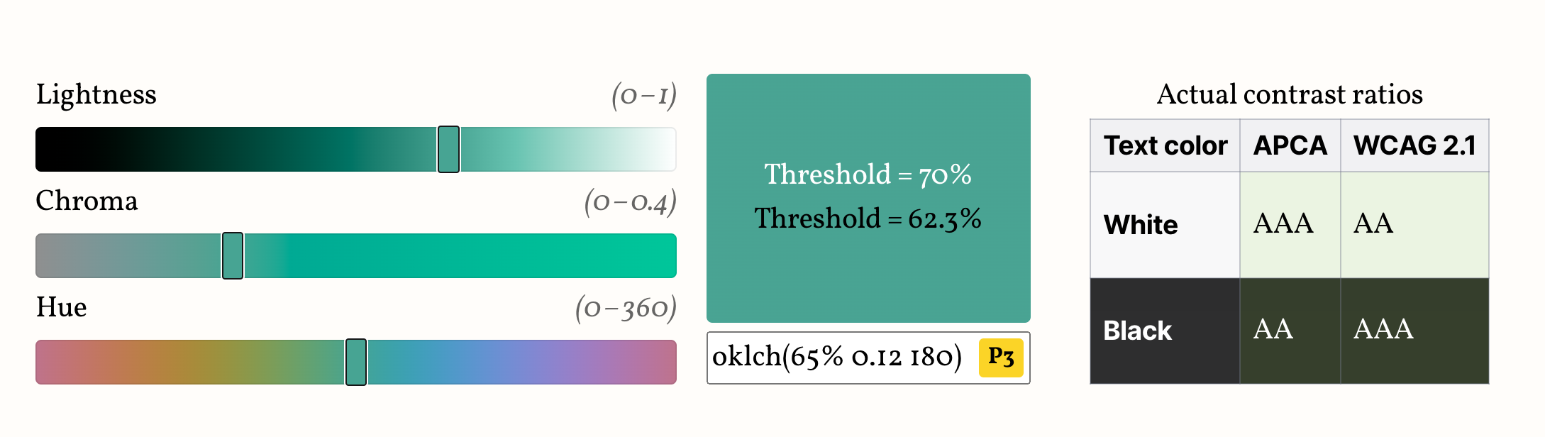
Here’s a demo so you can see how they both play out.
Edit the color below to see how the two thresholds work in practice, and compare with the actual contrast brackets, shown on the table next to (or below) the color picker.
Your browser does not support Relative Color Syntax, so the demo below will not work.
This is what it looks like in a supporting browser:
Lthreshold = 70%
Lthreshold = 62.3%
Actual contrast ratios
Text color
APCA
WCAG 2.1
White
Black
Avoid colors marked “P3+”, “PP” or “PP+”, as these are almost certainly outside your screen gamut,
and browsers currently do not gamut map properly, so the visual result will be off.
Note that if your actual color is more constrained (e.g. a subset of hues or chromas or a specific gamut),
you might be able to balance these tradeoffs better by using a different threshold.
Run the experiment yourself with your actual range of colors and find out!
Here are some examples of narrower ranges I have tried and the highest threshold that still passes WCAG 2.1:
It is particularly interesting that the threshold is improved to 64.5% by just ignoring colors that are not actually displayable on modern screens.
So, assuming (though sadly this is not an assumption that currently holds true) that browsers prioritize preserving lightness when gamut mapping, we could use 64.5% and still guarantee WCAG compliance.
You can even turn this into a utility class that you can combine with different thesholds:
This is only a start.
I can imagine many directions for improvement such as:
Since RCS allows us to do math with any of the color components
in any color space, I wonder if there is a better formula that still be implemented in CSS and balances readability and compliance even better.
E.g. I’ve had some chats with Andrew Somers (creator of APCA) right before publishing this,
which suggest that doing math on luminance (the Y component of XYZ) instead could be a promising direction.
We currently only calculate thresholds for white and black text.
However, in real designs, we rarely want pure black text,
which is why contrast-color() only guarantees a “very light or very dark color” unless the max keyword is used.
How would this extend to darker tints of the background color?
As often happens, after publishing this blog post, a ton of folks reached out to share all sorts of related work in the space.
I thought I’d share some of the most interesting findings here.
When colors have sufficiently different lightness values (as happens with white or black text),
humans disregard chromatic contrast (the contrast that hue/colorfulness provide)
and basically only use lightness contrast to determine readability.
This is why L can be such a good predictor of whether white or black text works best.
Another measure, luminance, is basically the color’s Y component in the XYZ color space,
and a good threshold for flipping to black text is when Y > 0.36.
This gives us another method for computing a text color:
As you can see in this demo by Lloyd Kupchanko, using Ythreshold > 36%
very closely predicts the best text color as determined by APCA.
In my tests (codepen) it appeared to work as well as the Lthreshold method,
i.e. it was a struggle to find colors where they disagree.
However, after this blog post, Lloyd added various Lthreshold boundaries to his demo,
and it appears that indeed, Lthreshold has a wider range where it disagrees with APCA than Ythreshold does.
Given this, my recommendation would be to use the Ythreshold method if you need to flip between black and white text,
and the Lthreshold method if you need to customize the text color further (e.g. have a very dark color instead of black).
About a week after publishing this post, I discovered a browser bug with color-mix() and RCS,
where colors defined via color-mix() used in from render RCS invalid.
You can use this testcase to see if a given browser is affected.
This has been fixed in Chrome 125 and Safari TP release 194, but it certainly throws a spanner in the works since the whole point of using this technique is that we don’t have to care how the color was defined.
There are two ways to work around this:
Adjust the @supports condition to use color-mix(), like so:
@supports (color: oklch(from color-mix(in oklch, red, tan) l c h)) {
	/* ... */
}
The downside is that right now, this would restrict the set of browsers this works in to a teeny tiny set.
2. Register the custom property that contains the color:
This completely fixes it, since if the property is registered, by the time the color hits RCS, it’s just a resolved color value.
@property is currently supported by a much wider set of browsers than RCS, so this workaround doesn’t hurt compatiblity at all.
tl;dr:Overfitting happens when solutions don’t generalize sufficiently and is a hallmark of poor design.
Eigensolutions are the opposite: solutions that generalize so much they expose links between seemingly unrelated use cases.
Designing eigensolutions takes a mindset shift from linear design to composability.
Usability and aesthetics usually go hand in hand.
In fact, there is even what we call the “Aesthetic Usability Effect”:
users perceive beautiful interfaces as easier to use and cut them more slack when it comes to minor usability issues.
Unfortunately, sometimes usability and aesthetics can be at odds, also known as “form over function”.
A common incarnation of form-over-function, is when designers start identifying signifiers and affordances as noise to be eliminated,
sacrificing a great deal of learnability for an — often marginal — improvement in aesthetics.
Aesthetic and Minimalist Design is one of the Nielsen/Norman core usability heuristics (and all other heuristics taxonomies have something similar).
More poetically, Antoine de Saint-Exupéry said “Perfection is achieved, not when there is nothing more to add, but when there is nothing left to take away”.
However, this is one of those cases where everyone agrees with the theory, but the devil is in the details (though user testing can do wonders for consensus).
Survey results are used by browsers to prioritize roadmaps — the reason Google is funding this.
Time spent thoughtfully filling them out is an investment that can come back to you tenfold
in the form of seeing features you care about implemented, browser incompatibilities being prioritized, and gaps in the platform being addressed.
In addition to browsers, several standards groups are also using the results for prioritization and decision-making.
Learn about new and upcoming features you may have missed; add features to your reading list and get a list of resources at the end!
Get a personalized score and see how you compare to other respondents
Learn about the latest trends in the ecosystem and what other developers are focusing on
While the survey will be open for 3 weeks, responses entered within the first 9 days (until October 1st) will have a much higher impact on the Web,
as preliminary data will be used to inform Interop 2024 proposals.
The State of HTML logo, designed by Chris Kirk-Nielsen, who I think surpassed himself with this one!
This is likely the most ambitious Devographics survey to date.
For the past couple of months, I’ve been hard at work leading a small product team spread across three continents (2am to 8am became my second work shift 😅).
We embarked on this mission with some uncertainty about whether there were enough features for a State of HTML survey,
but quickly found ourselves with the opposite problem:
there were too many, all with good reasons for inclusion!
To help weigh the tradeoffs and decide what makes the cut we consulted both the developer community,
as well as stakeholders across browsers, standards groups, community groups, and more.
We even designed new UI controls to facilitate collecting the types of complex data that were needed without making the questions too taxing,
and did original UX research to validate them.
Once the dust settles, I plan to write separate blog posts about some of these.
Absolutely! Do not worry about filling it out perfectly in one go.
If you create an account, you can edit your responses for the whole period the survey is open, and even split filling it out across multiple devices (e.g. start on your phone, then fill out some on your desktop, etc.)
Even if you’re filling it out anonymously, you can still edit responses on your device for a while.
You could even start anonymously and create an account later, and your responses will be preserved (the only issue is filling it out anonymously, then logging in with an existing account).
For the same reason there are JS APIs in the HTML standard:
many JS APIs are intrinsically related to HTML.
We mainly included JS APIs in the following areas:
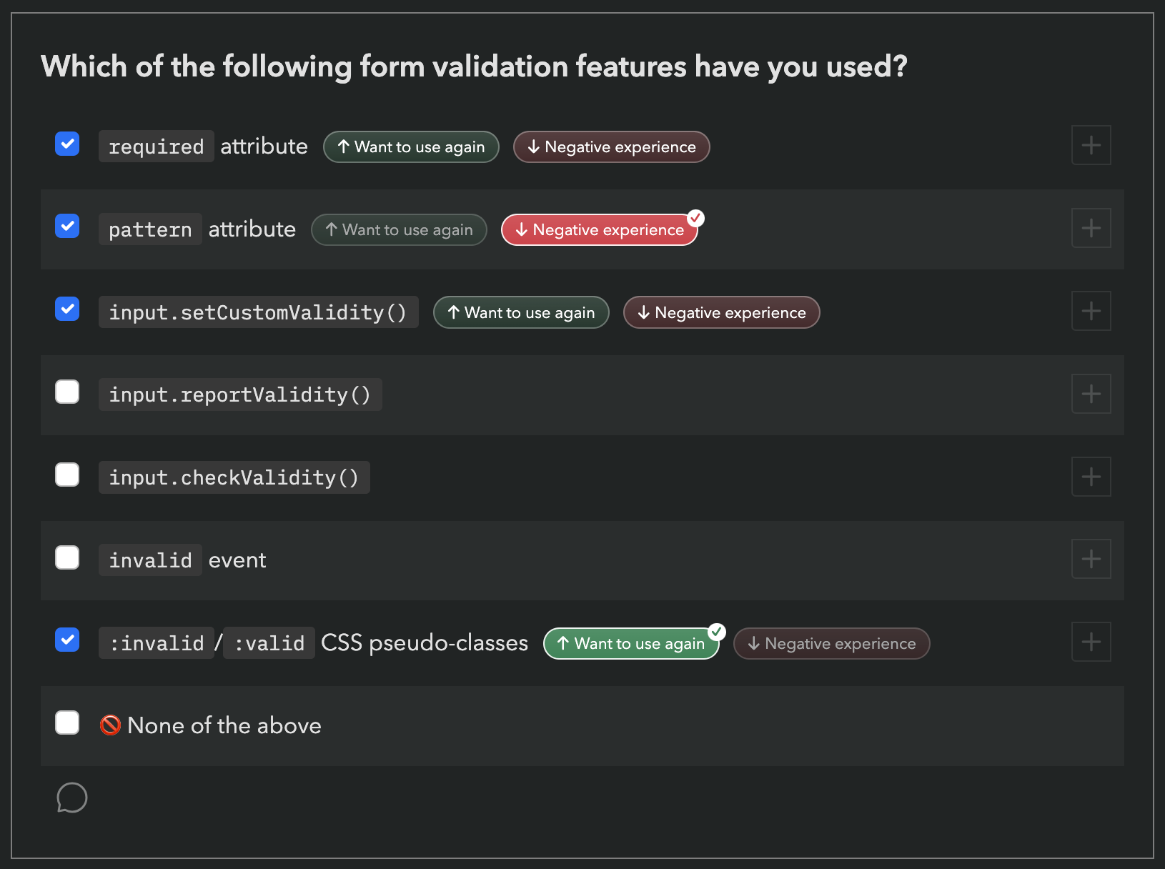
APIs used to manipulate HTML dynamically (DOM, form validation, etc.)
Web Components APIs, used to create custom HTML elements
APIs used to create web apps that feel like native apps (e.g. Service Workers, Web App Manifest, etc.)
If you don’t write any JS, we absolutely still want to hear from you!
In fact, I would encourage you even more strongly to fill out the survey: we need to hear from folks who don’t write JS, as they are often underrepresented.
Please feel free to skip any JS-related questions (all questions are optional anyway) or select that you have never heard these features.
There is a question at the end, where you can select that you only write HTML/CSS:
Absolutely not! Localization has been an integral part of these surveys since the beginning.
Fun fact: Nobody in the core State of HTML team is a native English speaker.
Each survey gets (at least partially) translated to over 30 languages.
However, since translations are a community effort, they are not necessarily complete, especially in the beginning.
If you are a native speaker of a language that is not yet complete, please consider helping out!
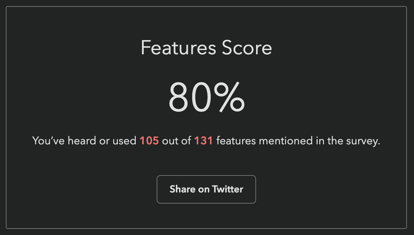
Previous surveys reported score as a percentage: “You have heard or used X out of Y features mentioned in the survey”.
This one did too at first:
This was my own score when the survey first launched, and I created the darn survey 😅
Our engineer, Sacha who is also the founder of Devographics got 19%!
These were a lot lower for this survey, for two reasons:
It asks about a lot of cutting edge features, more than the other surveys.
As I mentioned above, we had a lot of difficult tradeoffs to make,
and had to cut a ton of features that were otherwise a great fit.
We err’ed on the side of more cutting edge features, as those are the areas the survey can help make the most difference in the ecosystem.
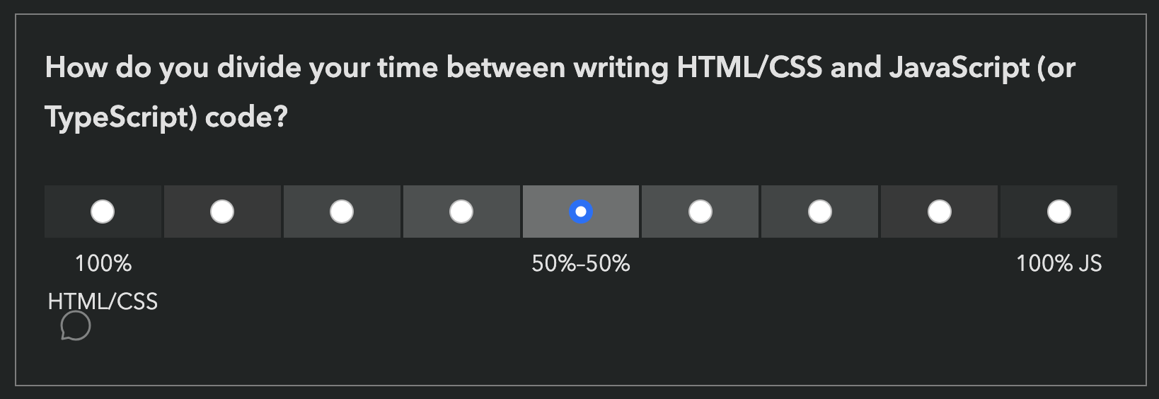
To save on space, and be able to ask about more features, we used a new compact format for some of the more stable features, which only asks about usage, not awareness.
Here is an example from the first section of the survey (Forms):
However, this means that if you have never used a feature, it does not count towards your score, even if you have been aware of it for years.
It therefore felt unfair to many to report that you’ve “heard or used” X% of features, when there was no way to express that you have heard 89 out of 131 of them!
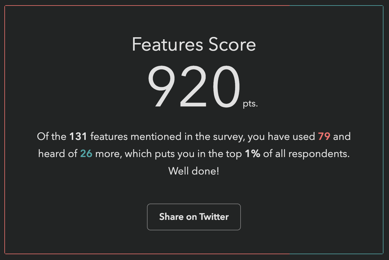
To address this, we changed the score to be a sum of points, a bit like a video game:
each used feature is worth 10 points, each known feature is worth 5 points.
Since the new score is harder to interpret by itself and only makes sense in comparison to others,
we also show your rank among other participants, to make this easier.
My score after the change.
If you have already taken the survey, you can just revisit it (with the same device & browser if filled it in anonymously)
and go straight to the finish page to see your new score and ranking!
As you may know, this summer I am leading the design of the inaugural State of HTML survey.
Naturally, I am also exploring ways to improve both survey UX, as well as all questions.
Shaine Madala, a data scientist working on the survey design team proposed using numerical inputs instead of brackets for the income question.
While I was initially against it,
I decided to explore this a bit further, which changed my opinion.
You have likely participated in several Devographics surveys before,
such as State of CSS, or State of JS.
These surveys have become the primary source of unbiased data for the practices of front-end developers today
(there is also the Web Almanac research, but because this studies what is actually used on the web, it takes a lot longer for changes in developer practices to propagate).
You may remember that last summer, Google sponsored me to be Survey Design Lead for State of CSS 2022.
It went really well: we got 60% higher response rate than the year before, which gave browsers a lot of actionable data to prioritize their work.
The feedback from these surveys is a prime input into the Interop project,
where browsers collaborate to implement the most important features for developers interoperably.
So this summer, Google trusted me with a much bigger project, a brand new survey: State of HTML!
WordPress has been with me since my very first post in 2009.
There is a lot to love about it: It’s open source, it has a thriving ecosystem, a beautiful default theme, and a revolutionary block editor that makes my inner UX geek giddy.
Plus, WP made building a website and publishing content accessible to everyone.
No wonder it’s the most popular CMS in the world, by a huge margin.
However, for me, the bad had started to outweigh the good:
Things I could do in minutes in a static site, in WP required finding a plugin or tweaking PHP code.
It was slow and bloated.
Getting a draft out of it and into another medium was a pain.
Despite having never been hacked, I was terrified about it, given all the horror stories.
I was periodically getting “Error establishing a database connection” errors, whose frequency kept increasing.
Just like most WP users, I was using both categories and tags, simply because they came for free.
However the difference between them was a bit fuzzy, as evidenced by how inconsistently they are used, both here and around the Web.
I was mainly using Categories for the type of article (Articles, Rants, Releases, Tips, Tutorials, News, Thoughts),
however there were also categories that were more like content tags (e.g. CSS WG, Original, Speaking, Benchmarks).
This was easily solved by moving the latter to actual tags.
However, tags are no panacea, there are several issues with them as well.
It was important to me to have good, RESTful, usable, hackable URLs.
While a lot of that is easy and comes for free, following this principle with Eleventy proved quite hard:
URLs that are “hackable” to allow users to move to higher levels of the information architecture by hacking off the end of the URL
What does this mean in practice?
It means it’s not enough if tags/foo/ shows all posts tagged “foo”, tags/ should also show all tags.
Similarly, it’s not enough if /blog/2023/04/private-fields-considered-harmful/ links to the corresponding blog post,
but also:
I had been using Disqus for comments for years, so I didn’t want to lose them, even if I ended up using a different solution for the future (or no comments at all).
Looking around for an existing solution did not yield many results.
There’s Zach’s eleventy-import-disqus but it’s aimed at importing Disqus comments as static copies,
but I wanted to have the option to continue using Disqus.
Looking at the WP generated HTML source, I noticed that Disqus was using the WP post id (a number that is not displayed in the UI) to link its threads to the posts.
However, the importer I used did not preserve the post ids as metadata (filed issue #95).
What to do?
Today I mourn. What am I mourning? Encapsulation. At least in my projects.
As a library author, I’ve decided to avoid private class fields from now on and gradually refactor them out of my existing libraries.
Why did I make such a drastic decision?
It all started a few days ago, when I was building a Vue 3 app that used Color.js Color objects. For context, Vue 3 uses proxies to implement its reactivity system, just like Mavo did back in 2016 (the first one to do so as far as I’m aware). I was getting several errors and upon tracking them down I had a very sad realization: instances of classes that use private fields cannot be proxied.
I will let that sink in for a bit. Private fields, proxies, pick one, you can’t have both. Here is a reduced testcase illustrating the problem.
It has been over a decade when I launchedcontrast-ratio.com, an app to calculate the WCAG 2.1 contrast ratio between any two CSS colors. At the time, all similar tools suffered from several flaws when being used for CSS editing:
No support for semi-transparent colors (Since WCAG included no guidance for alpha transparency — I had to do original research to calculate the contrast ratio range for that case)
No support for color formats other than hex or (at best) RGB with sliders. I wanted something where I could just paste a CSS color just like I had it specified in my code (e.g. hsl(220 10% 90%), possibly tweak it a bit to pass, then paste it back. I didn’t want to use unintuitive hex colors, and I didn’t want to fiddle with sliders.
Poor UX, often calculating the actual ratio required further user actions, making iteration tedious
Over the years, contrast-ratio.com grew in popularity: it was recommended in several books, talks, and workshops. It basically became the standard URL developers would visit for this purpose.
Therefore, when Ross and Drew from Siege Media approached me with a generous offer to buy the domain, and a commitment to take over maintainship of the open source project, I was cautiously optimistic. But now, after having seen some of their plans for it, I could not be more certain that the future of this tool is much brighter with them.
Please join me in welcoming them to the project and help them get settled in as new stewards!
Update:I got re-elected!! Thank you for trusting me once more with this huge responsibility towards the Open Web. I will continue to do my best to justify the confidence the W3C membership has placed in me. 🥹
Context: In 2020, I ran for the TAG election for the first time and had the great honor of being elected by the W3C membership. This year, I’m running for re-election. The W3C Technical Architecture Group (TAG) is the Working Group that ensures that Web Platform technologies are usable and follow consistent design principles, whether they are created inside or outside W3C. It advocates for the needs of everyone who uses the Web and everyone who works on the Web. If you work for a company that is a W3C Member, please consider encouraging your AC rep to vote for me! My candidate statement follows.
I’m Lea, and I’m running for re-election to the TAG to continue applying my usability research, CSS WG, and TAG experience to help W3C stay connected to the developer community, and to better serve their needs by ensuring web platform features are not only powerful, but also learnable and approachable, with a smooth ease-of-use to complexity curve.
I wear many hats. My background spans almost two decades of web design & development experience, one decade of standards work in the CSS WG, nearly a decade of PhD level human-computer interaction research & teaching at MIT, and over a decade of educating web developers through talks, books, articles, and helping them through my dozens of open source projects, some of which are used on millions of websites. For those unfamiliar with my background, I encourage taking a look at my 2020 candidate statement.
In 2020, I had the great honor of being elected to serve on the TAG by the W3C membership. In the two years I have served on the TAG, I participated in over 70 design reviews and helped prioritize API design in our reviewing. I have been publicly praised for the quality of design reviews I led.
It is important that the TAG does not operate in a vacuum: The primary purpose of our work is to serve developers and end-users by ensuring web platform features are usable, secure and privacy preserving. I have used my experience during design reviews to make sure we remain connected to this mission.
Together with Sangwhan Moon, I took the lead on our Web Platform Design Principles effort, which documents the principles that underlie Web Platform features — previously only existing in WG lore. The Web Platform is going through an explosion of new features; only in the last year the TAG received almost a hundred design review requests. With this volume, it is important that reviews are consistent, transparent, and fast. Evolving our published design principles helps with all three goals.
The Web ecosystem is not just the Web Platform itself, but also the various tools and libraries out there. I started a project to publish a subset of the design principles that apply to web developers, to help them in creating Web Platform compatible APIs. After all, with web components, web developers are now HTML designers, with Houdini APIs, they are now CSS designers, and with JS, they’ve been JS API designers since forever. The project is currently in its infancy, and If elected, it will be one of my tasks to get it published within my next term.
As a Greek woman, I bring both a Mediterranean and European perspective that diversifies the TAG and as a fully bilingual Greek and English speaker, I can fully participate in rapid technical discussions while also having an appreciation of the Internationalization needs of those who use the Web in languages other than English.
To ensure my participation has been beneficial for the TAG, I reached out to the chairs for feedback before deciding to run again. Both were very positive and strongly encouraged me to run again.
As someone not employed at a big tech company, I am not influenced by any particular company line. My only agenda is to lead the Web Platform to its full potential, and if re-elected, I’m willing to commit to spending the requisite hundreds of hours working towards that goal over the next two years. This was just the beginning, there is so much more important work to be done!
I would like to thank Open JS Foundation for graciously funding my TAG-related travel, in the event that I am re-elected, and both OpenJS Foundation and Bocoup for funding it during my first term.
A while ago I posted a call for feedback to inform the design of the State of CSS 2022 survey. The response has been overwhelming and it was glorious. We got quite a lot of proposals, feedback, votes. But that also meant we had to make some tough decisions about what gets in the survey and what doesn’t, otherwise we’d end up with a survey so long nobody would want to finish it!

 However, this means that if you have never used a feature, it does not count towards your score, even if you have been aware of it for years.
It therefore felt unfair to many to report that you’ve “heard or used” X% of features, when there was no way to express that you have heard 89 out of 131 of them!
However, this means that if you have never used a feature, it does not count towards your score, even if you have been aware of it for years.
It therefore felt unfair to many to report that you’ve “heard or used” X% of features, when there was no way to express that you have heard 89 out of 131 of them!