Blog

38 posts 2009 16 posts 2010 50 posts 2011 28 posts 2012 15 posts 2013 7 posts 2014 10 posts 2015 5 posts 2016 4 posts 2017 7 posts 2018 2 posts 2019 17 posts 2020 7 posts 2021 7 posts 2022 11 posts 2023 7 posts 2024

Introducing Prism: An awesome new syntax highlighter

2 min read 0 comments Report broken page

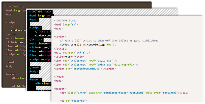
For the past three weeks, on and off, I’ve been working on releasing Dabblet’s syntax highlighter as standalone, since many people had requested it. Zachary Forrest  suggested the name “Prism” and I liked it so much I decided to go with it, even though there is an abandoned Mozilla project with the same name. I ended up refactoring and extending it so much that I will need to backport it to Dabblet one of these days! This doesn’t mean I bloated it, the core is still a tiny 1.5KB minified & gzipped. It just means it’s more awesome. :)

Seriously? The world needs another syntax highlighter?

In certain ways, Prism is better than any other syntax highlighter I’ve seen:

  • It’s tiny. The core is only 1.5KB minified & gzipped, which can go up to 2KB with the currently available language definitions (CSS, Markup and JS). But many other highlighters are also small, so read on.
  • It’s incredibly extensible. Not only it’s easy to add new languages (that’s a given with every syntax highlighter these days), but also to extend existing ones. Most importantly, it supports plugins, through hooks strategically placed in its source. There are a few plugins already available, and it’s really easy to write your own. I haven’t seen any other highlighter that supports plugins.
  • It encourages good author practices. Other highlighters encourage or even force you to use elements that are semantically wrong, like <pre> (on its own) or <script>. Prism forces you to use the only semantically correct element for marking up code: <code>. On its own for inline code, or inside a <pre> for blocks of code. In addition, the code language is declared through the way recommended in the HTML5 draft: through a language-xxxx class.
  • One of its best features: The language definition is inherited. This means that if multiple code snippets have the same language, you can just define it once, in one of their common ancestors. Obviously, if you define a language on the <body> element, you’ve essentially declared a default language for the entire document.
  • It looks good. All three of its existing themes. Most people wanted me to release Dabblet’s highlighter because they found other highlighters (including their themes) quite ugly.
  • It supports parallelism through Web Workers, for better performance in certain cases.
  • It doesn’t force you to use any Prism-specific markup, not even a Prism-specific class name, only standard markup you should be using anyway. So, you can just try it for a while, remove it if you don’t like it and leave no traces behind.

However, there are some limitations too:

  • Pre-existing HTML in the code block will be stripped off. However, there are plugins for links and highlighting certain lines.
  • I decided not to support IE8. Prism won’t break on IE8, it just won’t work. I don’t think many people using IE8 and below are able to read code, so I don’t see the point.

Enjoy: prismjs.com

If you like this project, don’t forget to follow @prismjs on Twitter!

I’ll soon update this blog to use Prism in the code examples as well.


Important -prefix-free update

3 min read 0 comments Report broken page

Those of you that have been following and/or using my work, are surely familiar with -prefix-free. Its promise was to let you write DRY code, without all the messy prefixes, that would be standards-compliant in the future (which is why I’m always against adding proprietary features in it, regardless of their popularity). The way -prefix-free works is that it feature tests which CSS features are available only with a prefix, and then adds the prefix in front of their occurences in the code. Nothing will happen if the feature is supported both with and without a prefix or if it’s not supported at all.

This worked well when browsers implementations aren’t significantly different from the unprefixed, standard version. It also works fine when the newer and the older version use incompatible syntaxes. For example, direction keywords in gradients. The old version uses top whereas the new version uses to bottom. If you include both versions, the cascade does its job and ignores the latter version if it’s not supported:

background: linear-gradient(top, white, black);
background: linear-gradient(to bottom, white, black);

However, when the same syntax means different things in the older and the newer version, things can go horribly wrong. Thankfully, this case is quite rare. A prime example of this is linear gradient angles. 0deg means a horizontal (left to right) gradient in prefixed linear-gradients and a vertical (bottom to top) gradient in unprefixed implementations, since they follow the newer Candidate Recommendation rather than the old draft. This wasn’t a problem when every browser supported only prefixed gradients. However, now that IE10 and Firefox 16 are unprefixing their gradients implementations, it was time for me to face the issue I was avoiding ever since I wrote -prefix-free.

The solution I decided on is consistent with -prefix-free’s original promise of allowing you to write mostly standards-compliant code that will not even need -prefix-free in the future. Therefore, it will assume that your gradients use the newer syntax, and if only a prefixed implementation is available, it will convert the angles to the legacy definition. This means that if you update -prefix-free on a page that includes gradients coded with the older definition, they might break. However, they would break anyway in modern browsers, so the sooner the better. Even if you weren’t using -prefix-free at all, and had written all the declarations by hand before the angles changed, you would still have to update your code. Unfortunately, that’s the risk we all take when using experimental features like CSS gradients and I think it’s worth it.

-prefix-free will not take care of any other syntax changes, since when the syntaxes are incompatible, you can easily include both declarations. The angles hotfix was included out of necessity because there is no other way to deal with it.

Here’s a handy JS function that converts older angles to newer ones:

function fromLegacy(deg) { return Math.abs(deg-450) % 360 }

You can read more about the changes in gradient syntax in this excellent IEblog article.

In addition to this change, a new feature was added to -prefix-free. If you ONLY want to use the prefixed version of a feature, but still don’t want to write out of all the prefixes, you can just use -*- as a prefix placeholder and it will be replaced with the current browser’s prefix on runtime. So, if you don’t want to change your angles, you can just prepend -*- to your linear-gradients, like so:

background: -*-linear-gradient(0deg, white, black);

However, it’s a much more futureproof and standards compatible solution to just update your angles to the new definition. You know you’ll have to do it at some point anyway. ;)

Edit: Although -prefix-free doesn’t handle syntax changes in radial gradients, since the syntaxes are mutually incompatible, you may use this little PrefixFree plugin I wrote for the CSS Patterns Gallery, which converts the standard syntax to legacy syntax when needed:

StyleFix.register(function(css, raw) {
	if (PrefixFree.functions.indexOf('radial-gradient') > -1) {
		css = css.replace(/radial-gradient\(([a-z-\s]+\s+)?at ([^,]+)(?=,)/g, function($0, shape, center){
			return 'radial-gradient(' + center + (shape? ', ' + shape : '');
		});
	}

return css; });

Keep in mind however that it’s very crude and not very well tested.


So, you’ve been invited to speak

7 min read 0 comments Report broken page

I’ve been lucky enough to be invited to do about 25 talks over the course of the past few years and I have quite a few upcoming gigs as well, most of them at international conferences around Europe and the US. Despite my speaking experience, I’m still very reluctant to call myself a “professional speaker” or even a “speaker” at all. In case you follow me on twitter, you might have noticed that my bio says “Often pretends to be a speaker”, and that captures exactly how I feel. I’m not one of those confident performers that don’t just present interesting stuff, but also can blurt jokes one after the other, almost like stand-up comedians and never backtrack or go “ummm”. I greatly admire these people and I aspire to become as confident as them on stage one day. People like Aral Balkan, Christian Heilmann, Nicole Sullivan, Jake Archibald and many others. Unlike them, I often backtrack mid-sentence, say a lot of "ummmm"s and sometimes talk about stuff that was going to be later in my slides, all of which are very awkward.

However, I’ve reached the conclusion that I must be doing something right. I do get a lot of overwhelmingly positive feedback after almost every talk, even by people I admire in the industry. I don’t think I’ve ever gotten a negative comment for a talk, even in cases that I thought I had screwed up. Naturally, after all these conferences, I’ve attended a lot of technical talks myself, and I’ve gathered some insight on what constitutes a technical talk the audience will enjoy. I’ve been pondering to write a post with advice about this for a long time, but my lack of confidence about my speaking abilities put me off the task. However, since people seem to consider me good, I figured it might help others doing technical talks as well.

All of the following are rules of thumb. You have to keep in mind that there are exceptions to every single one, but it’s often quicker and more interesting to talk in absolutes. I will try to stay away from what’s already been said in other similar articles, such as “tell a story” or “be funny” etc, not because it’s bad advice, but because a) I’m not really good at those so I prefer to let others discuss them and b) I don’t like repeating stuff that’s already been said numerous times before. I will try to focus on what I do differently, and why I think it works. It might not fit your style and that’s ok. Audiences like a wide range of presentation styles, otherwise I’d be screwed, as I don’t fit the traditional “good speaker” profile. Also, it goes without saying that some of my advice might be flat out wrong. I’m just trying to do pattern recognition to figure out why people like my talks. That’s bound to be error-prone. My talks might be succeeding in spite of X and not because of it.

1. Do something unique

There are many nice talks with good minimal slides (almost everyone has read Presentation Zen by now), funny pictures, good content and confident presenters. In fact, they dominate almost every conference I’ve been at. You can always become a good speaker by playing it safe, and many famous speakers in the industry have earned their fame by doing so. There is absolutely nothing wrong with that. However, to stand out doing that kind of talk, you need to be really, really good. Hats off to the speakers that managed to stand out doing talks like that, because it means they are truly amazing.

However, if you, like me, fear that your speaking skills are not yet close to that caliber, you need to figure out something else that sets you apart. Something that will make your talk memorable. We see a lot of innovation in our discipline, but it’s limited to the scripts and apps we write. Why not to our presentations as well? Do something different, and make it your thing, your “trademark” way of presenting.

For me, that was the embedded demos in my slides. I usually have a small text field where I write code, and something (often the entire slide or text field itself) that displays the outcome. This lets the attendees see not just the end result, but also the intermediate states until we get there, which often proves out to be enlightening. It also makes the slide quite flexible, as I can always show something extra if I have the time.

Of course, it also means that things might (and if you talk often enough, will at some point) go wrong. To mitigate this to a degree, I try to keep demos small, with a sensible starting state, so that I won’t have to write a lot of code. Which brings us to the next point.

2. Never show a lot of code on a slide

I have a theory: Attendees’ understanding of code decreases exponentially as the lines of simultaneously displayed code increase. Avoid showing many lines of code at once like the plague. Although I’ve shown up to 10 lines of code on a single slide (maybe even more), I usually try to keep it well below five. Ideally less than three even. If you absolutely must present more code, try to use a technique to make the audience understand it by chunks, so that they still only have to process very little code at any given time.

One technique I use for that is showing little code at first, and writing the rest on stage, gradually, explaining the steps as I go. When that isn’t possible or it doesn’t make sense (for example when there is no visual result to see), I try to show parts of the code step by step, explaining what everything does as it appears. This doesn’t necessarily mean showing one line at a time. For example, if you are showing a JS function, it makes sense to show the closing brace at the same time as the opening brace and not at the end. Show the elements of the code in the order you would write them in a top-down implementation, not by pure source order (although in some cases those two may coincide). To make this more clear, here’s an example slide where I used this technique. It’s from my “Polyfilling the gaps” talk at JSConf EU 2011, one of the very few talks of mine that had no live coding.

Also, it goes without saying that if you have to present a lot of code at once, syntax highlighting is a must. Comments aren’t: That’s what you are there for. Comments just add visual clutter and make it harder for people to interpret the actual code. Also, while explaining the code, try to somehow highlight the part you’re currently describing, even if your method is as rudimentary as selecting the text. Otherwise, if someone misses a sentence, they will completely lose track.

3. IDEs are not good presentation tools

I’ve seen this so many times: Someone wants to live demo a technology and fires up their IDE or text editor and starts coding. The audience tries to follow along at first, but at some point almost always gets lost. While these tools are great for programming, they are not presentation tools. They have a lot of distracting clutter, very small text and require you to show parts of the code that aren’t really relevant. They also require you to switch applications to toggle between the code and result, which disrupts the flow of your presentation.

In addition, the probability you will make a mistake increases exponentially with the amount of code you write, both in real life and especially in presentations where you are also nervous. Then the audience is stuck with an embarrassed presenter trying to find what’s wrong for five minutes, until someone from the audience decides to put them out of their misery and shout that a closing parenthesis is missing on line 25.

That’s why live coding has gotten a bad reputation over the years.

As you’ve probably figured from tip #1, I’m not against live coding. Done well, it can really help the audience learn. However, if not done properly, it can end up completely wrecking a talk. Even if you absolutely have to use an external tool, try to make the experience as smooth as possible:

  • Hide any toolbars, sidebars, panels. If your editor doesn’t allow you to hide everything that isn’t relevant, use another editor.
  • Make the text BIG. If possible, as big as the text in your slides. Remember: Text in slides is big, because you need even the attendees sitting in the back rows to still be able to read it. Why is it that this simple consideration seems to escape so many presenter minds when they switch from slides to code?
  • If parts of the code are needed but not relevant (e.g. CSS files in a JavaScript talk), put them in separate files and reference them. Try to minimize the code you will actually show as much as possible, and then even more.
  • If applicable, use LiveReload and have the browser window and code editor side by side.

4. Don’t aim to beginners (only)

Some of the nastiest criticism I’ve seen against people’s talks was that they were too elementary. Getting feedback like that has almost become a phobia of mine. Of course, it’s always better if your entire audience is at the same level, and you are fully aware what that level is. However, that’s almost never the case, so you will have to err on one side. Do your best to cater to the median, but when you have to err, err on the side of more advanced content. A somewhat selfish reason would be that when people find your talk too elementary, they will blame you; when they find it too advanced, they will blame themselves. However, it’s not just covering your ass, it’s better for your audience as well. Someone who didn’t learn anything new gets absolutely nothing out of your talk (unless it’s an interesting performance on its own, e.g. so funny it could have been stand up comedy for geeks). A person that learned many things but didn’t understand some of the more advanced concepts will still have gotten a lot out of it.

If someone learns a useful thing or two from your talk, that’s what they’ll remember. Even if the rest of the talk was elementary or too advanced for them, they will walk out with a positive impression, thinking “I learned something today!”. Even if most of your talk is elementary, try to sneak in some more advanced or obscure bits, that not many people know.

My favorite approach to cater for a diverse audience with very different levels of experience, is to pick a narrow topic, start from the very basics and work my way up to more advanced concepts. This way everyone learns something, and nobody feels intimidated. On the flip side, if you are in a multi-track conference, this also limits the potential audience that might come to your talk.

5. Eat your own dog food

I’m a huge fan of HTML-based (or SVG-based) slideshows. I’ve always been, since my first talk. It’s a technology you’re already accustomed to, so you can do amazing things with it. You can write scripts that demonstrate the concepts you describe in some visual way, you can do live demos, you can embed iframes of other people’s demos, you know how to style it much better than you likely know how to use Keynote. Yes, if you’re used to traditional presentation tools, it might be hard at first. Many features you’ve been taking for granted will be missing. Styling is not visual, there are no presenter notes, no next slide preview, no automatic adjustment to the projector resolution to name a few. But what you gain in potential and expressiveness, are totally worth the trade-off. Also, rather than having the talk prep keep you from writing code and becoming better at what you do, it will now actually contribute to it! It’s also a great chance to try experimental stuff, as it’s going to be run in a very controlled environment.

You don’t even need to write your own presentation framework if you don’t want to. There are a ton available now, such as my own CSSS, impress.js and many others.

6. Involve the audience

There is an old Chinese proverb that goes like:

Tell me, and I’ll forget Show me, and I’ll remember Involve me, and I’ll understand

I’ve noticed that audiences respond extremely well to talks that attempt to involve them. Seb-Lee Delisle gave a talk at Fronteers 2011 where he involved the audience by ideas like demonstrating Web Sockets through making their iPhones flash in such a way that he could create light patterns with the audience. Even though some of the demos failed (I think something crashed, don’t remember very well), the audience loved every bit. I’ve rarely seen people that excited about a talk.

Involving the audience was something I wanted to do for a while. In my recent Regular Expressions talks, I had a series of small “challenges” where the audience tried to write a regexp to match a certain set of strings as quickly as possible and tweet it. I provided a link to an app I made especially for that. The person who got most regexes right (or more right than others) won a book. This was also very well received and lots of positive feedback mentioned it. When it feels like a game, learning is much more fun.
Why I bought a high-end MacBook Air instead of the Retina MBP

4 min read 0 comments Report broken page

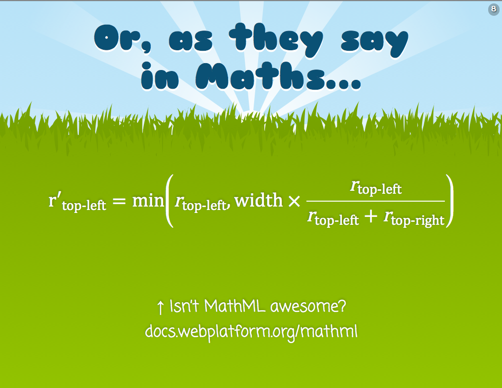
After the WWDC keynote, I was convinced I would buy a new MacBook Air. I was looking forward to any announcements about new hardware during the event, as my 13" 2010 MacBook Pro (Henceforth abbreviated as MBP) was becoming increasingly slow and dated. Also, I wanted to gift my MBP to my mother, who is currently using a horrible tiny Windows XP Netbook and every time I see her struggling to work on it, my insides hurt. All tweets about my shopping plans, or, later, about my new toy (I bought it yesterday) were met with surprise and bewilderment: I was repeatedly bombarded with questions asking why I’m not getting a Retina MacBook Pro, over and over again. The fact that I paid about $2200 + tax for it (it’s the best 13" Air you can currently get) made it even more weird: If you could afford that, why wouldn’t you possibly get the Retina MBP at the exact same price?

At first, I tried to reply with individual tweets to everyone that asked. Then I got tired of that and started replying with links to the first tweets, then I decided to write a blog post. So, here are my reasons:

Portability

I travel a lot. For me, it’s very important to be able to use my laptop in a cramped airplane seat, or while standing in a line. You can’t really do that with a 15" MacBook Pro, even with the new slimmer design. I wanted to be able to quickly pull it out of my tote bag with one hand, hold it with said hand and quickly look up something with the other hand. Usage scenarios of that sort are just unthinkable for big laptops. Of course, portability is not the only thing that matters, as I only use one laptop as my main work machine. Having two machines, one for portability and one for “real work”, always seemed to me like more hassle than it’s worth. So, a 11" MacBook Air was also out of the question. Which brings us to the middle ground of a 13" laptop. All my laptops had always been around 13". It’s a perfect trade-off between power and portability and I don’t wish to change that any time soon. It was quite simple: The 13" Air is more portable than my MBP. The 15" Retina MBP was less portable. I needed more portability than I had, not less.

I saw the Retina MBP and wasn’t too impressed

When I first went to the Apple Store to buy the MacBook Air, I saw the new Retina display. I even managed to use it a bit, despite the swarm of fellow geeks nerdgasming uncontrollably around it. I won’t lie: I was tempted at first. The display is very crisp indeed, although the difference between icons that were not updated for the Retina is quite obvious, especially next to their accompanying text (which is always crisp, since text is vector-based). I started being unsure about my decision, as Nicole Sullivan can attest (she was with me). And then it dawned on me: Hey, I should see the MacBook I was planning to buy in person too. Maybe its screen is also quite crisp. Maybe the difference won’t even be that noticeable. I was right: My simple, untrained eyes could not really tell the difference. MacBook Airs have a decently crisp screen. Of course, if you put them next to each other, I’d imagine the difference would be fairly obvious. But who does that?

However, my impression still wasn’t sufficient to make a decision. I’ve learned not to trust my unreliable human senses too much. I needed numbers. Calculating the actual DPI of a monitor is actually fairly simple: All you need is the Pythagorean theorem you learned in school, to calculate the hypotenuse of the screen in pixels, and then divide that number by the length of the diagonal in inches. The result will be the number of pixels per inch, commonly (and slightly incorrectly) referred to as DPI (PPI is more correct). If you know basic JavaScript, you don’t even need a calculator, just your ol’ trusty console.

I even wrote a handy function that does it for me:

function dpi(w,h,inches) { return Math.round(Math.sqrt(w*w + h*h)/inches) }

For the 13" MacBook Air, the DPI is:

> dpi(1440, 900, 13.3) 128

For the Retina MBP, it’s:

> dpi(2880, 1800, 15.4)  221

220 DPI is certainly higher than 130, but it’s not the kind of eyegasm-inducing difference I experienced when I moved from an iPhone 3G to an iPhone 4 (the difference there was 163 DPI vs 326 DPI).

I don’t want to distance myself too much from the average web user

It happens more than we like to admit: We get cool new hardware, and eventually we’re carried away and think most web users are close to our level. We start designing for bigger and bigger resolutions, because it’s hard to imagine that some people are still on 1024x768. We code to better CPUs, because it’s hard to imagine how crappy computers many of our target users have. We don’t care about bandwidth and battery, because they aren’t a concern for most of us. Some of us will realize before launching, during a very painful testing session, some others will only realize after the complaints start pouring in. It’s the same reason a website always looks and works better in the browser its developers use, even though almost always it gets tested in many others.

We like to think we’re better than that, that we always test, that we never get carried away, but in most cases we are lying to ourselves. So, even though I recognize that I probably have much better hardware than most web users, I consciously try to avoid huge resolutions as I know I’ll get carried away. I try to keep myself as close to the average user as I can tolerate. Using IE9 on a 1024x768 resolution would be over that threshold, but not using a Retina display is easily tolerable.

That’s all folks

Hope this makes sense. Hopefully, it might help others trying to decide between the two. I sure am very happy so far with my new Air :)


Hacking lookahead to mimic intersection, subtraction and negation

2 min read 0 comments Report broken page

Note: To understand the following, I expect you to know how regex lookahead works. If you don’t, read about it first and return here after you’re done.

I was quite excited to discover this, but to my dismay, Steven Levithan assured me it’s actually well known. However, I felt it’s so useful and underdocumented (the only references to the technique I could find was several StackOverflow replies) that I decided to blog about it anyway.

If you’ve been using regular expressions for a while, you surely have stumbled on a variation of the following problems:

  • Intersection: “I want to match something that matches pattern A AND pattern B” Example: A password of at least 6 characters that contains at least one digit, at least one letter and at least one symbol
  • Subtraction: “I want to match something that matches pattern A but NOT pattern B” Example: Match any integer that is not divisible by 50
  • Negation: “I want to match anything that does NOT match pattern A” Example: Match anything that does NOT contain the string “foo”

Even though in ECMAScript we can use the caret (^) to negate a character class, we cannot negate anything else. Furthermore, even though we have the pipe character to mean OR, we have nothing that means AND. And of course, we have nothing that means “except” (subtraction). All these are fairly easy to do for single characters, through character classes, but not for entire sequences.

However, we can mimic all three operations by taking advantage of the fact that lookahead is zero length and therefore does not advance the matching position. We can just keep on matching to our heart’s content after it, and it will be matched against the same substring, since the lookahead itself consumed no characters. For a simple example, the regex /^(?!cat)\w{3}$/ will match any 3 letter word that is NOT “cat”. This was a very simple example of subtraction. Similarly, the solution to the subtraction problem above would look like /^(?!\d+[50]0)\d+$/.

For intersection (AND), we can just chain multiple positive lookaheads, and put the last pattern as the one that actually captures (if everything is within a lookahead, you’ll still get the same boolean result, but not the right matches). For example, the solution to the password problem above would look like /^(?=.*\d)(?=.*[a-z])(?=.*[\W_]).{6,}$/i. Note that if you want to support IE8, you have to take this bug into account and modify the pattern accordingly.

Negation is the simplest: We just want a negative lookahead and a .+ to match anything (as long as it passes the lookahead test). For example, the solution to the negation problem above would look like /^(?!.*foo).+$/. Admittedly, negation is also the least useful on its own.

There are caveats to this technique, usually related to what actually matches in the end (make sure your actual capturing pattern, outside the lookaheads, captures the entire thing you’re interested in!), but it’s fairly simple for just testing whether something matches.

Steven Levithan took lookahead hacking to the next level, by using something similar to mimic conditionals and atomic groups. Mind = blown.


Teaching: General case first or special cases first?

2 min read 0 comments Report broken page

A common dilemma while teaching (I’m not only talking about teaching in a school or university; talks and workshops are also teaching), is whether it’s better to first teach some easy special cases and then generalize, or first the general case and then present special cases as merely shortcuts.

I’ve been revisiting this dilemma recently, while preparing the slides for my upcoming regular expressions talks. For example: Regex quantifiers.

1. General rule first, shortcuts after

You can use {m,n} to control how many times the preceding group can repeat (m = minimum, n = maximum). If you omit n (like {m,}) it’s implied to be infinity (=“at least m times”, with no upper bound).

  • {m, m} can also be written as
  • {0,1} can also be written as ?
  • {0,} can also be written as *
  • {1,} can also be written as +

Advantages & disadvantages of this approach

  • Harder to understand the general rule, so the student might lose interest before moving on to the shortcuts
  • After understanding the general rule, all the shortcuts are then trivial.
  • If they only remember one thing, it will be the general rule. That’s good.

2. Special cases first, general rule after

  • You can add ? after a group to make it optional (it can appear, but it may also not).
  • If you don’t care about how many times something appears (if at all), you can use *.
  • If you want something to appear at least once, you can use +
  • If you want something to be repeated exactly n times, you can use
  • If you want to set specific upper and lower bounds, you can use {m,n}. Omit the n for no upper bound.

Advantages & disadvantages of this approach

  • Easy to understand the simpler special cases, building up student interest
  • More total effort required, as every shortcut seems like a separate new thing until you get to the general rule
  • Special cases make it easier to understand the general rule when you get to it

What usually happens

In most cases, educators seem to favor the second approach. In the example of regex quantifiers, pretty much every regex book or talk explains the shortcuts first and the general rule afterwards. In other disciplines, such as Mathematics, I think both approaches are used just as often.

What do you think? Which approach do you find easier to understand? Which approach do you usually employ while teaching?


Poll: ¿Is animation-direction a good idea?

3 min read 0 comments Report broken page

¿animation-direction?

Lets assume you have a CSS animation for background-color that goes from a shade of yellow (#cc0) to a shade of blue (#079) and repeats indefinitely. The code could be something like this:

@keyframes color {
  from { background: #cc0 }
  to { background: #079 }
}

div { animation: color 3s infinite; }

If we linearize that animation, the progression over time goes like this (showing 3 iterations):

As you can see, the change from the end state to the beginning state of a new iteration is quite abrupt. You could change your keyframes to mitigate this, but there’s a better way. A property with the name animation-direction gives a degree of control on the direction of the iterations to smooth this out. It also reverses your timing functions, which makes it even smoother.

In early drafts, only the values normal and alternate were allowed. normal results in the behavior described above, whereas alternate flips every other iteration (the 2nd, the 4th, the 6th and so on), resulting in a progression like this (note how the 2nd iteration has been reversed):

The latest draft also adds two more values: reverse which reverses every iteration and alternate-reverse, which is the combination of both reverse and alternate. Here is a summary of what kind of progression these four values would create for the animation above:

The problem

I was excited to see that reverse and alternate-reverse were finally added to the spec, but something in the syntax just didn’t click. I initially thought the reason was that these four values essentially set 2 toggles:

  • ¿Reverse all iterations? yes/no
  • ¿Reverse even iterations? yes/no

so it’s pointless cognitive overhead to remember four distinct values. I proposed that they should be split in two keywords instead, which would even result to a simpler grammar too.

The proposal was well received by one of the co-editors of the animations spec (Sylvain Galineau), but there was a dilemma as to whether mixing normal with alternate or reverse would make it easier to learn or more confusing. This is a point where your opinion would be quite useful. Would you expect the following to work, or would you find them confusing?

  • animation-direction: normal alternate; /* Equivalent to animation-direction: alternate; */
  • animation-direction: alternate normal; /* Equivalent to animation-direction: alternate; */
  • animation-direction: normal reverse; /* Equivalent to animation-direction: reverse; */
  • animation-direction: reverse normal; /* Equivalent to animation-direction: reverse; */

A better (?) idea

At some point, in the middle of writing this blog post (I started it yesterday), while gazing at the graphic above, I had a lightbulb moment. ¡These values are not two toggles! All four of them control one thing: which iterations are reversed:

  • normal reverses no iterations
  • reverse reverses all iterations
  • alternate reverses even iterations
  • alternate-reverse reverses odd iterations

The reason it’s so confusing and it took me so long to realize myself, is that the mental model suggested by these keywords is detached from the end result, especially in the case of alternate-reverse. You have to realize that it works as if both alternate and reverse were applied in sequence, so reverse first reverses all iterations and then alternate reverses the even ones. Even iterations are reversed twice, and are therefore equivalent to the original direction. This leaves the odd ones as being reversed. It’s basically a double negative, making it hard to visualize and understand.

I thought that a property that would reflect this in a much more straightforward way, would be animation-reverse (or animation-iteration-reverse), accepting the following values:

  • none (equivalent to animation-direction: normal)
  • all (equivalent to animation-direction: reverse)
  • even (equivalent to animation-direction: alternate)
  • odd (equivalent to animation-direction: alternate-reverse)

Not only this communicates the end result much better, but it’s also more extensible. For example, if in the future it turns out that reversing every 3rd iteration is a common use case, it will be much easier to add expressions to it, similar to the ones :nth-child() accepts.

I knew before proposing it that it’s too late for such drastic backwards-incompatible changes in the Animations module, however I thought it’s so much better that it’s worth fighting for. After all, animation-direction isn’t really used that much in the wild.

Unfortunately, it seems that only me and Sylvain thought it’s better, and even he was reluctant to support the change, due to the backwards compatibility issues. So, I started wondering if it’s really as much better as I think. ¿What are your thoughts? ¿Would it make it simpler for you to understand and/or teach? Author feedback is immensely useful for standardization, so please, ¡voice your opinion! Even without justifying it if you don’t have the time or energy. Gathering opinions is incredibly useful.

TL;DR

  1. ¿Is alternate reverse and reverse alternate (either would be allowed) a better value for animation-direction over alternate-reverse?
  2. ¿If so, should redundant combinations of normal with alternate or reverse also be allowed, such as normal alternate?
  3. ¿Or maybe we should ditch it altogether and replace it with animation-reverse, accepting values of none, all, even, odd?

Side note: If you’re wondering about the flipped question and exclamation marks (¿¡) it’s because I believe they improve the usability of the language if widely adopted, so I’m doing my part for it ;) And no, I don’t speak Spanish.


Text masking — The standards way

2 min read 0 comments Report broken page

As much as I like .net magazine, I was recently outraged by their “Texturizing Web Type” article. It features a way to apply a texture to text with -webkit-mask-image, presenting it as an experimental CSS property and misleading readers. There are even -moz-, -o- and -ms- prefixes for something that is not present in any specification, and is therefore unlikely to ever be supported by any non-WebKit browser, which further contributes to the misdirection. A while back, I wrote about how detrimental to our work and industry such proprietary features can be.

A common response to such complaints is that they are merely philosophical and who cares if the feature works right now and degrades gracefully. This argument could be valid for some cases, when the style is just a minor, gracefully degrading enhancement and no standards compliant alternative is present (for example, I’ve used ::-webkit-scrollbar styles myself). However, this is not the case here. We have had a standards compliant alternative for this for the past 11 years and it’s called SVG. It can also do much more than masking, if you give it a chance. Here’s an example of texturized text with SVG:

Edit: Thanks to @devongovett’s improvements, the code is now simpler & shorter.

Yes, the syntax might be more unwieldy but it works in a much wider range of browsers: Chrome, Safari, Firefox, IE9, Opera. Also, it’s trivial to make a script that generates the SVG markup from headings and applies the correct measurements for each one. When WebKit fixes this bug, we can even move the pattern to a separate SVG file and reference it from there.

In case you’re wondering about semantics, the <svg> element is considered “flow content” and is therefore allowed in heading elements. Also, even if search engines don’t understand inline SVG, they will just ignore the tags and still see the content inside the <text> element. Based on that, you could even make it degrade gracefully in IE8, as long as you include the HTML5 fix for the <svg> element. Then the CSS rules for the typography will still apply. You’ll just need to conditionally hide the <image>, since IE8 displays a broken image there (a little known fact is that, in HTML, <image> is basically equivalent to <img>, so IE8 treats it as such) .

Credits to David Storey’s original example that inspired this.


How I got into web development — the long version

10 min read 0 comments Report broken page

I’m often asked how I got into web development, especially from people that haven’t met many women in the field. Other times it’s people with little kids and they are asking for guidance about how to steer them into programming. I promised them that I would write a long post about it at some point, and now that I’m in the verge of some big changes in my life, I’ve started reflecting on the fascinating journey that got me here.

Rebecca Murphey wrote something similar a while back (albeit much shorter and less detailed), and I think it would be nice if more people in the field started posting their stories, especially women. I sure would find them interesting and if you give it a shot, you’ll see it’s quite enjoyable too. I sure had a blast writing this, although it was a bit hard to hit the “Publish” button afterwards.

Keep in mind that this is just my personal story (perhaps in excruciating detail). I’m not going to attempt to give any advice, and I’m not suggesting that my path was ideal. I’ve regretted some of my decisions myself, whereas some others proved to be great, although they seemed like failures at the time. I think I was quite lucky in how certain things turned out and I thank the Flying Spaghetti Monster daily for them.

Warning: This is going to be a very long read (over 3000 words) and there is no tl;dr.

Childhood (1986-1998)

I was born on June 13th, 1986. I grew up in a Greek island called Lesbos (yes, the island where the word “lesbian” comes from, in case you were wondering), in the small town of Kalloni. I didn’t have a computer as a kid, but I always loved making things. I had no siblings, so my childhood was mostly spent playing solitarily with paper, fabric, staples, scissors and the like. I was making all kinds of stuff: Little books, wallets, bags, pillows, anything I could come up with that was doable with my limited set of tools and materials. I also loved drawing. I had typical toys as well (legos, dolls, playmobil, cars, teddy bears) but the prevailing tendency in my childhood was making stuff. I wasn’t particularly interested in taking things apart to see how they worked, I just liked making new things.

I had never used a computer until I was around 10. We spent Christmas with an uncle of mine and his family in Athens. That uncle was working at Microsoft Hellas, and had a Windows 95 machine in his apartment. I got hooked from the first moment I used that computer. I didn’t do anything particularly interesting in it, just played around with MS Paint and some other equally mundane applications. However, for me it was so fascinating that I spent most of my Christmas vacation that year exploring Windows 95.

After I returned to Lesbos, I knew I badly wanted a computer for myself. However, computers were quite expensive back then, so I didn’t get one immediately, even though my family was quite well off. My father started taking me to his job’s offices on weekends, and I spent hours every time on a Windows 3.1 machine, exploring it, mostly drawing on its paint app.

In 1997, my mother finally bought me a computer. It cost around 700K drachmas (around €2000?) which was much more at the time than it is today. It was a Pentium MMX at 233MHz with 32MB of RAM and a 3.1GB hard drive, which was quite good at the time. I was so looking forward for it to arrive, and when it did, I spent every afternoon using it, from the moment I got back from school, until late at night. The only times I didn’t use my computer was when I was reading computer books or magazines or studying for school. In a year, I had become quite proficient about how its OS worked (Windows 95), editing the registry, trying to learn DOS (its command line). I also exercised my creativity by making magazines and newspapers in Microsoft Word. I’m quite surprised I didn’t break it, even though I was experimenting with anything I could get my cursor on.

Unfortunately, my computer fascination was largely solitary. There were no other geeks in my little town I could relate to, which I guess made me even more of an introvert. The only people reading my MS Word-generated newspaper were me and a friend of mine. During my years in Lesbos, I only met 2 other kinda geeky kids, and we didn’t really hit it off. One of them was living too far, the other was kind of annoying. :P The former however gave me his fonts, which I was really grateful for. I loved fonts. I didn’t have any typographic sophistication, so I loved about every font, but I remember desperately wanting to make my own. Unfortunately, I never pursued that, as I couldn’t find any font creation software until very recently.

In late 1997, we visited some relatives in a NYC suburb to spend Christmas there. It was my first time in the US and I fell in love with the place. My uncle, knowing my computer obsession took me to a big computer store called CompUSA. I was like a kid in a candy store! The software that caught my eye the most was called “Mutimedia Fusion”. It was a graphical IDE that allowed you to make applications (mostly games and screensavers, but you could potentially make anything) without writing any code. The thought processes involved were the same as in programming, but instead of typing commands, you picked them from menus or wrote mathematical expressions through a GUI. You could even go online and get new plugins that added functionality, but my access to the internet in my little town was very limited.

I got super excited. The idea of being able to make my very own programs, was too good to be true. I convinced my mother to buy it for me and thankfully, she did. For the year that followed, my afternoons and weekends became way more creative. I wasn’t interested in making games, but more in utility applications. Things that were going to be useful for my imaginary users. My biggest app back then was something that allowed you to draw different kinds of grids (from horizontal and vertical grids to simple 3d-like kinds of grids), with different parameters, or even mix them together and overlay them over an image. Anything that combined programming with graphics was doubly fascinating for me.

My access to the internet was limited, so I couldn’t share my creations with anybody. What kept me going was the idea that if I make something amazing, it will get popular and people will use it. I had no idea how that would happen, but it was useful as a carrot in front of me that made me constantly strive to improve. We had dial-up, but due to technical issues, I could only connect about 10% of the times I tried it, and even then I had to keep it short as it was quite expensive. I spent my limited time online downloading plugins for Multimedia Fusion, searching anything I could come up with in Altavista and perusing IRC chatrooms with Microsoft Comic Chat.

Adolescence (1998-2004)

After a year of making applications with Multimedia Fusion, I wanted something more flexible and powerful. I wanted to finally learn a programming language. My Microsoft uncle sent me a free copy of Visual Studio, so I was trying to decide which “Visual Whatever” language was best to start with. Having read that C++ was “teh pro stuff”, I got a book about Visual C++. Unfortunately, I couldn’t understand much. I decided that it was probably too early for me and C++, so I got a Visual Basic 6 book.  It was about 10cm thick, detailing everything you could ever possibly want to learn about Visual Basic. Thankfully, Visual Basic didn’t prove so hard, so I started with it, making small apps and finally ported my grid application from Multimedia Fusion to Visual Basic 6.

I had a very fun and creative 3 years, full of new knowledge and exercise for the mind. Unfortunately, when I reached 15, I realized that boys in my little town weren’t really into geeky girls. I decided that if I wanted a boyfriend, I should quit programming (if any geeky teenage girls are reading this: Just be patient. It gets better, you can’t imagine how much). It “helped” that my computer was broken during the summer and I had to wait for it to come back, so I had to find other things to do in the meantime.

Unable to code, I pursued other geeky interests, such as mobile phones and mathematics, which I guess shows that no matter how much you try, you can’t escape who you are. In retrospect, this helped me, as I got some pretty good distinctions in the various stages of the national mathematical competitions, up to 2nd place nationally for two years in a row (these competitions had 4 stages. I failed the preliminary contest for the Balkan Mathematical Olympiad, so I never went there.). I was fascinated by Number Theory and started wanting to become a mathematician, rather than a programmer. Sometime around then I also moved from my small town to Athens, which I wanted to do since childhood.

When the time of career decisions came, I chickened out. I knew that if I became a mathematician and failed at research, I would end up teaching mathematics in a high school. I didn’t want that, so I picked a “safer” career path. Since my grades were very good, I went to study Electrical and Computer Engineering, which is a profession held in very high esteem in Greece, about as much as lawyers and doctors. I told myself that I would probably find it interesting, as it would involve lots of mathematics and programming. I was wrong.

Adulthood (2004-Today)

I was away from Athens, in a city that most Greeks love (Thessaloniki). However, I found it cold, gray, old and with hordes of cockroaches. I hated it with a passion. I also hated my university. It involved little coding and little theoretical Mathematics, the kind that I loved. Most of it was physics and branches of Mathematics I didn’t like, such as linear algebra. It only had two coding courses, both of which were quite mundane and lacked any kind of creativity. Moreover, most of my fellow students had perviously wanted to become doctors and failed medical school so they just went for the next highly respected option. They had no interest in technology and their main life goals were job security, making money and be respected. I felt more lonely than ever. After the first semester, I slowly stopped going to lectures and eventually gave up socializing with them. Not going to lectures is not particularly unusual for a university student in Greece. Most Greeks do it after a while, since attendance is not compulsory and Greek universities are free (as in beer). As long as you pass your exams every semester and do your homework, you can still get a degree just fine.

During my first summer as a university student, we decided with my then boyfriend to make an online forum. We were both big fans of online forums and we wanted to make something better. He set up the forum software in an afternoon (using SMF) and then we started customizing it. I didn’t know much about web development back then, so I constrained myself to helping with images and settings. After 2 months, the forum grew to around 200 members, and we decided to switch to the more professional (and costly) forum software, vBulletin. It was probably too early, but the signs were positive, so we thought better earlier than later.

The migration took 2-3 days of nonstop work, during which we took turns in sleeping and worked the entire time that we were awake. We wanted everything to be perfect, even the forum theme should be as similar to the old one as possible. I had a more involved role in this, and I even started learning a bit of PHP while trying to install some “mods” (modifications to the vBulletin source code that people posted). Due to my programming background, I caught up with it quite easily and after a few months, I was the only one fiddling with code on the website.

I was learning more and more about PHP, HTML, CSS and (later) JavaScript. That online forum was my primary playground, where I put my newly acquired knowledge into practice. Throughout these years, I released quite a few of my own vBulletin mods, many of which are still in use in vBulletin forums worldwide. Having spent so many years making apps that nobody used, I found it fascinating that you can make something and have people use it only a few hours later.

By the end of 2005, I started undertaking some very small scale client work, most (or all) of which doesn’t exist anymore. I was not only interested in code, but also in graphic design. I started buying lots of books, both about the languages involved and graphic design principles. The pace of learning new things back then was crazy, almost on par with my early adolescence years.

In late 2006, I decided I couldn’t take it any more with my university. I had absolutely no interest in Electrical Engineering, and my web development work had consumed me entirely. I didn’t want to give up on higher education, so I tried to decide where I should switch to. Computer Science was the obvious choice, but having grown up with civil engineer parents, I didn’t want to give up on engineering just yet (strangely, CS is not considered engineering in Greece, it’s considered a science, kinda like Mathematics). I also loved graphic design, so I considered going to a graphic design school, but there are no respected graphic design universities in Greece and I wasn’t ready to study abroad. I was also in a long term relationship in Greece, which I didn’t want to give up on.

I decided to go with Architecture, although I had no interest in buildings. The idea was that it bridges engineering and art, so it would satisfy both of my interests. Unfortunately, since I hadn’t taken drawing classes in high school, I had to take the entire national university placement exams (Πανελλήνιες), again, including courses I aced the first time, such as Mathematics. I was supposed to spend the first half of 2007 preparing for these exams, but instead I spent most of it freelancing and learning more about web development. I did quite well on the courses I had been previously examined on (although not as good as the first time), but borderline failed freehand drawing. Passing freehand drawing was a requirement for Architecture, so that was out of the question now. This seemed like a disaster at the time, but in retrospect, I’m very grateful to the grader that failed me. I would’ve been utterly miserable in Architecture.

Not wanting to go back to EE, I took a look at my options. My mother suggested Computer Science and even though I was still a bit reluctant, I put it in my application. I picked a CS school that seemed more programming-oriented, as I didn’t want to have many physics, computer architecture and circuits courses again. When the results came out, I had been placed there. It turned out to be one of my best decisions. I could get good grades on most of the courses with hardly any studying, as I knew lots of the stuff already. I also learned a bunch of useful new things. I can’t say that everything I learned was useful for my work, but it was enough to make it worth it.

In mid 2007, the online forum we built had grown quite a lot. We decided to make a company around it, in order to be able to accept more high-end advertising. We had many dreams about expanding what it does, most of which never got materialized. In 2008, after a long time of back and forth, we officially registered a company for it so I stopped freelancing and focused solely on that.

It wasn’t easy, but eventually it started generating a very moderate income. I decided to start a Greek blog to post about my CSS and JS discoveries, but it didn’t go very well. After a dozen posts or so, I decided to close it down, and start a new one, in English this time. It turned out that developers abroad were more interested in what I had to say, so I got my first conference invitation in 2010, to speak in a new Polish conference called Front-Trends. When I got the invitation email, I couldn’t believe my eyes. Why would someone want me to speak at a conference? I wasn’t that good! How would I speak in front of all these people? It even crossed my mind that it might be a joke, but they had confirmed speakers like Douglas Crockford, Jake Archibald, Jeremy Keith and Paul Bakaus. I told my inner shy self to shut up, and enthusiastically agreed to speak there.

I spent the 8 months until that conference stressing about my presentation. I had never been to a conference outside Greece, and the only Greek conference I had attended was a graphic design one. I had only spoken once before, to an audience of around 30 people in a barcamp-style event. I decided that I didn’t want my first web development conference to be the one I speak at, so I bought a ticket for Fronteers 2010. It had a great line-up and was quite affordable (less than €300 for a ticket). I convinced 3 of my friends to come with me (for vacation), and we shared a quadruple hotel room, so the accommodation ended up not costing too much either.

It was an amazing experience that I will never forget. I met people I admired and only knew through their work online. It was the first time in my life that I was face to face with people that really shared the same interests. I even met my partner to date there. Until today, Fronteers is my favorite conference. Partly because it was my first, partly because it’s a truly great conference with a very strong sense of community.

There was a talk or two at Fronteers that year, which were criticized for showing things that most people in the audience already knew. This became my worst fear about giving talks. Until today, I always try to add nuggets of more advanced techniques in my talks, to avoid getting that kind of reaction, and it works quite well. I remember going back home after Fronteers and pretty much changing all my slides for my upcoming talk. I trashed my death-by-powerpoint kind of slides and my neat bulleted lists and made a web-based slideshow with interactive examples for everything I wanted to show.

I was incredibly nervous before and during my Front-Trends talk, so I kept mumbling and confusing my words. However, despite what I thought throughout, the crowd there loved it. The comments on twitter were enthusiastic! Many people even said it was the best talk of the conference.

That first talk was the beginning of a roller-coaster that I just can’t describe. I started getting more invitations for talks, articles, workshops and many other kinds of fascinating things. I met amazing people along the way. Funny, like-minded, intelligent people. To this day, I think that getting in this industry has been the best thing in my life. I have experienced no sexism or other discrimination, nothing negative, just pure fun, creativity and a sense that I belong in a community with like-minded people that understand me. It’s been great, and I hope it continues to be like this for a very long time. Thank you all.


Pure CSS scrolling shadows with background-attachment: local

2 min read 0 comments Report broken page

A few days ago, the incredibly talented Roman Komarov posted an experiment of his with pure CSS “scrolling shadows”. If you’re using Google Reader, you are probably familiar with the effect:

Screenshot demonstrating the “scrolling shadows” in Google Reader

In Roman’s experiment, he is using absolutely positioned pseudoelements to cover the shadows (which are basically radial gradients as background images), taking advantage of the fact that when you scroll a scrollable container, its background does not scroll with it, but absolutely positioned elements within do. Therefore, when you scroll, the shadows are no longer obscured and can show through. Furthermore, these pseudoelements are linear gradients from white to transparent, so that these shadows are uncovered smoothly.

When I saw Roman’s demo, I started wondering whether this is possible with no extra containers at all (pseudoelements included). It seemed like a perfect use case for background-attachment: local. Actually, it was the first real use case for it I had ever came up with or seen.

“background-attachment… what? I only know scroll and fixed!”

scroll and fixed were the only values for background-attachment back in the days of CSS 2.1. scroll is the initial value and positions the background relative to the element it’s applied on, whereas fixed positions it relative to the viewport, resulting in the background staying in place when the page was scrolled. As a result of these definitions, when only a part of the page was scrollable (e.g. a <div> with overflow: auto), its background did not scroll when the container itself was scrolled.

In Backgrounds & Borders Level 3, a new value was added to lift this restriction: local. When background-attachment: local is applied, the background is positioned relative to the element’s contents. The result is that it scrolls when the element is scrolled. This is not a new feature, it has been with us since the first drafts of Backgrounds and Borders 3 in 2005 (of course, implementations took some more time, starting from 2009).

If the way it works seems unclear, play a bit with this dabblet that demonstrates all three values (your browser needs to support all three of course):

“Ok, I get it. Back to the scrolling shadows please?”

Basically, the idea was to convert these absolutely positioned pseudoelements into background layers that have background-attachment: local applied. I tried it, it worked and helped reduce the code quite a lot. Here’s the dabblet with it:

The drawback of this is that it reduces browser support a bit. Roman’s original experiment might even work in IE8, if the gradients are converted into images (gradients are not essential for the functionality). When you rely on background-attachment: local, you reduce browser support to IE9+, Safari 5+, Chrome and Opera. Firefox is the most notable absentee of that list, you can vote on bug #483446 if you’re interested in getting them to implement it (edit: Firefox supports this now [2013]).

However, browser support is not that important, since the effect degrades very gracefully. On browsers that don’t support this, you just get no shadow. ;)


git commit -m “EVERYTHING”

1 min read 0 comments Report broken page

I was working on a project today, when I realized that I had forgotten to commit for days (local only repo). I switched to my terminal, spent at least five minutes trying to decide on the commit message before settling to the completely uninformative “Another commit”. Embarrassed with myself, I shared my frustration with twitter:

Immediately, I started getting a flood of suggestions of what that commit message could have been. Some of them were hilarious, some clever and some both. So, I decided I wouldn’t be selfish and I’d share them. Enjoy:

https://twitter.com/jo\_Osiah/status/187541784870666241


In defense of reinventing wheels

3 min read 0 comments Report broken page

One of the first things a software engineer learns is “don’t reinvent the wheel”. If something is already made, use that instead of writing your own. “Stand on the shoulders of giants, they know what they’re doing better than you”. Writing your own tools and libraries, even when one already exists, is labelled “NIH syndrome”  and is considered quite bad. “But what if my version is better?”. Surely, reinventing the wheel can’t be bad when your new wheel improves existing wheel designs, right? Well, not if the software is open source, which is usually the case in our industry. “Just contribute to it” you’ll be told. However, contributing to an open source project is basically teamwork. The success of any team depends on how well its members work together, which is not a given. Sometimes, your vision about the tool might be vastly different from that of the core members and it might be wiser to create your own prototype than to try and change the minds of all these people.

However, Open Source politics is not what I wanted to discuss today. It’s not the biggest potential benefit of reinventing the wheel. Minimizing overhead is. You hardly ever need 100% of a project. Given enough time to study its inner workings, you could always delete quite a large chunk of it and it would still fit your needs perfectly. However, the effort needed to do that or to rewrite the percentage you actually need is big enough that you are willing to add redundant code to your codebase.

Redundant code is bad. It still needs to get parsed and usually at least parts of it still need to be executed. Redundant code hinders performance. The more code, the slower your app. Especially when we are dealing with backend code, when every line might end up being executed hundreds or even thousands of times per second. The slower your app becomes, the bigger the need to seriously address performance. The result of that is even more code (e.g. caching stuff) that could have been saved in the first place, by just running what you need. This is the reason software like Joomla, Drupal or vBulletin is so extremely bloated and brings servers to their knees if a site becomes mildly successful. It’s the cost of code that tries to match everyone’s needs.

Performance is not the only drawback involved in redundant code. A big one is maintainability. This code won’t only need to be parsed by the machine, it will also be parsed by humans, that don’t know what’s actually needed and what isn’t until they understand what every part does. Therefore, even the simplest of changes become hard.

I’m not saying that using existing software or libraries is bad. I’m saying that it’s always a tradeoff between minimizing effort on one side and minimizing redundant code on the other side. I’m saying that you should consider writing your own code when the percentage of features you need from existing libraries is tiny (lets say less than  20%). It might not be worth carrying the extra 80% forever.

For example, in a project I’m currently working on, I needed to make a simple localization system so that the site can be multilingual. I chose to use JSON files to contain the phrases. I didn’t want the phrases to include HTML, since I didn’t want to have to escape certain symbols. However, they had to include simple formatting like bold and links, otherwise the number of phrases would have to be huge. The obvious solution is Markdown.

My first thought was to use an existing library, which for PHP is PHP Markdown. By digging a bit deeper I found that it’s actually considered pretty good and it seems to be well maintained (last update in January 2012) and mature (exists for over 2 years). I should happily use it then, right?

That’s what I was planning to do. And then it struck me: I’m the only person writing these phrases. Even if more people write translations in the future, they will still go through me. So far, the only need for such formatting is links and bold. Everything else (e.g. lists) is handled by the HTML templates. That’s literally two lines of PHP! So, I wrote my own function. It’s a bit bigger, since I also added emphasis, just in case:

function markdown($text) {
 // Links
 $text = preg\_replace('@\\\\\[(.+?)\\\\\]\\\\((#.+?)\\\\)@', '<a href="$2">$1</a>', $text);

// Bold $text = preg_replace(‘@(?<!\\\\)\\*(?<!\\\\)\\*(.+?)(?<!\\\\)\\*(?<!\\\\)\\*@’, ‘<strong>$1</strong>’, $text);

// Emphasis $text = preg_replace(‘@(?<!\\\\)\\*(.+?)(?<!\\\\)\\*@’, ‘<em>$1</em>’, $text);

return $text; }

Since PHP regular expressions also support negative lookbehind, I can even avoid escaped characters, in the same line. Unfortunately, since PHP lacks regular expression literals, backslashes have to be doubled (\\ instead of \ so \\\\ instead of \\, which is pretty horrible).

For comparison, PHP Markdown is about 1.7K lines of code. It’s great, if you need the full power of Markdown (e.g. for a comment system) and I’m glad Michel Fortin wrote it. However, for super simple, controlled use cases, is it really worth the extra code? I say no.

Rachel Andrew recently wrote about something tangentially similar, in her blog post titled “Stop solving problems you don’t yet have”. It’s a great read and I’d advise you to read that too.


Flexible multiline definition lists with 2 lines of CSS 2.1

1 min read 0 comments Report broken page

If you’ve used definition lists (<dl>) you’re aware of the problem. By default, <dt>s and <dd>s have display:block. In order to turn them into what we want in most cases (each pair of term and definition on one line) we usually employ a number of different techniques:

  • Using a different <dl> for each pair: Style dictating markup, which is bad
  • Floats: Not flexible
  • display: run-in; on the <dt>: Browser support is bad (No Firefox support)
  • Adding a <br> after each <dd> and setting both term and definition as display:inline: Invalid markup. Need I say more?

If only adding <br>s was valid… Or, even better, what if we could insert <br>s from CSS? Actually, we can! As you might be aware, the CR and LF characters that comprise a line break are regular unicode characters that can be inserted anywhere just like every unicode character. They have the unicode codes 000D and 000A respectively. This means they can also be inserted as generated content, if escaped properly. Then we can use an appropriate white-space value to make the browser respect line breaks only in that part (the inserted line break). It looks like this:

dd:after { content: ‘\A’; white-space: pre; }

Note that nothing above is CSS3. It’s all good ol’ CSS 2.1.

Of course, if you have multiple <dd>s for every <dt>, you will need to alter the code a bit. But in that case, this formatting probably won’t be what you want anyway.

Edit: As Christian Heilmann pointed out, HTML3 (!) used to have a compact attribute on <dl> elements, which basically did this. It is now obsolete in HTML5, like every other presentational HTML feature.

You can see a live result here:

Tested to work in IE8+, Chrome, Firefox 3+, Opera 10+, Safari 4+.


A List Apart article: Every time you call a proprietary feature “CSS3”, a kitten dies

1 min read 0 comments Report broken page

My first article in ALA was published today, read it here:

Every time you call a proprietary feature “CSS3”, a kitten dies

Some comments about it on twitter:


Vendor prefixes, the CSS WG and me

2 min read 0 comments Report broken page

The CSS Working Group is recently discussing the very serious problem that vendor prefixes have become. We have reached a point where browsers are seriously considering to implement -webkit- prefixes, just because authors won’t bother using anything else. This is just sad. :( Daniel Glazman, Christian Heilmann and others wrote about it, making very good points and hoping that authors will wake up and start behaving. If you haven’t already, visit those links and read what they are saying. I’m not very optimistic about it, but I’ll do whatever I can to support their efforts.

And that brings us to the other thing that made me sad these days. 2 days ago, the CSS WG published its Minutes (sorta like a meeting) and I was surprised to hear that I’ve been mentioned. My surprise quickly turned into this painful feeling in your stomach when you’re being unfairly accused:

tantek: Opposite is happening right now. Web standards activists are teaching people to use -webkit- tantek: People like Lea Verou. tantek: Their demos are filled with -webkit-. You will see presentations from all the web standards advocates advocating people to use -webkit- prefixes.

Try to picture being blamed of the very thing you hate, and you might understand how that felt. I’ve always been an advocate of inclusive CSS coding that doesn’t shut down other browsers. It’s good for future-proofing, it’s good for competition and it’s the right thing to do. Heck, I even made a popular script to help people adding all prefixes! I’m even one of the few people in the industry who has never expressed a definite browser preference. I love and hate every browser equally, as I can see assets and defects in all of them (ok, except Safari. Safari must die :P).

When Tantek realized he had falsely accused me of this, he corrected himself in the #css IRC room on w3.org:

\[17:27\] <tantek> (ASIDE: regarding using -webkit- prefix, clarification re: Lea Verou - she's advocated using \*both\* vendor prefixed properties (multiple vendors) and the unprefixed version after them. See her talk http://www.slideshare.net/LeaVerou/css3-a-practical-introduction-ft2010-talk from Front-Trends 2010 for example. An actual example of -webkit- \*only\* prefix examples (thus implied advocacy) is Google's http://slides.html5rocks.com/ , e.g.
\[17:27\] <tantek> http://slides.html5rocks.com/#css-columns has three -webkit- property declarations starting with -webkit-column-count )

That’s nice of him, and it does help. At least I had a link to give to people who kept asking me on twitter if I was really the prefix monster he made me out to be. :P The problem is that not many read the IRC logs, but many more read the www-style archives. Especially since, with all this buzz, many people were directed into reading this discussion by the above articles. I don’t know how many people will be misled by Tantek’s uninformed comment without reading his correction, but I know for sure that the number is non-zero. And the worst of all is that many of them are people in the CSSWG or in the W3C in general,  people who I have great respect and admiration for. And quite frankly, that sucks.

I don’t think Tantek had bad intentions. I’ve met him multiple times and I know he’s a nice guy. Maybe he was being lazy by making comments he didn’t check, but that’s about it. It could happen to many people. My main frustration is that it feels there is nothing I can do about it, besides answering people when they take the time to talk to me about it. I can do nothing with the ones that won’t, and that’s the majority. At least, if a forum was used over a mailing list, this could’ve been edited or something.