10 posts on CSS Animations

Dynamically generated SVG through SASS + A 3D animated RGB cube!

3 min read 0 comments Report broken page

Screenshot of the cube
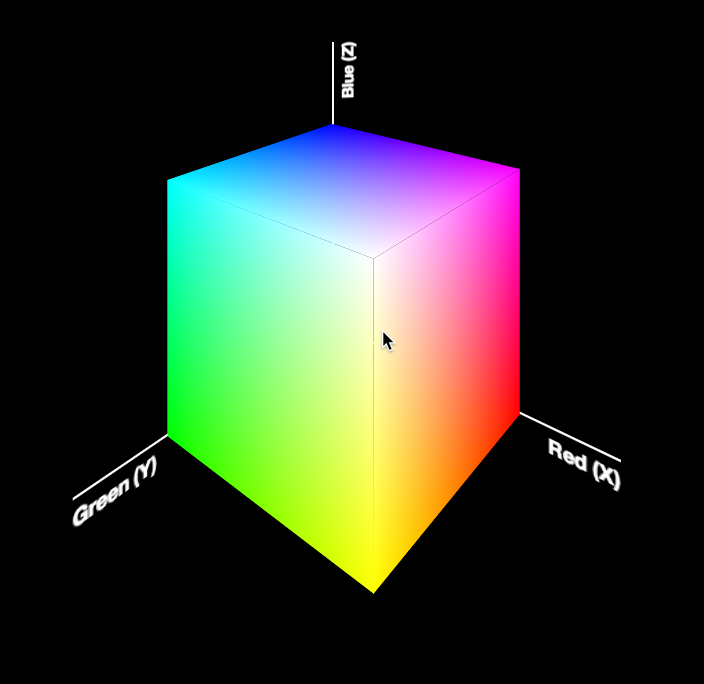
Today, I was giving the opening keynote at Codemania in Auckland, New Zealand. It was a talk about color from a math/dev perspective. It went quite well, despite my complete lack of sleep. I mean that quite literally: I hadn’t slept all night. No, it wasn’t the jetlag or the nervousness that kept me up. It was my late minute decision to replace the static, low-res image of an RGB cube I was using until then with a 3D cube generated with CSS and animated with CSS animations. Next thing I knew, it was light outside and I had to start getting ready. However, I don’t regret literally losing sleep to make a slide that is only shown for 20 seconds at most. Not only it was super fun to develop, but also yielded a few things that I thought were interesting enough to blog about.

The most challenging part wasn’t actually the 3D cube. This has been done tons of times before, it was probably the most common demo for CSS 3D transforms a couple of years ago. The only part of this that could be of interest is that mine only used 2 elements for the cube. This is a dabblet of the cube, without any RGB gradients on it:

The challenging part was creating the gradients for the 6 sides. These are not plain gradients, as you can see below:

RGB cube sides
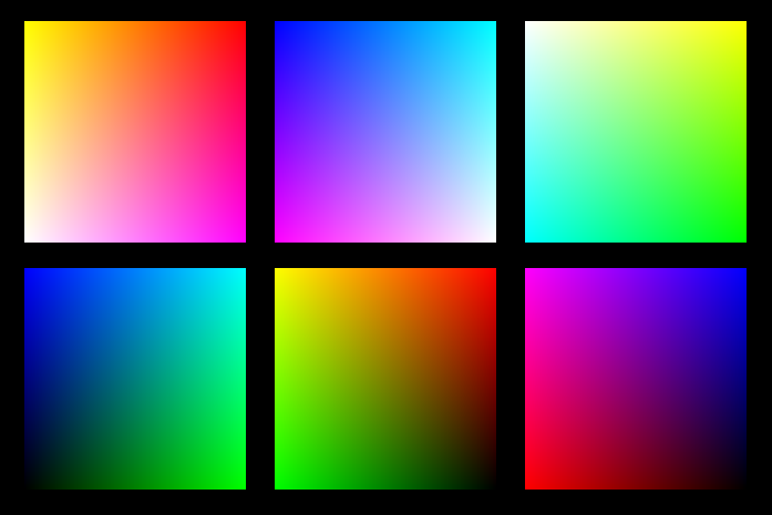
These are basically two linear gradients from left to right, with the topmost one being masked with a gradient from top to bottom. You can use CSS Masking to achieve this (for Chrome/Safari) and SVG Masks for Firefox, but this masks the whole element, which would hide the pseudo-elements needed for the sides. What I needed was masks applied to backgrounds only, not the whole element.

It seemed obvious that the best idea would be to use SVG background images. For example, here is the SVG background needed for the top left one:

<svg xmlns="http://www.w3.org/2000/svg" width="200px" height="200px">

<linearGradient id="yellow-white" x1="0" x2="0" y1="0" y2="1"> <stop stop-color="yellow" /> <stop offset="1" stop-color="white" /> </linearGradient> <linearGradient id="magenta-red" x1="0" x2="0" y1="0" y2="1"> <stop stop-color="red" /> <stop offset="1" stop-color="magenta" /> </linearGradient> <linearGradient id="gradient" x1="0" x2="1" y1="0" y2="0"> <stop stop-color="white" /> <stop offset="1" stop-color="black" /> </linearGradient> <mask id="gradient-mask"> <rect width="100%" height="100%" fill="url(#gradient)"/> </mask>

<rect width="100%" height="100%" fill="url(#yellow-white)"/> <rect width="100%" height="100%" fill="url(#magenta-red)" mask="url(#gradient-mask)"/>

</svg>

However, I didn’t want to have 6 separate SVG files, especially with this kind of repetition (cross-linking to reuse gradients and masks across different files is still fairly buggy in certain browsers). I wanted to be able to edit this straight from my CSS. And then it hit me: I was using SASS already. I could code SASS functions that generate SVG data URIs!

Here’s the set of SVG generating SASS functions I ended up writing:

@function inline-svg($content, $width: $side, $height: $side) {
	@return url('data:image/svg+xml,#{$content}');
}

@function svg-rect($fill, $width: ‘100%’, $height: $width, $x: ‘0’, $y: ‘0’) { @return unquote(‘’); }

@function svg-gradient($id, $color1, $color2, $x1: 0, $x2: 0, $y1: 0, $y2: 1) { @return unquote(’

'); }

@function svg-mask($id, content) { @return unquote('#{content}'); }

And then I was able to generate each RGB plane with another function that made use of them:

@function rgb-plane($c1, $c2, $c3, $c4) {
	@return inline-svg(
		svg-gradient('top', $c1, $c2) +
		svg-gradient('bottom', $c3, $c4) +
		svg-gradient('gradient', white, black, 0, 1, 0, 0) +
		svg-mask('gradient-mask', svg-rect('url(%23gradient)')) +
		svg-rect('url(%23bottom)') +
		svg-rect('url(%23top)" mask="url(%23gradient-mask)')
	);
}

/* … */

.cube { background: rgb-plane(blue, black, aqua, lime);

&::before { background: rgb-plane(blue, fuchsia, aqua, white); }

&::after { background: rgb-plane(fuchsia, red, blue, black); } }

.cube .sides { background: rgb-plane(yellow, lime, red, black);

&::before { background: rgb-plane(yellow, white, red, fuchsia); }

&::after { background: rgb-plane(white, aqua, yellow, lime); } }

However, the same functions can be used for all sorts of SVG backgrounds and it’s very easy to add a new one. E.g. to make polygons:

@function svg-polygon($fill, $points) {
	@return unquote('');
}

@function svg-circle($fill, $r: ‘50%’, $cx: ‘50%’, $cy: ‘50%’) { @return unquote(‘’); }

You can see the whole SCSS file here and its CSS output here.

Warning: Keep in mind that IE9 and some older versions of other browsers have issues with unencoded SVG data URIs. Also, you still need to escape hashes (%23 instead of #), otherwise Firefox fails.


Smooth state animations with animation-play-state

1 min read 0 comments Report broken page

When a CSS animation is applied from the beginning of the page load, things are easy. You just use the animation property with appropriate parameters, and you’re done. However, what if the animation is applied on a certain state, e.g. :hover, :active, :focus or a JS-triggered class change?

A naĂŻve approach would be to try something like this:

However, this means that when you hover out of the element, it abruptly snaps to its original state (no rotation). In many cases, it would be a more desirable to have it freeze in the last shown frame, until we hover over it again. To achieve that, we can apply the animation from the beginning, with animation-play-state: paused; and just change it on :hover to animation-play-state: running;. This is what happens then:

I figured this out when I was recently helping my good friend Julian with his one page website*. When you hover over the figure, it starts scrolling, but when you hover out of it, it doesn’t snap back to its original position, which would’ve looked awful.

*Beware it’s still a bit rough around the edges, e.g. the result has some rendering bugs on Firefox & IE plus some unsupported features messing it up (e.g. baseline-shift in SVG), but those are for another day as I had work to do and this ended up taking longer than the few hours I expected. Beyond the animation, you might want to explore the CSS-only buttons (see what I did there?) or the leather figure frame. Credits to Laura Kalbag for the tweed background & color scheme. I also experimented with SASS on this one and found it much smoother to work with than LESS, so I might stick with it for those cases where I need a preprocessor.

Screenshot


Cleanest CSS spinner, ever

1 min read 0 comments Report broken page

For some reason, I seem to have a fascination with CSS loaders these days. After recreating the Google loader with clean CSS recently, I set off to recreate the classic spinner with CSS. Yes, I know this has been done zillions of times, but I wanted a clean, maintainable, reusable solution, not just a proof of concept. Something with not tons of CSS and/or HTML elements.

I managed to recreate it with only 2 elements. I’m still not completely satisfied, as I was hoping to come up with a solution with just one element, but it’s still much better than all those solutions out there that use tons of elements and code.

So, how did I do it?

  • I use the ::before and ::after pseudoelements of the parent and child div to create the 4 first bars
  • I use box-shadow with no blur on all four of the above to create the remaining 4 bars
  • I rotate the whole element with a steps(8) timing function to create the animation

As with the Google-style loader, just changing the font-size on this scales the whole element, as everything is sized with ems. Also, there is fallback text, to make it accessible to screen readers. Tested in Chrome, Firefox, Safari, IE10. Should degrade gracefully on IE9 (spinner should look fine, just no animation).

Using a preprocessor for variables and calculations should simplify the code even further.

Enjoy :)

Ideas for further improvement are welcome. Remember that it’s not just the size of the code that matters, but also its simplicity.


Flexible Google-style loader with CSS

1 min read 0 comments Report broken page

So, for a while I had noticed the nice sutble loader Google apps use and I was wondering if it would be easy to make with CSS and CSS animations: Google’s loader

Yesterday, I realised that you can get this effect by increasing border size until about the middle of the element, as long as the total width stays the same (by using box-sizing: border-box):

However, as you can see above, after the midpoint, the border is not curved any more, so does not produce the desired effect. However, what if we split the background colour in half, and animated border-left until 50% of the width and then border-right from 50% of the width? That worked, but only gave us 25% of the effect. I could recreate the whole effect by then animating border-top/bottom instead etc, but it’s easier to apply animation-direction: alternate to alternate between showing and hiding the circle and and simultaneously rotate the loader by 90deg each time, by applying animation-timing-function: steps(4) to a rotate animation that runs over 4x the duration of the border animation.

This is the finished result:

The dimensions are all set in ems so that you can change the size in one place: Just change the font-size and the loader scales perfectly. It’s also accessible to screen reader users, as there is still text there.

And yes, it’s not super useful as-is, there are tons of spinners on the Web that you can use instead. However, I decided to post it (instead of just tweeting it) as I thought the techniques involved in making it might be interesting for some of you :)


CSS Animations with only one keyframe

2 min read 0 comments Report broken page

This is a very quick tip, about a pet peeve of mine in almost every CSS animation I see. As you may know, I’m a sucker for reducing the amount of code (as long as it remains human readable of course). I demonstrated a very similar example in my “CSS in the 4th dimension” talk, but I recently realized I never blogged about it (or seen anyone else do so).

Lets assume you have a simple animation of a pounding heart, like so:

@keyframes pound {
	from { transform: none; }
	50% { transform: scale(1.4); }
	to { transform: none; }
}

.heart { /* … */ animation: pound .5s infinite; }

You can see the problem already: the shrunk heart state is repeated twice in the keyframes (from and to). You probably know you can combine them into one rule, like so:

@keyframes pound {
	from, to { transform: none; }
	50% { transform: scale(1.4); }
}

What many don’t know, is that you don’t need these two keyframes at all, since they basically replicate the same state as the one in the .heart rule. To quote the CSS Animations spec:

If a 0% or “from” keyframe is not specified, then the user agent constructs a 0% keyframe using the computed values of the properties being animated. If a 100% or “to” keyframe is not specified, then the user agent constructs a 100% keyframe using the computed values of the properties being animated.

Therefore, the code could actually be as simple as:

@keyframes pound {
	50% { transform: scale(1.4); }
}

This trick is very useful for providing fallbacks that are the same as the first or last keyframe, without having to repeat them in the @keyframes rule. Of course it doesn’t only apply to animations where you only have one keyframe beyond from and/or to. You can omit the from and to keyframes in every animation, when you want them to be the same as the styles that are applied to the element anyway.

Of course, to make this particular animation appear more natural, it would be much more wise to do something like this, still with only one keyframe (the from state is dynamically generated by the browser):

@keyframes pound {
	to { transform: scale(1.4); }
}

.heart { /* … */ animation: pound .25s infinite alternate; }

which just reverses every even iteration, instead of trying to have both states (shrinking and growing) in the animation. The reason this looks more natural is that animation-direction: alternate; (which is what the alternate keyword does in the animation shorthand) also reverses the timing (easing) function for the reversed iterations. ;)


Poll: ÂżIs animation-direction a good idea?

3 min read 0 comments Report broken page

Âżanimation-direction?

Lets assume you have a CSS animation for background-color that goes from a shade of yellow (#cc0) to a shade of blue (#079) and repeats indefinitely. The code could be something like this:

@keyframes color {
  from { background: #cc0 }
  to { background: #079 }
}

div { animation: color 3s infinite; }

If we linearize that animation, the progression over time goes like this (showing 3 iterations):

As you can see, the change from the end state to the beginning state of a new iteration is quite abrupt. You could change your keyframes to mitigate this, but there’s a better way. A property with the name animation-direction gives a degree of control on the direction of the iterations to smooth this out. It also reverses your timing functions, which makes it even smoother.

In early drafts, only the values normal and alternate were allowed. normal results in the behavior described above, whereas alternate flips every other iteration (the 2nd, the 4th, the 6th and so on), resulting in a progression like this (note how the 2nd iteration has been reversed):

The latest draft also adds two more values: reverse which reverses every iteration and alternate-reverse, which is the combination of both reverse and alternate. Here is a summary of what kind of progression these four values would create for the animation above:

The problem

I was excited to see that reverse and alternate-reverse were finally added to the spec, but something in the syntax just didn’t click. I initially thought the reason was that these four values essentially set 2 toggles:

  • ÂżReverse all iterations? yes/no
  • ÂżReverse even iterations? yes/no

so it’s pointless cognitive overhead to remember four distinct values. I proposed that they should be split in two keywords instead, which would even result to a simpler grammar too.

The proposal was well received by one of the co-editors of the animations spec (Sylvain Galineau), but there was a dilemma as to whether mixing normal with alternate or reverse would make it easier to learn or more confusing. This is a point where your opinion would be quite useful. Would you expect the following to work, or would you find them confusing?

  • animation-direction: normal alternate; /* Equivalent to animation-direction: alternate; */
  • animation-direction: alternate normal; /* Equivalent to animation-direction: alternate; */
  • animation-direction: normal reverse; /* Equivalent to animation-direction: reverse; */
  • animation-direction: reverse normal; /* Equivalent to animation-direction: reverse; */

A better (?) idea

At some point, in the middle of writing this blog post (I started it yesterday), while gazing at the graphic above, I had a lightbulb moment. ÂĄThese values are not two toggles! All four of them control one thing: which iterations are reversed:

  • normal reverses no iterations
  • reverse reverses all iterations
  • alternate reverses even iterations
  • alternate-reverse reverses odd iterations

The reason it’s so confusing and it took me so long to realize myself, is that the mental model suggested by these keywords is detached from the end result, especially in the case of alternate-reverse. You have to realize that it works as if both alternate and reverse were applied in sequence, so reverse first reverses all iterations and then alternate reverses the even ones. Even iterations are reversed twice, and are therefore equivalent to the original direction. This leaves the odd ones as being reversed. It’s basically a double negative, making it hard to visualize and understand.

I thought that a property that would reflect this in a much more straightforward way, would be animation-reverse (or animation-iteration-reverse), accepting the following values:

  • none (equivalent to animation-direction: normal)
  • all (equivalent to animation-direction: reverse)
  • even (equivalent to animation-direction: alternate)
  • odd (equivalent to animation-direction: alternate-reverse)

Not only this communicates the end result much better, but it’s also more extensible. For example, if in the future it turns out that reversing every 3rd iteration is a common use case, it will be much easier to add expressions to it, similar to the ones :nth-child() accepts.

I knew before proposing it that it’s too late for such drastic backwards-incompatible changes in the Animations module, however I thought it’s so much better that it’s worth fighting for. After all, animation-direction isn’t really used that much in the wild.

Unfortunately, it seems that only me and Sylvain thought it’s better, and even he was reluctant to support the change, due to the backwards compatibility issues. So, I started wondering if it’s really as much better as I think. ¿What are your thoughts? ¿Would it make it simpler for you to understand and/or teach? Author feedback is immensely useful for standardization, so please, ¡voice your opinion! Even without justifying it if you don’t have the time or energy. Gathering opinions is incredibly useful.

TL;DR

  1. ÂżIs alternate reverse and reverse alternate (either would be allowed) a better value for animation-direction over alternate-reverse?
  2. ÂżIf so, should redundant combinations of normal with alternate or reverse also be allowed, such as normal alternate?
  3. ÂżOr maybe we should ditch it altogether and replace it with animation-reverse, accepting values of none, all, even, odd?

Side note: If you’re wondering about the flipped question and exclamation marks (¿¡) it’s because I believe they improve the usability of the language if widely adopted, so I’m doing my part for it ;) And no, I don’t speak Spanish.


Moving an element along a circle

1 min read 0 comments Report broken page

It all started a few months ago, when Chris Coyier casually asked me how would I move an element along a circle, without of course rotating the element itself. If I recall correctly, his solution was to use multiple keyframes, for various points on a circle’s circumference, approximating it. I couldn’t think of anything better at the time, but the question was stuck in the back of my head. 3 months ago, I came up with a first solution. Unfortunately, it required an extra wrapper element. The idea was to use two rotate transforms with different origins and opposite angles that cancel each other at any given time. The first transform-origin would be the center of the circle path and the other one the center of the element. Because we can’t use multiple transform-origins, a wrapper element was needed.

So, even though this solution was better, I wasn’t fully satisfied with it due to the need for the extra element. So, it kept being stuck in the back of my head.

Recently, I suggested to www-style that transform-origin should be a list and accept multiple origins and presented this example as a use case. And then Aryeh Gregor came up with this genius idea to prove that it’s already possible if you chain translate() transforms between the opposite rotates.

I simplified the code a bit, and here it is:

With the tools we currently have, I don’t think it gets any simpler than that.


Simpler CSS typing animation, with the ch unit

2 min read 0 comments Report broken page

A while ago, I posted about how to use steps() as an easing function to create a typing animation that degrades gracefully.

Today I decided to simplify it a bit and make it more flexible, at the cost of browser support. The new version fully works in Firefox 1+ and IE10, since Opera and WebKit don’t support the ch unit and even though IE9 supports it, it doesn’t support CSS animations. To put it simply, one ch unit is equivalent to the width of the zero (0) character of the font. So, in monospace fonts, it’s equivalent to the width of every character, since every character has the same width.

In the new version, we don’t need an obscuring span, so no extra HTML and it will work with non-solid backgrounds too. Also, even though the number of characters still needs to be hard-coded, it doesn’t need to be hardcoded in the animation any more, so it could be easily done through script without messing with creating/modifying stylesheets. Note how each animation only has one keyframe, and takes advantage of the fact that when the from (0%) and to (100%) keyframes are missing, the browser generates them from the fallback styles. I use this a lot when coding animations, as I hate duplication.

In browsers that support CSS animations, but not the ch unit (such as WebKit based browsers), the animation will still occur, since we included a fallback in ems, but it won’t be 100% perfect. I think that’s a pretty good fallback, but if it bothers you, just declare a fallback of auto (or don’t declare one at all, and it will naturally fall back to auto). In browsers that don’t support CSS animations at all (such as Opera), the caret will be a solid black line that doesn’t blink. I thought that’s better than not showing it at all, but if you disagree, it’s very easy to hide it in those browsers completely: Just swap the border-color between the keyframe and the h1 rule (hint: when a border-color is not declared, it’s currentColor).

Edit: It appears that Firefox’s support for the ch unit is a bit buggy so, the following example won’t work with the Monaco font for example. This is not the correct behavior.

Enjoy:


Animatable: A CSS transitions gallery

1 min read 0 comments Report broken page

What kind of transitions can you create with only one property? This is what my new experiment, animatable aims to explore.

It’s essentially a gallery of basic transitions. It aims to show how different animatable properties look when they transition and to broaden our horizons about which properties can be animated. Hover over the demos to see the animation in action, or click “Animate All” to see all of them (warning: might induce nausea, headache and seizures :P ). You can also click on it to see more details and get a permalink. Instead of clicking, you can also navigate with the arrow keys and press Esc to return to the main listing.

Fork it on Github and add your own ideas. Be sure to add your twitter username to them as a data-author attribute!

I’ve only tested in Firefox and Chrome for OSX so far. Not sure which other browsers are supported. However, since it uses CSS animations, we know for sure that it won’t work in browsers that don’t support CSS animations.

Hope you enjoy it :)


Pure CSS3 typing animation with steps()

1 min read 0 comments Report broken page

steps() is a relatively new addition to the CSS3 animations module. Instead of interpolating the values smoothly, it allows us to define the number of “frames” precisely. So I used it to create headers that have the well-known animated “typing effect”:

As you can see, the number of characters is hardcoded in the steps() function, but that’s the only place. Everything else is totally flexible. Apart from the font: It has to be monospace, so that every character has the same width.

Also, this particular way requires a solid background and an extra <span>. You can avoid these limitations by directly animating the width of the heading itself, but this requires a fixed target width hardcoded in the animation, so 2 things that need to be changed for every heading:

If you’re having trouble understanding how it works, take a look at this simpler example, with just the cursor.

Gecko (Firefox) and Webkit only at the moment, since other engines haven’t implemented CSS animations yet. However, both examples degrade very gracefully in other browsers (IMO at least).