
By now, you probably know that you can use custom properties for individual color components, to avoid repeating the same color coordinates multiple times throughout your theme. You may even know that you can use the same variable for multiple components, e.g. HSL hue and lightness:
:root {
	--primary-hs: 250 30%;
}

h1 {
	color: hsl(var(--primary-hs) 30%);
}

article {
	background: hsl(var(--primary-hs) 90%);
}

article h2 {
	background: hsl(var(--primary-hs) 40%);
	color: white;
}
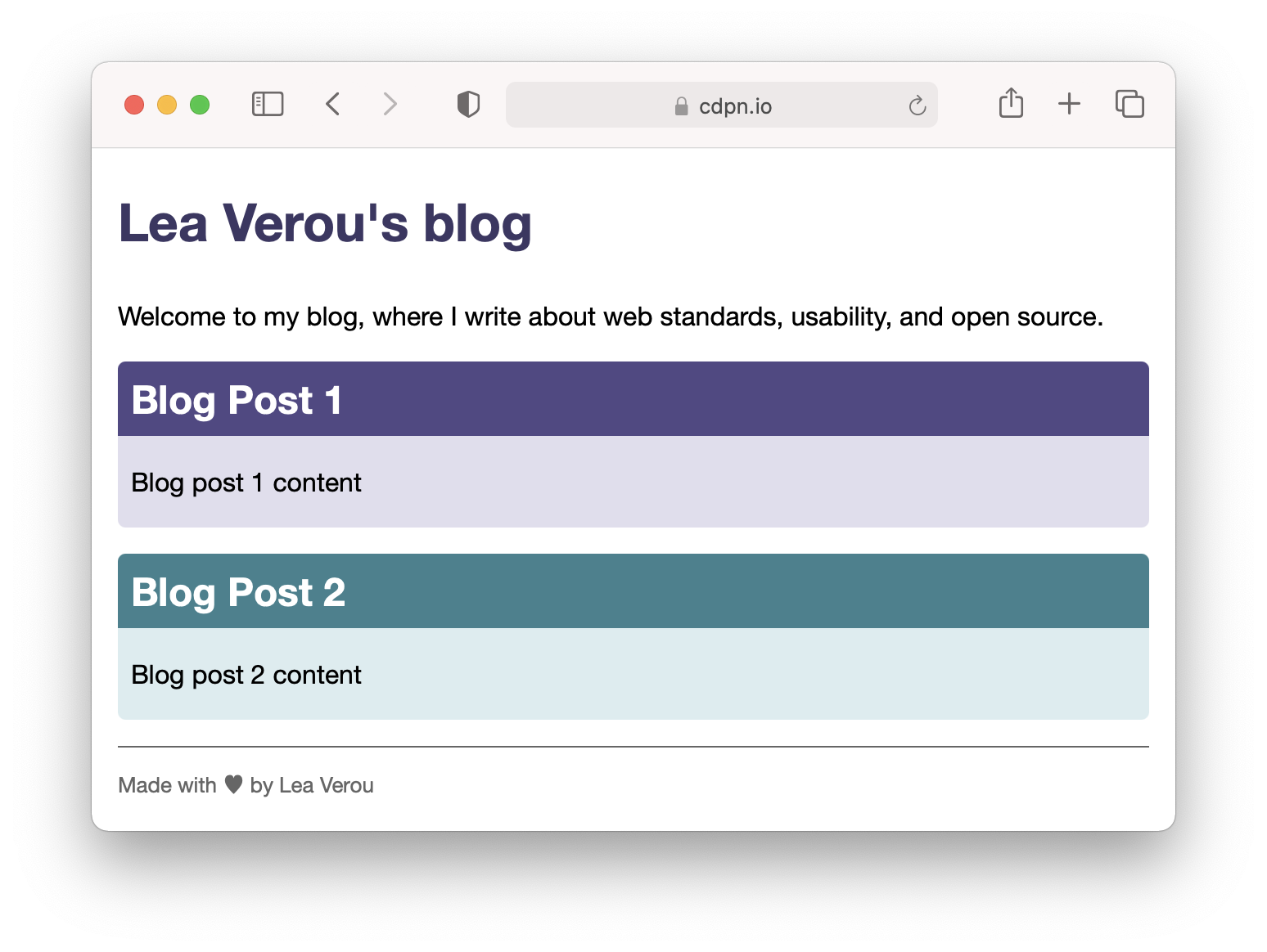
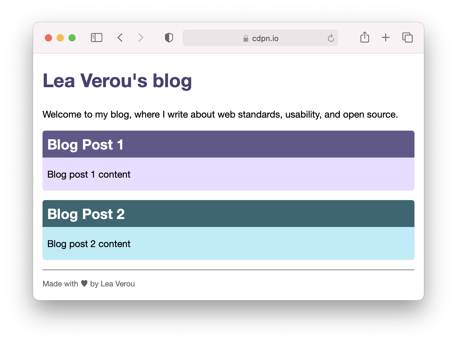
Here is a very simple page designed with this technque:
Unlike preprocessor variables, you could even locally override the variable, to have blocks with a different accent color:
:root {
	--primary-hs: 250 30%;
	--secondary-hs: 190 40%;
}

article {
	background: hsl(var(--primary-hs) 90%);
}

article.alt {
	--primary-hs: var(--secondary-hs);
}
This is all fine and dandy, until dark mode comes into play. The idea of using custom properties to make it easier to adapt a theme to dark mode is not new. However, in every article I have seen, the strategy suggested is to create a bunch of custom properties, one for each color, and override them in a media query.
This is a fine approach, and you’ll likely want to do that for at least part of your colors eventually. However, even in the most disciplined of designs, not every color is a CSS variable. You often have colors declared inline, especially grays (e.g. the footer color in our example). This means that adding a dark mode is taxing enough that you may put it off for later, especially on side projects.
The trick I’m going to show you will make anyone who knows enough about color cringe (sorry Chris!) but it does help you create a dark mode that works in minutes. It won’t be great, and you should eventually tweak it to create a proper dark mode (also dark mode is not just about swapping colors) but it’s better than nothing and can serve as a base.
The basic idea is to use custom properties for the lightness of colors instead of the entire color. Then, in dark mode, you override these variables with 100% - lightness. This generally produces light colors for dark colors, medium colors for medium colors, and dark colors for light colors, and still allows you to define colors inline, instead of forcing you to use a variable for every single color. This is what the code would look like for our example:
root {
	--primary-hs: 250 30%;
	--secondary-hs: 190 40%;

	--l-0: 0%;
	--l-30: 30%;
	--l-40: 40%;
	--l-50: 50%;
	--l-90: 90%;
	--l-100: 100%;
}

@media (prefers-color-scheme: dark) {
	:root {
		--l-0: 100%;
		--l-30: 70%;
		--l-40: 60%;
		--l-90: 10%;
		--l-100: 0%;
	}
}


body {
	background: hsl(0 0% var(--l-100));
	color: hsl(0 0% var(--l-0));
}

h1 {
	color: hsl(var(--primary-hs) var(--l-30));
}

article {
	background: hsl(var(--primary-hs) var(--l-90));
}

article h2 {
	background: hsl(var(--primary-hs) 40%);
	color: white;
}

footer {
	color: hsl(0 0% var(--l-40));
}
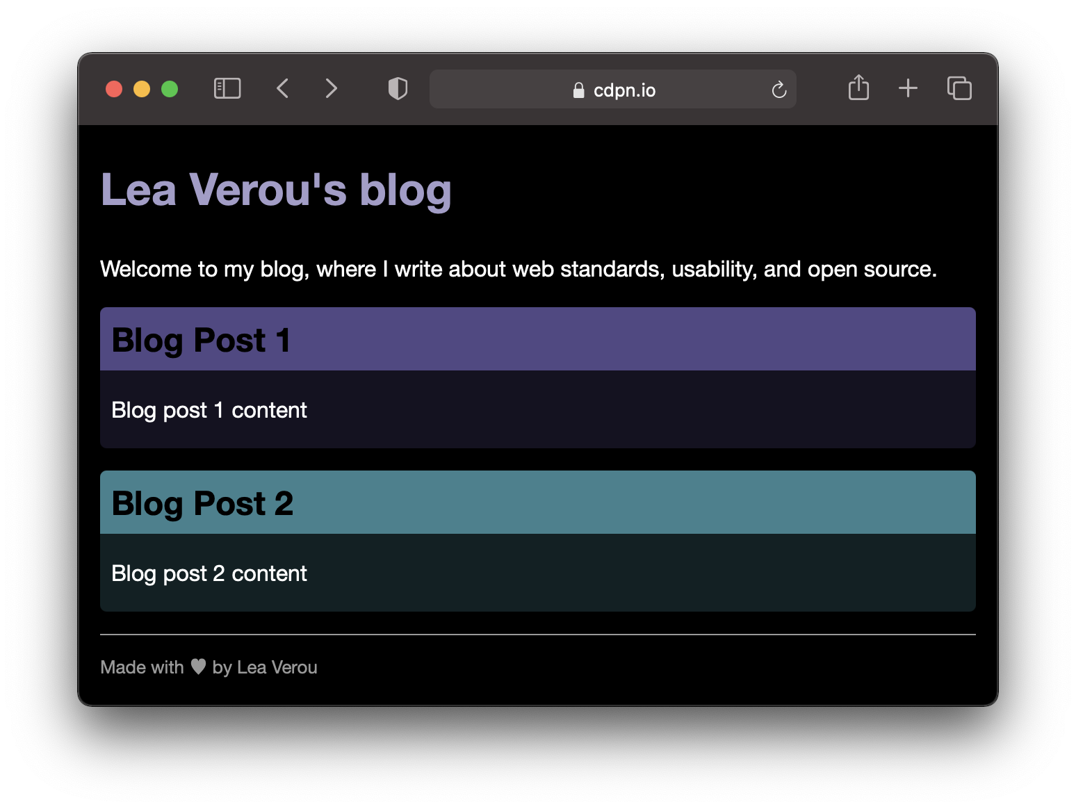
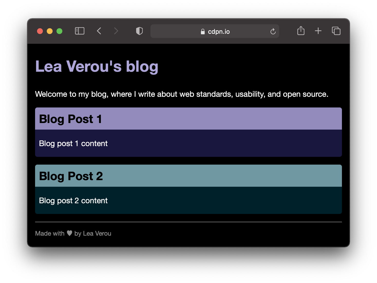
The result looks like this in light & dark mode:
Note that here we indiscriminately replaced all lightnesses with lightness variables. In reality, we don’t need to be quite as sweeping. For example, the article titles would actually look better and would have better contrast if we just kept them the same:
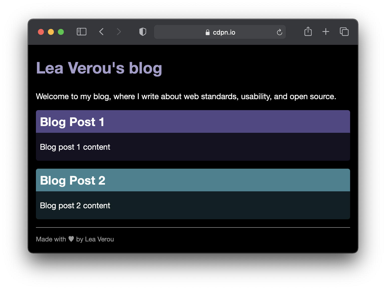
Comparison of dark mode with every lightness becoming a variable versus a more refined approach, where we make exceptions as needed (in this case the background and text colors for article > h2).
These are decisions that are easy to make while you go through your CSS replacing lightness percentages with variables and previewing the result.
The problem with HSL
But why were the article headers easier to read with their original colors than with inverted lightness? The root cause is that HSL lightness does not actually correspond to what humans perceive as lightness, and the same lightness difference can produce vastly different perceptual differences.
That is the big problem with this approach: it assumes that HSL lightness actually means something, but as we’ve discussed before, it does not. Yellow and blue have the same HSL lightness (50%) for crying out loud! Also, you will notice that your dark colors have smaller differences between them than your light colors, because HSL is not perceptually uniform.
Does that mean the technique is not useful for anything other than a placeholder while we develop our real dark mode, if that?
Well, things are not quite as grim.
Soon enough, we will get LCH colors in the browser. The first browser implementation just recently shipped in Safari and there is activity in that space among the other browser vendors too.
LCH is a much better color space for this technique, because its lightness actually means something, not just across different lightnesses of the same color, but across different hues and chromas.
This next example needs Safari TP 120+ . Compare these two gradients, the top one showing various HSL colors all with lightness 50%, and the bottom various LCH colors, all with lightness 50%. You can even adjust the slider and try different lightnesses:
Here is a screenshot for those of you who don’t have access to Safari TP 120+:
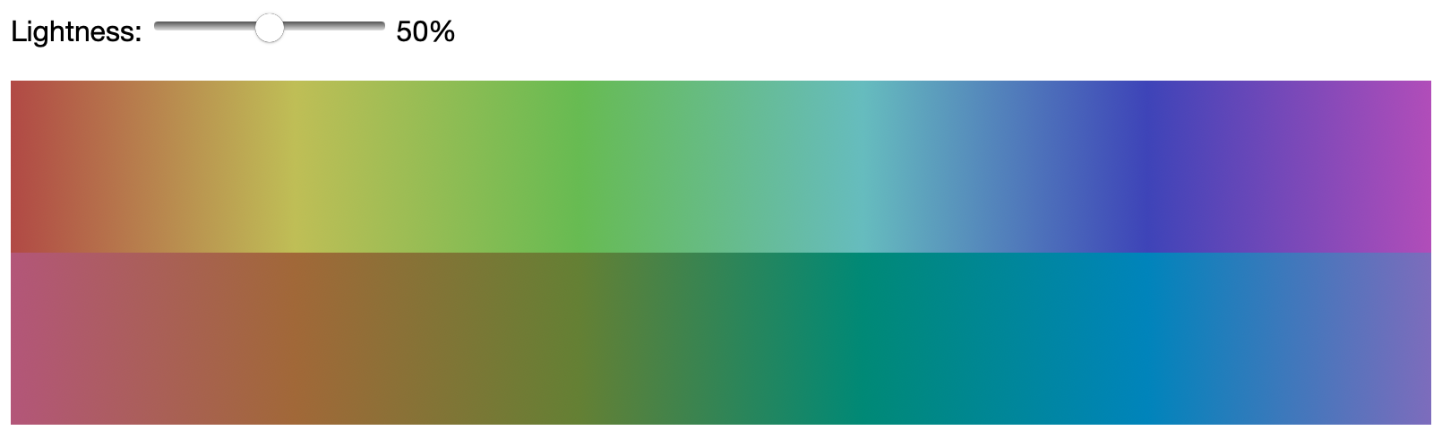
Notice that in HSL, some colors (like yellow and cyan) are much lighter than others. In LCH, all colors at the same lightness are, well, the same lightness.
Keep in mind that LCH chroma doesn’t really correspond to HSL lightness, so even though we’ve set it to the same number, it doesn’t correspond to the same thing.
So, how would this technique work with LCH colors? Let’s try it out!
I used this tool to convert the existing HSL colors to LCH, then tweaked the values manually a bit as the initially converted colors didn’t look nice across all LCH lightnesses (note that HSL colors with the same hue and saturation may have different hue and chromas in LCH. The opposite would defeat the point!). This is what this technique looks like with LCH colors instead (you will need Safari TP 120 or later to view this):
And here is a screenshot:
Not only does dark mode look a lot better, but even in light mode, our two alternate colors actually look more uniform since they have the same LCH lightness.
Here is a comparison of the two dark modes:
Comparison of the two auto-generated dark modes, via HSL lightness on the left and LCH lightness on the right.
Here you can see an animated comparison of them over each other:
Note that in reality, until LCH colors are reliably supported everywhere you’d need to provide a fallback via @supports, but for brevity, I did not include one in this demo.
Automating generation of lightness variables
If you are using a preprocessor that supports loops, such as Sass, you can automate the generation of these variables, and make them even more granular, e.g. every 5%:
:root {
    @for $i from 0 through 20 {
        --l-#{$i * 5}: #{$i * 5}%;
    }
}

@media (prefers-color-scheme: dark) {
    :root {
        @for $i from 0 through 20 {
            --l-#{$i * 5}: #{100 - $i * 5}%;
        }
    }
}
Can we make lightness variables more DRY?
Some of you may have disliked the repetition of values: we need to declare e.g. --l-40 as 40%, then set it to 60% in dark mode. Can’t we derive it somehow, by subtracting the value we already have from 100%?
Those with experience in programming may try something like this:
--l-40: calc(100% - var(--l-40));
However, this will not work. CSS is not an imperative language. It does not have steps of calculation, where variables have different values before and after each step. There is no such concept of time, all declarations that are currently applied, need to be true at once. It’s more similar to the reactive evaluation of spreadsheet formulas than to computation in JS and other popular programming languages (there are general purpose reactive programming languages, but they are less well known). Therefore, declarations like the one above are considered cycles: since --l-40 cannot refer to itself, this is an error, and --l-40 would be set to its initial value as an error recovery mechanism (since CSS cannot throw errors).
So, is there a way to avoid declaring lightness variables twice, once for light mode and once for dark mode?
There is, but I wouldn’t recommend it. It makes the code more convoluted to read and comprehend, for little benefit. But for the sake of intellectual amusement, I’m going to describe it here.
Instead of setting --l-40 to 40%, we are going to set it in terms of its difference from 50%, i.e. -10%. Then, calc(50% + var(--l-40)) gives us 40% and calc(50% - var(--l-40)) gives us 60%, the two values we need. We can therefore declare one variable that is -1 in dark mode and 1 in light mode, and just multiply with that.
Here is a subset of what our code would be like with this:
:root {
	--dm: 1;

	/* Example declaration: */
	--l-40: -10%;
}

@media (prefers-color-scheme: dark) {
	:root {
		--dm: -1;
	}
}

/* Example usage: */

footer {
	color: hsl(0 0% calc(50% + var(--dm) * var(--l-40));
	/* Ewww! */
}
And hopefully now you can see why I wouldn’t recommend this: it makes usage much more complicated, to DRY up a few declarations that would only be specified once. It’s this kind of obsessive adherence to DRY that programmers eventually realize is counterproductive.
Liked this article? Sign up for my Smashing Workshop on Dynamic CSS for more content like this!