LCH colors in CSS: what, why, and how?
I was always interested in color science. In 2014, I gave a talk about CSS Color 4 at various conferences around the world called “The Chroma Zone”. Even before that, in 2009, I wrote a color picker that used a hidden Java applet to support ICC color profiles to do CMYK properly, a first on the Web at the time (to my knowledge). I never released it, but it sparked this angry rant.
Color is also how I originally met my now husband, Chris Lilley: In my first CSS WG meeting in 2012, he approached me to ask a question about CSS and Greek, and once he introduced himself I said “You’re Chris Lilley, the color expert?!? I have questions for you!”. I later discovered that he had done even more cool things (he was a co-author of PNG and started SVG 🤯), but at the time, I only knew of him as “the W3C color expert”, that’s how much into color I was (I got my color questions answered much later, in 2015 that we actually got together).
My interest in color science was renewed in 2019, after I became co-editor of CSS Color 5, with the goal of fleshing out my color modification proposal, which aims to allow arbitrary tweaking of color channels to create color variations, and combine it with Una’s color modification proposal. LCH colors in CSS is something I’m very excited about, and I strongly believe designers would be outraged we don’t have them yet if they knew more about them.
What is LCH?
CSS Color 4 defines lch() colors, among other things, and as of recently, all major browsers have started implementing them or are seriously considering it:
LCH is a color space that has several advantages over the RGB/HSL colors we’re familiar with in CSS. In fact, I’d go as far as to call it a game-changer, and here’s why.
1. We actually get access to about 50% more colors.
This is huge. Currently, every CSS color we can specify, is defined to be in the sRGB color space. This was more than sufficient a few years ago, since all but professional monitors had gamuts smaller than sRGB. However, that’s not true any more. Today, the gamut (range of possible colors displayed) of most monitors is closer to P3, which has a 50% larger volume than sRGB. CSS right now cannot access these colors at all. Let me repeat: We have no access to one third of the colors in most modern monitors. And these are not just any colors, but the most vivid colors the screen can display. Our websites are washed out because monitor hardware evolved faster than CSS specs and browser implementations.
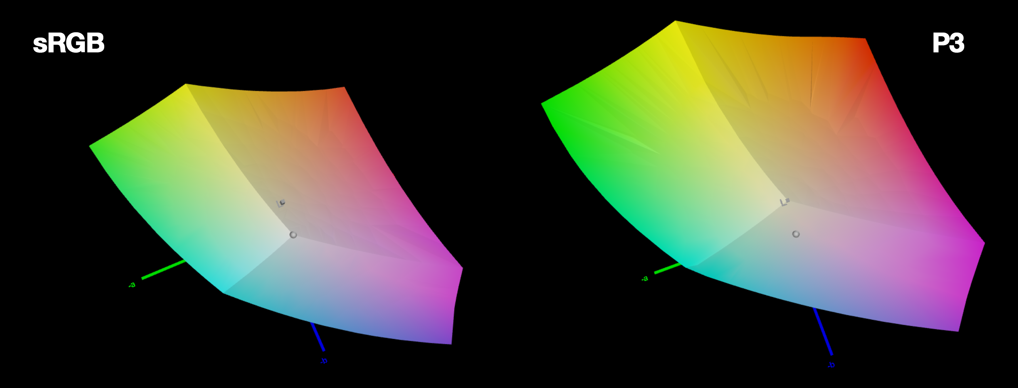
Gamut volume of sRGB vs P3
2. LCH (and Lab) is perceptually uniform
In LCH, the same numerical change in coordinates produces the same perceptual color difference. This property of a color space is called “perceptual uniformity”. RGB or HSL are not perceptually uniform. A very illustrative example is the following [example source]:
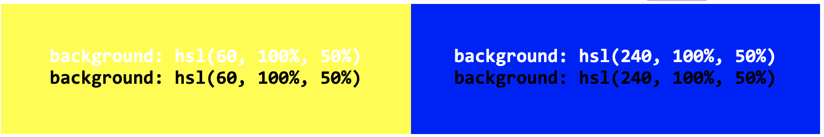
Both the colors in the first row, as well as the colors in the second row, only differ by 20 degrees in hue. Is the perceptual difference between them equal?
3. LCH lightness actually means something
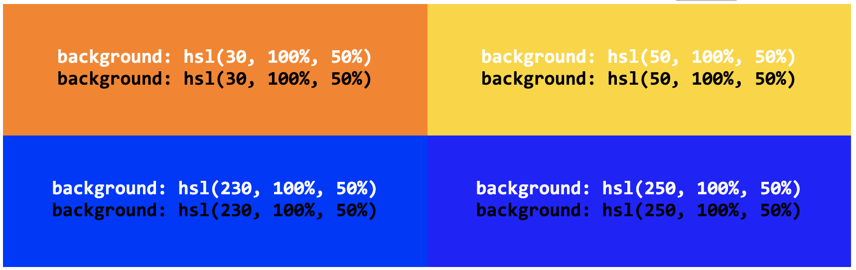
In HSL, lightness is meaningless. Colors can have the same lightness value, with wildly different perceptual lightness. My favorite examples are yellow and blue. Believe it or not, both have the same HSL lightness!
Both of these colors have a lightness of 50%, but they are most certainly not equally light. What does HSL lightness actually mean then?
You might argue that at least lightness means something for constant hue and saturation, i.e. for adjustments within the same color. It is true that we do get a lighter color if we increase the HSL lightness and a darker one if we decrease it, but it’s not necessarily the same color:
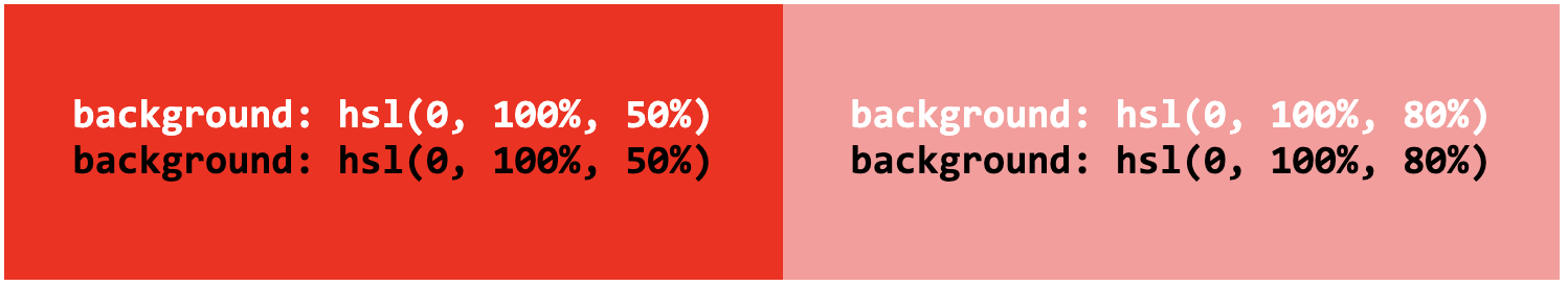
Both of these have the same hue and saturation, but do they really look like darker and lighter variants of the same color?
With LCH, any colors with the same lightness are equally perceptually light, and any colors with the same chroma are equally perceptually saturated.
How does LCH work?
LCH stands for “Lightness Chroma Hue”. The parameters loosely correspond to HSL’s, however there are a few crucial differences:
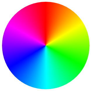
The hue angles don’t fully correspond to HSL’s hues. E.g. 0 is not red, but more of a magenta and 180 is not turquoise but more of a bluish green, and is exactly complementary.
Note how these colors, while wildly different in hue, perceptually have the same lightness.
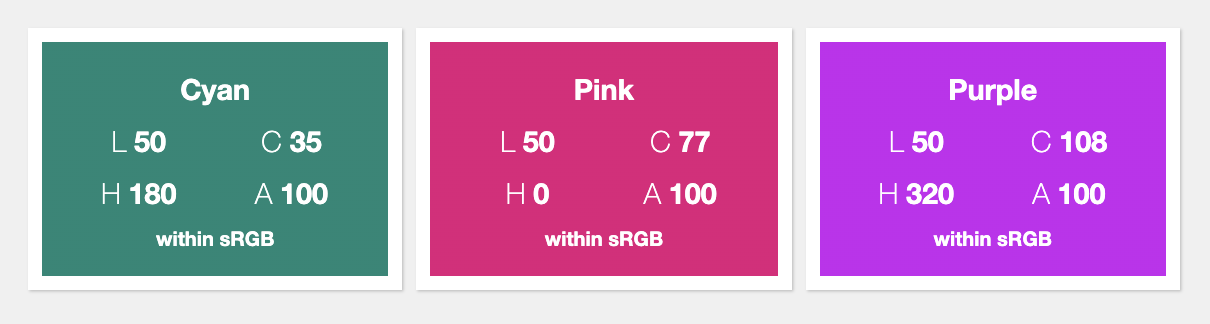
In HSL, saturation is a neat 0-100 percentage, since it’s a simple transformation of RGB into polar coordinates. In LCH however, Chroma is theoretically unbounded. LCH (like Lab) is designed to be able to represent the entire spectrum of human vision, and not all of these colors can be displayed by a screen, even a P3 screen. Not only is the maximum chroma different depending on screen gamut, it’s actually different per color.
This may be better understood with an example. For simplicity, assume you have a screen whose gamut exactly matches the sRGB color space (for comparison, the screen of a 2013 MacBook Air was about 60% of sRGB, although most modern screens are about 150% of sRGB, as discussed above). For L=50 H=180 (the cyan above), the maximum Chroma is only 35! For L=50 H=0 (the magenta above), Chroma can go up to 77 without exceeding the boundaries of sRGB. For L=50 H=320 (the purple above), it can go up to 108!
While the lack of boundaries can be somewhat unsettling (in people and in color spaces), don’t worry: if you specify a color that is not displayable in a given monitor, it will be scaled down so that it becomes visible while preserving its essence. After all, that’s not new: before monitors got gamuts wider than sRGB, this is what was happening with regular CSS colors when they were displayed in monitors with gamuts smaller than sRGB.
An LCH color picker
Hopefully, you are now somewhat excited about LCH, but how to visualize it?
I actually made this a while ago, primarily to help me, Chris, Adam, and Una in wrapping our heads around LCH sufficiently to edit CSS Color 5. It’s different to know the theory, and it’s different to be able to play with sliders and see the result. I even bought a domain, css.land, to host similar demos eventually. We used it a fair bit, and Chris got me to add a few features too, but I never really posted about it, so it was only accessible to us, and anybody that noticed its Github repo.
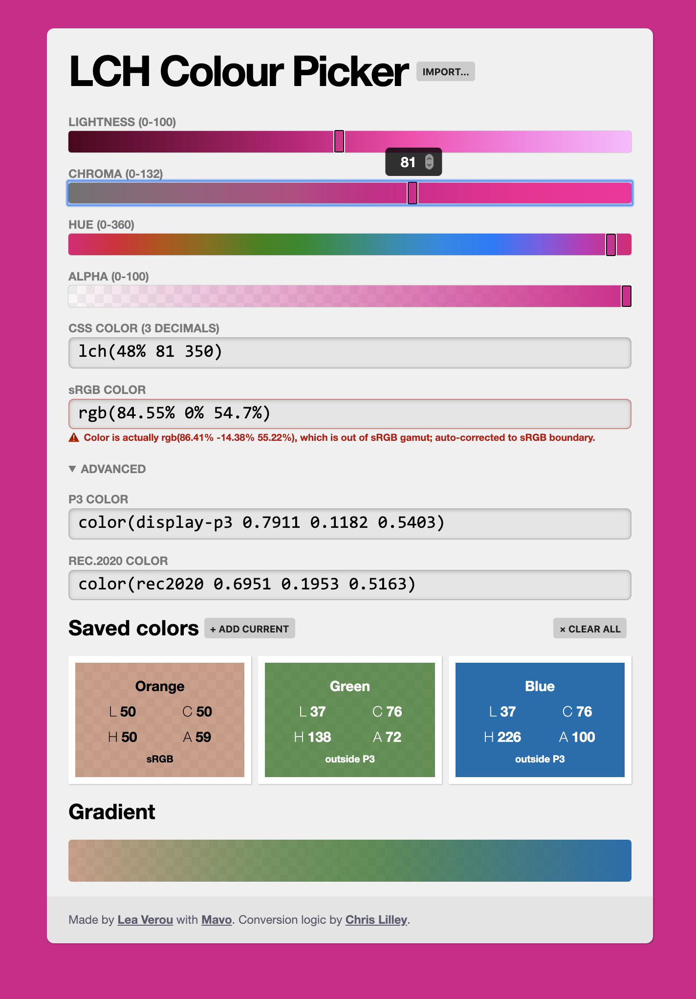
Why not just use an existing LCH color picker?
- The conversion code for this is written by Chris, and he was confident the math is at least intended to be correct (i.e. if it’s wrong it’s a bug in the code, not a gap in understanding)
- The Chroma is not 0-100 like in some color pickers we found
- We wanted to allow inputting arbitrary CSS colors (the “Import…” button above)
- We wanted to allow inputting decimals (the sliders only do integers, but the black number inputs allow any number)
- I wanted to be able to store colors, and see how they interpolate.
- We wanted to be able to see whether the LCH color was within sRGB, P3, (or Rec.2020, an even larger color space).
- We wanted alpha
- And lastly, because it’s fun! Especially since it’s implemented with Mavo (and a little bit of JS, this is not a pure Mavo HTML demo).
Recently, Chris posted it in a whatwg/html issue thread and many people discovered it, so it nudged me to post about it, so, here it is: css.land/lch
FAQ
Based on the questions I got after I posted this article, I should clarify a few common misconceptions.
“You said that these colors are not implemented yet, but I see them in your article”
All of the colors displayed in this article are within the sRGB gamut, exactly because we can’t display those outside it yet. sRGB is a color space, not a syntax. E.g. rgb(255 0 0) and lch(54.292% 106.839 40.853) specify the same color.
“How does the LCH picker display colors outside sRGB?”
It doesn’t. Neither does any other on the Web (to my knowledge). The color picker is implemented with web technologies, and therefore suffers from the same issues. It has to scale them down to display something similar, that is within sRGB (it used to just clip the RGB components to 0-100%, but thanks to this PR from Tab it now uses a far superior algorithm: it just reduces the Chroma until the color is within sRGB). This is why increasing the Chroma doesn’t produce a brighter color beyond a certain point: because that color cannot be displayed with CSS right now.
“I’ve noticed that Firefox displays more vivid colors than Chrome and Safari, is that related?”
Firefox does not implement the spec that restricts CSS colors to sRGB. Instead, it just throws the raw RGB coordinates on the screen, so e.g. rgb(100% 0% 0%) is the brightest red your screen can display. While this may seem like a superior solution, it’s incredibly inconsistent: specifying a color is approximate at best, since every screen displays it differently. By restricting CSS colors to a known color space (sRGB) we gained device independence. LCH and Lab are also device independent as they are based on actual measured color.
What about color(display-p3 r g b)? Safari supports that since 2017!
I was notified of this after I posted this article. I was aware Safari was implementing this syntax a while ago, but somehow missed that they shipped it. In fact, WebKit published an article about this syntax last month! How exciting!
color(colorspaceid params) is another syntax added by CSS Color 4 and is the swiss army knife of color management in CSS: in its full glory it allows specifying an ICC color profile and colors from it (e.g. you want real CMYK colors on a webpage? You want Pantone? With color profiles, you can do that too!). It also supports some predefined color spaces, of which display-p3 is one. So, for example, color(display-p3 0 1 0) gives us the brightest green in the P3 color space. You can use this test case to test support: you’ll see red if color() is not supported and bright green if it is.
Exciting as it may be (and I should tweak the color picker to use it when available!), do note that it only addresses the first issue I mentioned: getting to all gamut colors. However, since it’s RGB-based, it still suffers from the other issues of RGB. It is not perceptually uniform, and is difficult to create variants (lighter or darker, more or less vivid etc) by tweaking its parameters.
Furthermore, it’s a short-term solution. It works now, because screens that can display a wider gamut than P3 are rare. Once hardware advances again, color(display-p3 ...) will have the same problem as sRGB colors have today. LCH and Lab are device independent, and can represent the entire gamut of human vision so they will work regardless of how hardware advances.
How does LCH relate to the Lab color space that I know from Photoshop and other applications?
LCH is the same color space as Lab, just viewed differently! Take a look at the following diagram that I made for my students:
The L in Lab and LCH is exactly the same (perceptual Lightness). For a given lightness L, in Lab, a color has cartesian coordinates (L, a, b) and polar coordinates (L, C, H). Chroma is just the length of the line from 0 to point (a, b) and Hue is the angle of that ray. Therefore, the formulae to convert Lab to LCH are trivial one liners: C is sqrt(a² + b²) and H is atan(b/a) (with different handling if a = 0). atan() is just the reverse of tan(), i.e. tan(H) = b/a.