2 posts on Sass

Dynamically generated SVG through SASS + A 3D animated RGB cube!

3 min read 0 comments Report broken page

Screenshot of the cube
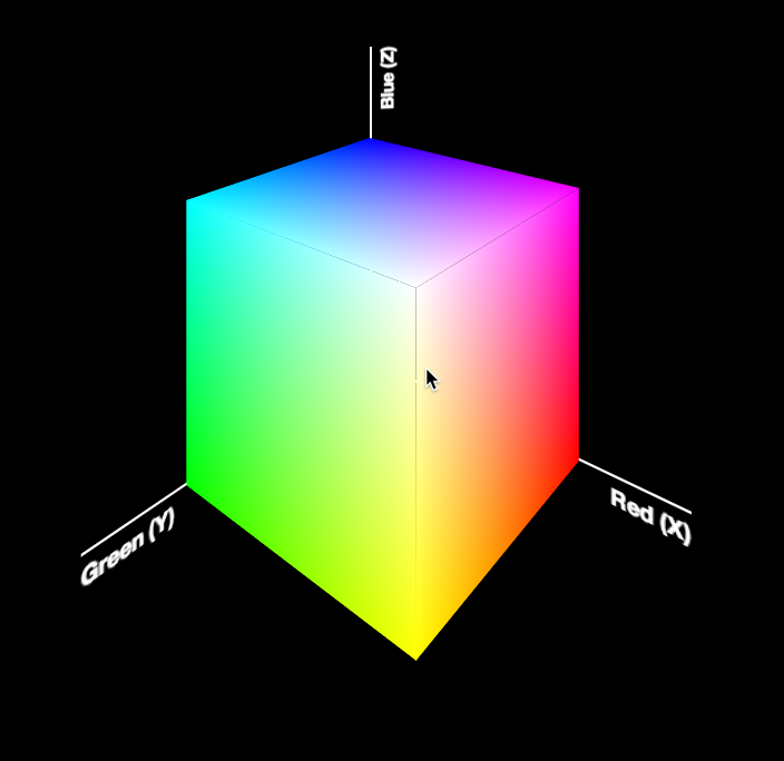
Today, I was giving the opening keynote at Codemania in Auckland, New Zealand. It was a talk about color from a math/dev perspective. It went quite well, despite my complete lack of sleep. I mean that quite literally: I hadn’t slept all night. No, it wasn’t the jetlag or the nervousness that kept me up. It was my late minute decision to replace the static, low-res image of an RGB cube I was using until then with a 3D cube generated with CSS and animated with CSS animations. Next thing I knew, it was light outside and I had to start getting ready. However, I don’t regret literally losing sleep to make a slide that is only shown for 20 seconds at most. Not only it was super fun to develop, but also yielded a few things that I thought were interesting enough to blog about.

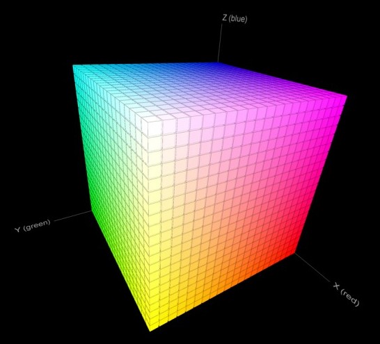
The most challenging part wasn’t actually the 3D cube. This has been done tons of times before, it was probably the most common demo for CSS 3D transforms a couple of years ago. The only part of this that could be of interest is that mine only used 2 elements for the cube. This is a dabblet of the cube, without any RGB gradients on it:

The challenging part was creating the gradients for the 6 sides. These are not plain gradients, as you can see below:

RGB cube sides
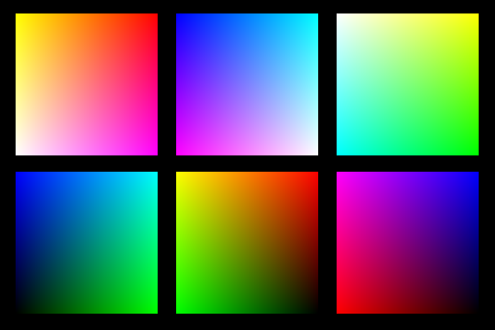
These are basically two linear gradients from left to right, with the topmost one being masked with a gradient from top to bottom. You can use CSS Masking to achieve this (for Chrome/Safari) and SVG Masks for Firefox, but this masks the whole element, which would hide the pseudo-elements needed for the sides. What I needed was masks applied to backgrounds only, not the whole element.

It seemed obvious that the best idea would be to use SVG background images. For example, here is the SVG background needed for the top left one:

<svg xmlns="http://www.w3.org/2000/svg" width="200px" height="200px">

<linearGradient id="yellow-white" x1="0" x2="0" y1="0" y2="1"> <stop stop-color="yellow" /> <stop offset="1" stop-color="white" /> </linearGradient> <linearGradient id="magenta-red" x1="0" x2="0" y1="0" y2="1"> <stop stop-color="red" /> <stop offset="1" stop-color="magenta" /> </linearGradient> <linearGradient id="gradient" x1="0" x2="1" y1="0" y2="0"> <stop stop-color="white" /> <stop offset="1" stop-color="black" /> </linearGradient> <mask id="gradient-mask"> <rect width="100%" height="100%" fill="url(#gradient)"/> </mask>

<rect width="100%" height="100%" fill="url(#yellow-white)"/> <rect width="100%" height="100%" fill="url(#magenta-red)" mask="url(#gradient-mask)"/>

</svg>

However, I didn’t want to have 6 separate SVG files, especially with this kind of repetition (cross-linking to reuse gradients and masks across different files is still fairly buggy in certain browsers). I wanted to be able to edit this straight from my CSS. And then it hit me: I was using SASS already. I could code SASS functions that generate SVG data URIs!

Here’s the set of SVG generating SASS functions I ended up writing:

@function inline-svg($content, $width: $side, $height: $side) {
	@return url('data:image/svg+xml,#{$content}');
}

@function svg-rect($fill, $width: ‘100%’, $height: $width, $x: ‘0’, $y: ‘0’) { @return unquote(‘’); }

@function svg-gradient($id, $color1, $color2, $x1: 0, $x2: 0, $y1: 0, $y2: 1) { @return unquote(’

'); }

@function svg-mask($id, content) { @return unquote('#{content}'); }

And then I was able to generate each RGB plane with another function that made use of them:

@function rgb-plane($c1, $c2, $c3, $c4) {
	@return inline-svg(
		svg-gradient('top', $c1, $c2) +
		svg-gradient('bottom', $c3, $c4) +
		svg-gradient('gradient', white, black, 0, 1, 0, 0) +
		svg-mask('gradient-mask', svg-rect('url(%23gradient)')) +
		svg-rect('url(%23bottom)') +
		svg-rect('url(%23top)" mask="url(%23gradient-mask)')
	);
}

/* … */

.cube { background: rgb-plane(blue, black, aqua, lime);

&::before { background: rgb-plane(blue, fuchsia, aqua, white); }

&::after { background: rgb-plane(fuchsia, red, blue, black); } }

.cube .sides { background: rgb-plane(yellow, lime, red, black);

&::before { background: rgb-plane(yellow, white, red, fuchsia); }

&::after { background: rgb-plane(white, aqua, yellow, lime); } }

However, the same functions can be used for all sorts of SVG backgrounds and it’s very easy to add a new one. E.g. to make polygons:

@function svg-polygon($fill, $points) {
	@return unquote('');
}

@function svg-circle($fill, $r: ‘50%’, $cx: ‘50%’, $cy: ‘50%’) { @return unquote(‘’); }

You can see the whole SCSS file here and its CSS output here.

Warning: Keep in mind that IE9 and some older versions of other browsers have issues with unencoded SVG data URIs. Also, you still need to escape hashes (%23 instead of #), otherwise Firefox fails.


On CSS preprocessors

4 min read 0 comments Report broken page

Lately there has been a rise in the usage of CSS preprocessors such as LESS and SASS, which makes sense given the simultaneous increase of CSS3 usage. I’ve frequently argued with fellow front-end web developers about whether they should be used or not and I decided to finally put my thoughts in writing.

To start, I can fully understand the advantage of using such preprocessors over vanilla CSS3. I hate listing all the vendor prefixes, and not being able to use variables, mixins or nesting just like the next web developer. All this syntactic sugar can simplify your workflow by a great deal and make writing CSS3 incredibly fun. However, I still refrain from using them, and I’ll explain why below.

Losing track of CSS filesize

When I’m writing CSS, I try to keep the filesize as small as possible. I’m not a filesize hypochondriac, I try to balance filesize and readability and I prefer to err on the side of the latter. I’m not one of those people that will use #000 instead of black just to save a byte and I use lots of indents and newlines (later minification takes care of that). However, in cases when the readability impact is small and the filesize impact is large (and minification won’t help), I will do the optimization.

For example, consider the following case: Let’s suppose you have 3 rules (#foo, #bar and #baz) that will both use the same CSS rotate transformation, among other CSS declarations. Using a mixin is simple (using the LESS syntax in this example):

.rotate (@degrees: 10deg) { -moz-transform: rotate(@degrees); -ms-transform: rotate(@degrees); -o-transform: rotate(@degrees); -webkit-transform: rotate(@degrees); transform: rotate(@degrees); }

#foo { font-size: 150%; .rotate(40deg); }

#bar { background: silver; .rotate(40deg); }

#baz { background: white; .rotate(40deg); }

Sweet, huh? And only 370 bytes. However, what the end user downloads is this beast:

#foo { font-size: 150%; -moz-transform: rotate(40deg); -ms-transform: rotate(40deg); -o-transform: rotate(40deg); -webkit-transform: rotate(40deg); transform: rotate(40deg); }

#bar { background: silver; -moz-transform: rotate(40deg); -ms-transform: rotate(40deg); -o-transform: rotate(40deg); -webkit-transform: rotate(40deg); transform: rotate(40deg); }

#baz { background: white; -moz-transform: rotate(40deg); -ms-transform: rotate(40deg); -o-transform: rotate(40deg); -webkit-transform: rotate(40deg); transform: rotate(40deg); }

which is almost double the filesize (600 bytes). It could have easily been this:

#foo, #bar, #baz { -moz-transform: rotate(40deg); -ms-transform: rotate(40deg); -o-transform: rotate(40deg); -webkit-transform: rotate(40deg); transform: rotate(40deg); }

#foo { font-size: 150%; }

#bar { background: silver; }

#baz { background: white; }

which at 290 bytes, is even smaller than the first one. The differences would be even bigger if you had to specify a different transform-origin.

Of course you can still do such optimizations when using CSS preprocessors, but since you don’t have the ugliness in front of you and the file you’re working with remains small, it’s easy to forget and just do what’s easy. You lose sight of the big picture. But it’s the big picture (or big file, in this case ;)) that your users eventually download.

Same goes for nesting: Instead of actually putting some thought into the selectors you choose, you can just nest and let the preprocessor sort it out, usually in the straightforward but unavoidably verbose way.

LESS is better in this aspect, since it also offers a client-side version, so the user downloads the small file you wrote, and all the expansion is done in their machine. However, this has the (big, IMO) disadvantage that all your CSS becomes dependent on JavaScript to work and that your users have to download the LESS code, which isn’t that small: 33KB minified which is way larger than most stylesheets (granted, if you gzip, it will be smaller, but this is true for stylesheets as well).

Maintenance woes

Eventually, CSS will start supporting all this sweetness. Tab Atkins has already drafted a proposal and soon Webkit nightlies will implement the functionality. After that, I think it’s safe to assume that within 2 years Firefox and Opera will also implement the (by then) standard and within 1-2 more even IE. Then we’ll need another 2-3 years to be able to start using it (adoption rates of new browser versions will have increased too). This means that in as little as 6 years, we might be able to use CSS variables, mixins and nesting in vanilla CSS. All the code written for today’s preprocessors will eventually have to be rewritten. Maybe even sooner, since when a standard is published, I think it’s safe to assume (or hope) that the new versions of CSS preprocessors will deprecate their old syntax and start supporting and recommending the standard way, effectively becoming polyfills (which I definitely support). So, coding for a CSS preprocessor today feels a bit like building castles on sand.

Debugging woes (thanks to Jesper Ek)

Preprocessors make debugging CSS harder, since the CSS you see in Web Inspectors like Firebug or Dragonfly is not the CSS you wrote. The line numbers don’t match any more and the CSS itself is different. A lighter form of the same problem also occurs with minifiers, but you can delay using them until you’re done with the site. With CSS preprocessors, you have to use them from the beginning if you want to really take advantage of them.

Also, when I develop my CSS, I want to be able to instantly preview the changes in the file by just refreshing the browser. With preprocessors this becomes harder (although not impossible).

Generic concerns with such abstractions

With every new syntax, comes more effort required by someone to start working on our code. We either have to only collaborate with people proficient in the CSS preprocessor of our choice, or teach them its syntax. So we are either restricted in our choice of collaborators or need to spend extra time for training, both of which are nuisances.

Also, what happens if the preprocessor stops being updated? Granted, most (if not all) are open source, but the community’s interest might shift to something else. Many open source projects have eventually died due to lack of interest. And let’s not forget the law of leaky abstractions

Yes, both concerns are valid for every framework, in every language, but at least PHP frameworks or JavaScript libraries are more needed than CSS preprocessors, so it’s a tradeoff is that’s worth it. For CSS preprocessors, I’m not so sure.

Conclusion & disclaimer

I have to admit that even though I’ve read quite a bit on CSS preprocessors and talked with fellow web developers about them, I don’t have hands-on experience with them. Maybe I will change my mind if I actually do so. Besides, I think that if someone uses a CSS preprocessor carefully, with knowledge of the points mentioned above, it can actually turn out to be beneficial. However personally, I prefer to wait at least until they start supporting the (future) standard syntax, whenever that happens.