8 posts on CSS Properties

Custom <select> drop downs with CSS3

2 min read 0 comments Report broken page

The CSS3 Basic UI module defines pointer-events as:

The pointer-events property allows authors to control whether or when an element may be the target of user pointing device (pointer, e.g. mouse) events. This property is used to specify under which circumstance (if any) a pointer event should go “through” an element and target whatever is “underneath” that element instead. This also applies to other “hit testing” behaviors such as dynamic pseudo-classes (:hover, :active, :focus), hyperlinks, and Document.elementFromPoint().

The property was originally SVG-only, but eventually browsers and the W3C adopted a more limited version for HTML elements too.

It can be used in many use cases that weren’t possible before (or the solution was overly complicated), one of them being to create custom-looking <select> drop downs, by overlaying an element over the native drop down arrow (to create the custom one) and disallowing pointer events on it. Here’s a quick example:

-webkit-appearance: none was needed in Webkit to turn off the native OSX appearance (in OSX and maybe Safari on Windows, I didn’t test that). However, since that also removes the native drop down arrow, our custom arrow now obscures part of the text, so we had to add a 30px padding-right to the select element, only in Webkit. You can easily detect if pointer-events is supported via JS and only apply this it if it is (eg by adding or removing a class from the body element):

if(!(‘pointerEvents’ in document.body.style)) { … }

However, there is one caveat in this: Opera does include pointerEvents in HTML elements as well, but it does not actually support the property on HTML. There’s a more elaborate feature detection script here as a Modernizr plugin (but the code is quite short, so you can adapt it to your needs).

Also, don’t try to replicate the behavior in JavaScript for browsers that don’t support this: it’s impossible to open a <select> drop down with JavaScript. Or, to put it differently, if you manage to do it, you’ll probably be the first to. Everything I could think of failed and I spent hours yesterday searching for a way, but no avail.

References


The curious case of border-radius:50%

3 min read 0 comments Report broken page

Admittedly, percentages in border-radius are not one of the most common use cases. Some even consider them an edge case, since most people seem to set border-radius in pixels or --rarely-- ems. And since it’s not used very frequently, it’s still quite buggy. A bit of a chicken and egg case actually: Is it buggy because it’s used rarely or is it used rarely because it’s buggy? My vote would go to the first, so the purpose of this post is to let people know about why percentages in border-radius are incredibly useful and to highlight the various browser whims when it comes to rendering them.

Specification

Before we go into discussing implementations, let’s first examine what the right thing to do is, i.e. what the specification says:

Percentages: Refer to corresponding dimension of the border box.

The two length or percentage values of the ‘border-*-radius’ properties define the radii of a quarter ellipse that defines the shape of the corner of the outer border edge (see the diagram below). The first value is the horizontal radius, the second the vertical radius. If the second value is omitted it is copied from the first. If either length is zero, the corner is square, not rounded. Percentages for the horizontal radius refer to the width of the border box, whereas percentages for the vertical radius refer to the height of the border box.

Why is that useful?

It’s the only way of utilizing border-radius to draw a circle or ellipse, i.e. a rounded shape without any straight lines whatsoever (without knowing the dimensions in advance).

As you will see below, Firefox used to have a bug, or actually a different interpretation of the spec, which I think is a quite commonly needed use case, even more than ellipses: It always drew a regular curve for the corners (quarter of a circle) with the maximum possible radii. This is a very commonly needed shape in UI design. If you’re using OSX, you’re seeing it everywhere: the buttons, the scrollbars, even Skype (notice the blue or grey shading around the usernames in a chat). As I’m writing this post, I can see the same shape in the buttons of Wordpress’ admin panel. And as the current spec stands, there’s no way to do that. You have to know the height (or width, if you want a vertical shape) in advance, which even when possible, makes border-radius depend on the value of other attributes (such as line-height) and you have to remember to change it every time you change those, which causes maintenance headaches. And what’s worse is that the Backgrounds & Borders module is almost done, so it’s quite unlikely that this will change anytime soon. :(

As noted in this comment by David Baron, that assumption wasn’t exactly correct about Firefox’s old rendering. It just resolved % as relative to width in every case (kinda like percentages in margins) and when the height was smaller than the width, it applied the rules for radii that are too big, which say to reduce it equally. A straightforward deduction is that we do have a standards-compliant way to get the behavior from old versions of Firefox, in every browser: Just specify a very big radius, like 9999px.

Different implementations, different bugs

Firefox 4 beta 6

As I mentioned above, Gecko up to Firefox version 4 beta 6 always draws a regular curve for the corners with the largest radii applicable, resulting in a shape that is either a perfect circle or a rectangle with a semicircle on top and bottom (if height > width) or right and left (if width > height).

Minefield (latest Gecko nightlies)

In the latest nightlies this bug is fixed, and it follows the spec to the letter. I can’t help but wonder if this was a bug, a misinterpretation of the spec or a deliberate disagreement with it.

WebKit nightlies

Webkit was late to support percentages in border-radius, but it seems to be the first (it or IE9, I’m not sure) to follow the spec to the letter --concerning corner radii at least-- and renders an ellipse (horizontal radius = width/2, vertical radius = height/2) no matter what. Webkit however seems to be having serious trouble with borders, rendering them with variable width strokes (!).

Opera 11

Presto (Opera) is the weirdest when it comes to rendering a percentage border-radius. I can’t figure out the algorithm it uses to determine the radii of the corners even if it was to save my life, it even changes according to window size in my testcases! Since I’ve been using border-radius:50% regularly, I’ve had the pleasure of observing Opera’s rendering in many different designs and I still can’t find a pattern. It’s particularly funny when rendering the little fuchsia comment bubbles in the homepage of my blog: Every one of them has a different radius, even if they are about the same size. It even got one of them right and rendered it as an ellipse once!

Internet Explorer 9

Trident (IE9), along with the latest Gecko nightly is the only 100% correct one when it comes to rendering the testcases, which is not surprising since the IE team boasted quite a lot for their bulletproof border-radius implementation. Well, their CSS3 support might be a bit lacking, but at least the bits they actually implement aren’t buggy. Kudos for that.

Link to testcases

Note: Of course all bugs mentioned above have been reported to the respective browser vendors (except the Gecko one that is already fixed in the nightlies).


A CSS3 learning(?) tool

1 min read 0 comments Report broken page

In case anyone is interested, this is my take on the “challenge” that Brad Neuberg posted today on Ajaxian. It needs more properties, but it’s very easy to extend. I guess I should also add CSS3 values (RGBA/HSL(A) colors, CSS gradients etc) but oh well, I’m currently in a hurry. I will, if anyone actually finds it useful (?).

It didn’t prove much of a challenge actually and I honestly doubt it’s educational value (actually it’s value in general), but it was an interesting thing to do while drinking my first coffee in the morning – I really enjoyed writing it :)


Exploring CSS3 text-shadow

5 min read 0 comments Report broken page

I consider CSS3’s text-shadow one of the most exciting CSS3* properties, which offers us a lot more effects than it’s name suggests. Of course, it can be used for creating drop shadows for text, and it carries out that task very well, but it’s inherent flexibility allows it to be also used for glow effects, outlines, bevels, extruded text, inset text, fuzzy text and many others (until browser bugs and backwards compatibility come into play… :(). This post is about various findings of mine (and others’, where a source is provided) regarding this property, including browser bugs and inconsistencies, effects that can be achieved with it, compatibility woes etc.

Browser support

  • Opera 9.5+
  • Firefox 3.5+
  • Safari 1.0+
  • Google Chrome

text-shadow syntax

The syntax is fairly simple:

text-shadow: <offset-x> <offset-y> <blur-radius> <color>;

There are some variations (the color could be first instead of last, the blur radius can be omitted if it’s equal to zero and the color may be omitted if it’s the same as the text color) and you may include multiple comma delimited shadows.

You may read more about the syntax in the official specification.

How it works

It helps if you imagine the algorithm for drawing the text shadow as follows:

  1. Create a (most of the times differently colored) clone of the text and place it behind the text.
  2. Move it according to the X and Y offsets (positive values move it to the right and bottom respectively)
  3. If a blur radius is specified and it’s > 0, blur it accordingly (the specification doesn’t mention the blurring algorithm to be used, so each browser vendor may choose any blurring algorithm they prefer, and judging by my experiments, it seems they took advantage of this freedom). In all cases however, the bounding box of the blurred text can extend no further than the bounding box of the original text plus (+) the specified blur radius on each side.
  4. Repeat for the rest of the shadows, if more than 1 are specified. The order in which shadows are drawn seems to be a subject of debate, judging by the wording of the specification and the various existing implementations.

The experiments

You will find the experiments I performed here. I tried to come up with (or find) interesting uses of the property. I also tried to make some of them “pretty”, so they could be useful to others, but given the fact that these were primarily created for testing purposes, this wasn’t achievable for all of them. Next to each experiment is the CSS used to produce the effect (directly fetched from the <style> tag via JavaScript). You’d better not view it with IE until you read below or you might have some freaky nightmares tonight :P

Screenshots from various browsers: (mouse over the thumbnails to see which browser was used for each one)

[gallery link=“file”]

Browser bugs and inconsistencies

Apparently, some browser bugs were exposed in these experiments:

  • Opera 10 and Safari don’t display the shadow when the text color is transparent (demonstrated in Experiment #5). Opera 9.6 doesn’t seem to support transparent as a text color, so it ignores it.
  • When the text color is RGBA, Safari applies transparency to the shadow, equal to the Alpha component (demonstrated in Experiment #8).
  • Opera paints the shadows in the order they were specified, whereas all others use the reverse. According to the current version of the specification, Opera is the only correct one, but I doubt that web designers will give her credit for it :p (Experiment #8)
  • Google Chrome uses a crappy blurring algorithm (Experiments #5 and #7)
  • Safari and Chrome don’t default to the text color when no color is specified in text-shadow, but to transparent. (Experiment #2)
  • Opera is seriously messed up when it comes to transparent shadows, as demonstrated by Experiment #9. I can’t even describe the bug (try messing with the text-shadow value a bit and you’ll see why…). Luckily, I can’t think of a single case where a transparent text-shadow would be useful :P
  • You can see a bit of the shadow in Google Chrome even if the offsets and blur radius are all 0 (Experiment #9). I’m not sure if this is a bug, but it’s inconsistent with the other implementations.
  • Even if you ignore the bugs above, there are slight rendering variations when multiple blurred shadows are involved (or they are more apparent in those cases), as demonstrated by experiments #2, #6 and #7.

Firefox’s implementation seems to be the clear winner here…

A note about the above observations: When no version number is mentioned, 3.5 is implied for Firefox, 10 for Opera and 4 for Safari and Chrome.

Alternatives to text-shadow

IE Filters

As you might have noticed, I have managed to completely avoid mentioning Internet Explorer up to this point. It’s no surprise that our dearest browser doesn’t support the text-shadow property. However, it does support some filters (DropShadow and Shadow) that could be used to provide a very small subset of the different kinds of text shadows, although they severely mess up the font anti-aliasing (just like all IE filters). Also, if the parent or siblings of the text node in question have backgrounds or borders an extra element is needed to enclose the text node (you’ll see in the experiments why…). For these reasons,  I highly doubt whether they are worth it and I don’t use them personally. However, if you are interested you can see a brief demonstration of these two filters in Experiments #3 (DropShadow) and #6 (Shadow, actually 4 of them).

The :before pseudo-element

This could be used instead of the text-shadow, when the blur radius is 0, since browser support for the :before pseudo-element is better than browser support for text-shadow (even IE8 supports that, yay). Here is a thorough (although slightly outdated) tutorial on this technique. However,this workaround severely hurts separation of presentation and content/structure, since the content has to be duplicated in the CSS. Repeating something greatly increases the chance that the two copies become inconsistent, since people tend to be forgetful. Also, you have to know in advance the exact height of the text (in lines), another maintenance headache. For these reasons, I don’t use this workaround either.

In my humble opinion, the text shadow is usually just icing on the cake and not something crucial to the design, so it doesn’t hurt if it won’t show in some old and/or crappy browsers. It degrades gracefully in most cases (ok, you’ll have to wait a few years before using it in ways that don’t) so it doesn’t hurt usability/accessibility either. It’s just one of the little treats I like to offer to visitors that were smart enough to use a decent browser. :-)

Epilogue

text-shadow is a very flexible property, with probably the best browser and editor – even Dreamweaver acknowledges it’s existence! – support among all notable CSS3* properties. It also degrades gracefully most of the times (the experiments above shouldn’t be considered “most of the times”! :P ) and this is why it’s probably also the most widely used CSS3* property.

I think it could be improved even more by allowing for the inset keyword (just like inset box-shadows – sadly only Firefox 3.5 supports those at the time) and a fourth parameter could be used to enlarge or shrink the shadow (currently the only way to enlarge it is by blurring it, which isn’t always desirable) although it would complicate the shorthand (the blur radius would probably become required – so that the browser can tell them apart). However, a separate property could be used to solve that (text-shadow-size?). I guess we could combine the :before technique, with transparent text color (in the :before pseudo-element) and a text-shadow for that to imitate such an effect (I can elaborate if this seems obscure) although I haven’t actually tried it (however, even if it works, it’s too much of a hassle).

Anyway, I guess it’s too late for such suggestions, so let’s focus on what we actually will get (?) which is more than sufficient :-)

______________________________________________________________

*Actually, it was originally proposed for CSS 2.1, but it was dropped due to lack of implementations (basically only Webkit supported it)

Articles, Browser Bugs, Browsers, Chrome Bugs, CSS, CSS Properties, Experiments, Opera Bugs, Safari Bugs, Text Shadow, WebKit Bugs
Edit post on GitHub

Bevels in CSS3

1 min read 0 comments Report broken page

Yeah, yeah I know, bevels are soooo 1996. And I agree. However, it’s always good to know the capabilities of your tools. Talented designers will know when it’s suitable to use a certain effect and incapable ones will abuse whatever is given to them, so after a lot of thought, I decided to blog about my discovery.

Even though not directly mentioned in the spec, CSS3 is capable of easily creating a bevel effect on any element. Moreover, if the element has rounded corners, the bevel follows that as well. Before explaining the technique, let’s think about how a bevel actually gets drawn. It’s essentially two inner shadows, that when combined, create the illusion of a 3d appearance: a light one from the top left corner and a dark one from the bottom right corner. CSS3 includes the ability to create inner shadows, if you specify the keyword “inset” in the box-shadow declaration (currently only supported by Firefox 3.5). Moreover, the CSS3 spec allows for multiple box shadows on the same elements.

Now, let’s examine an example (only works in Firefox 3.5):

button { background:#f16; color:white; padding:6px 12px 8px 12px; border:none; font-size:18px; -moz-border-radius:10px; -moz-box-shadow: -2px -2px 10px rgba(0,0,0,.25) inset, 2px 2px 10px white inset; }

which produces this result:

css3bevel

If we want, we can also create a “pressed” button state, in a similar fashion:

button:active { -moz-box-shadow: 2px 2px 10px rgba(0,0,0,.25) inset, -2px -2px 10px white inset; padding:7px 11px 7px 13px; }

button::-moz-focus-inner

which produces this pressed state:

css3bevel_pressed

See it in action here (only for Firefox 3.5): http://lea.verou.me/demos/css3bevel.html

Of course, if implemented in a real world website, you should also add the -webkit- and -o- CSS3 properties to provide a closer effect for the other browsers and be ready for the time when the ones that aren’t implemented yet in them will finally make it (for instance, when Webkit implements inset box shadows, it will work in it as well).

Enjoy responsibly. :-)


Find the vendor prefix of the current browser

3 min read 0 comments Report broken page

As you probably know already, when browsers implement an experimental or proprietary CSS property, they prefix it with their “vendor prefix”, so that 1) it doesn’t collide with other properties and 2) you can choose whether to use it or not in that particular browser, since it’s support might be wrong or incomplete.

When writing CSS you probably just include all properties and rest in peace, since browsers ignore properties they don’t know. However, when changing a style via javascript it’s quite a waste to do that.

Instead of iterating over all possible vendor prefixes every time to test if a prefixed version of a specific property is supported, we can create a function that returns the current browser’s prefix and caches the result, so that no redundant iterations are performed afterwards. How can we create such a function though?

Things to consider

  1. The way CSS properties are converted their JS counterparts: Every character after a dash is capitalized, and all others are lowercase. The only exception is the new -ms- prefixed properties: Microsoft did it again and made their JS counterparts start with a lowercase m!
  2. Vendor prefixes always start with a dash and end with a dash
  3. Normal CSS properties never start with a dash

Algorithm

  1. Iterate over all supported properties and find one that starts with a known prefix.
  2. Return the prefix.
  3. If no property that starts with a known prefix was found, return the empty string.

JavaScript code

function getVendorPrefix()
{
	var regex = /^(Moz|Webkit|Khtml|O|ms|Icab)(?=[A-Z])/;

var someScript = document.getElementsByTagName(‘script’)[0];

for(var prop in someScript.style) { if(regex.test(prop)) { // test is faster than match, so it’s better to perform // that on the lot and match only when necessary return prop.match(regex)[0]; }

}

// Nothing found so far? return ‘’; }

Caution: Don’t try to use someScript.style.hasOwnProperty(prop). It’s missing on purpose, since if these properties aren’t set on the particular element, hasOwnProperty will return false and the property will not be checked.

Browser bugs

In a perfect world we would be done by now. However, if you try running it in Webkit based browsers, you will notice that the empty string is returned. This is because for some reason, Webkit does not enumerate over empty CSS properties. To solve this, we’d have to check for the support of a property that exists in all webkit-based browsers. This property should be one of the oldest -webkit-something properties that were implemented in the browser, so that our function returns correct results for as old browser versions as possible. -webkit-opacity seems like a good candidate but I’d appreciate any better or more well-documented picks. We’d also have to test -khtml-opacity as it seems that Safari had the -khtml- prefix before the -webkit- prefix. So the updated code would be:

function getVendorPrefix()
{
	var regex = /^(Moz|Webkit|Khtml|O|ms|Icab)(?=[A-Z])/;

var someScript = document.getElementsByTagName(‘script’)[0];

for(var prop in someScript.style) { if(regex.test(prop)) { // test is faster than match, so it’s better to perform // that on the lot and match only when necessary return prop.match(regex)[0]; }

}

// Nothing found so far? Webkit does not enumerate over the CSS properties of the style object. // However (prop in style) returns the correct value, so we’ll have to test for // the precence of a specific property if(‘WebkitOpacity’ in someScript.style) return ‘Webkit’; if(‘KhtmlOpacity’ in someScript.style) return ‘Khtml’;

return ‘’; }

By the way, if Webkit ever fixes that bug, the result will be returned straight from the loop, since we have added the Webkit prefix in the regexp as well.

Performance improvements

There is no need for all this code to run every time the function is called. The vendor prefix does not change, especially during the session :P Consequently, we can cache the result after the first time, and return the cached value afterwards:

function getVendorPrefix()
{
	if('result' in arguments.callee) return arguments.callee.result;

var regex = /^(Moz|Webkit|Khtml|O|ms|Icab)(?=[A-Z])/;

var someScript = document.getElementsByTagName(‘script’)[0];

for(var prop in someScript.style) { if(regex.test(prop)) { // test is faster than match, so it’s better to perform // that on the lot and match only when necessary return arguments.callee.result = prop.match(regex)[0]; }

}

// Nothing found so far? Webkit does not enumerate over the CSS properties of the style object. // However (prop in style) returns the correct value, so we’ll have to test for // the precence of a specific property if(‘WebkitOpacity’ in someScript.style) return arguments.callee.result = ‘Webkit’; if(‘KhtmlOpacity’ in someScript.style) return arguments.callee.result = ‘Khtml’;

return arguments.callee.result = ‘’; }

Afterthoughts

  • Please don’t use this as a browser detection function! Apart from the fact that browser detects are a bad way to code 99.9% of the time, it’s also unreliable for IE, since Microsoft added a vendor prefix in IE8 only. Before that it followed the classic attitude “We have a large market share so standards and conventions don’t apply to us”.
  • There are some browsers that support multiple prefixes. If that is crucial for you, you may want to return an array with all prefixes instead of a string. It shouldn’t be difficult to alter the code above to do that. I’ll only inform you that from my tests, Opera also has Apple, Xn and Wap prefixes and Safari and Chrome also have Khtml.
  • I wish there was a list somewhere with ALL vendor prefixes… If you know such a page, please leave a comment.

CSS3 border-radius, today

4 min read 0 comments Report broken page

This is the first one from a series of articles I’m going to write about using CSS3 properties or values today. I’ll cover everything I have found out while using them, including various browser quirks and bugs I know of or have personally filed regarding them. In this part I’ll discuss ways to create rounded corners without images and if possible without JavaScript in the most cross-browser fashion.

I will not cover irregular curves in this article, since I’ve yet to find any person who actually needed them, even once, including myself and browser support for them is far worse.

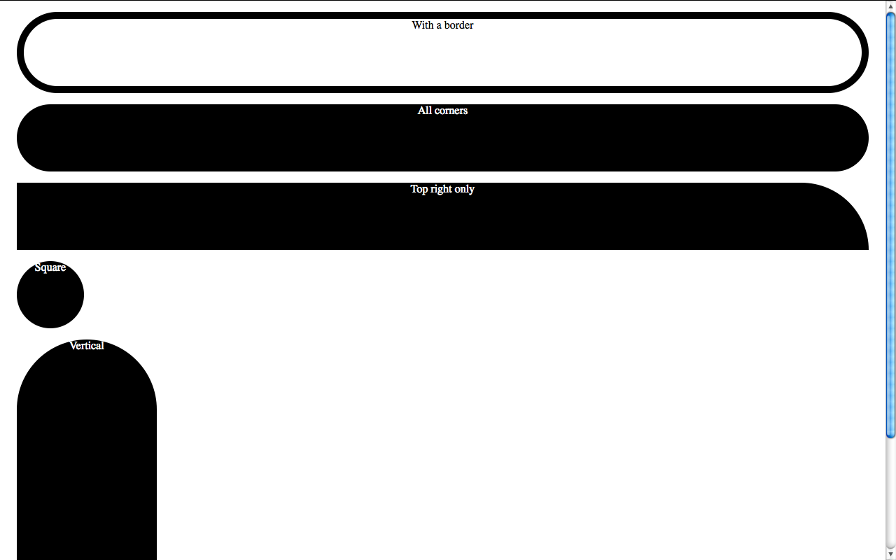
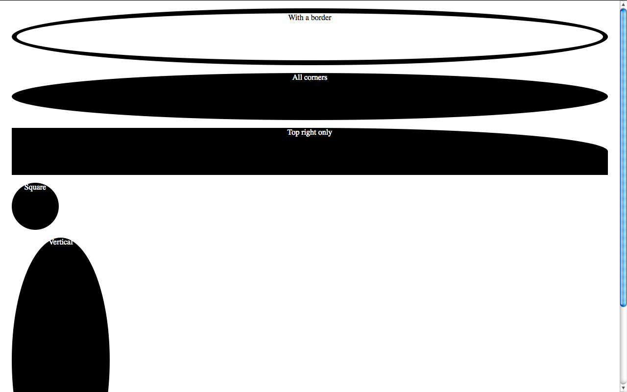
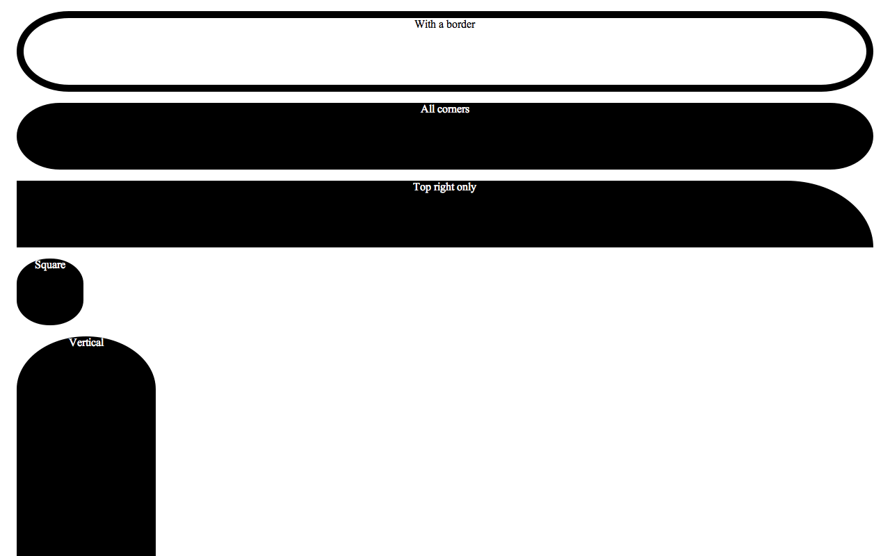
Caution: The contents of a container with border-radius set are NOT clipped according to the border radius in any implementation/workaround mentioned below, and no, setting overflow to hidden won’t help (and even if it did, you’d risk text missing). You should specify a proper border-radius and/or padding to them if you want them to  follow their container’s curves properly. This could allow for some nice effects but most of the time it’s just a pain in the a$$.

Mozilla Firefox

Firefox supports rounded corners since version 2. However incomplete support in version 2 made designers sceptical to use them. The problem was that the rounded corners created were aliased back then, and also did not crop the background image, so if you had one, no rounded corners for you. This was fixed in FF3, so now more and more designers are starting to use them. The syntax is

-moz-border-radius: [Number][unit];

This is effectively a shorthand for:

-moz-border-radius-bottomleft: [Number][unit];
-moz-border-radius-bottomright: [Number][unit];
-moz-border-radius-topleft: [Number][unit];
-moz-border-radius-topright: [Number][unit];

You don’t need to specify all these properties though, even if you wan’t different measures per corner, as -moz-border-radius functions as a regular CSS shorthand, allowing us to specify all 4 corners at once. It can be used in the following ways:

-moz-border-radius: [Top-left and Bottom-right] [Top-right and bottom-left];
-moz-border-radius: [Top-left] [Top-right and bottom-left] [Bottom-right];
-moz-border-radius: [Top-left] [Top-right] [Bottom-right] [Bottom-left];

A good mnemonic rule for the order of the values is that they are arranged clockwise, starting from Top left.

Apple Safari

Safari also implements CSS3 border-radius, but in a quite different way. If you want to set all four corners to the same border-radius, the process is almost identical. The only thing needed is:

-webkit-border-radius: [Number][unit]

However, things start to get tricky when you want to specify different radiuses per corner. Webkit does not support a shorthand syntax, since it chose to implement the spec closely, sacrifycing clarity but allowing for more flexibility. To cut a long story short, Webkit supports irregular curves instead of just circle quarters on each corner, so if you try to add 2 values, the result will be  horrendous.

So, you have to specify all four properties (or less if you want some of them to be square). To make matters even worse, the way the names of the properties are structured is different. There is one more dash, and the position of the corner styled by each property is not at the end but before -radius:

-webkit-border-top-left-radius
-webkit-border-top-right-radius
-webkit-border-bottom-left-radius
-webkit-border-bottom-right-radius

Caution: If the dimensions of your element are not enough to accomodate the rounded corners, they will be square in Webkit-based browsers. Specify a min-width/min-height or enough padding to avoid this.

Google Chrome

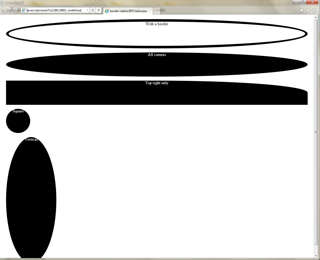
Since Google Chrome is based on Webkit, its border-radius support is like Safari’s. However, it’s haunted by an ugly bug: It renders the rounded corners aliased. :(

Opera

The bad news is that Opera does not implement the CSS3 border-radius yet (it will in the future, confirmed). The good news is that it allows for SVG backgrounds since version 9.5. The even better news is that it supports data:// URIs, so you can embed the SVG in your CSS, without resorting to external files as someone recently pointed out to me. Alexis Deveria was clever enough to even create a generator for them, so that you could easily specify the background, border width and border-color and get the data URI instantly. This is a quite useful tool, but lacks some features (for instance you might want the background to be semi-transparent, like the one used in this blog). It’s ok for most cases though.

While Opera’s current lack of border-radius support is disappointing, you can utilize it pretty well with this method and if you know SVG well enough yourself you can create stunning effects.

Internet Explorer (aka “The Web designer’s nemesis”)

There’s no need to tell you that IE doesn’t support border-radius or SVG backgrounds, even in it’s latest version, right? You probably guessed already. There is some hope here though, a clever guy named Drew Diller carefully researched the MS-proprietary VML language and came up with a script that utilizes it to create rounded corners in IE. The bad news is that MS when releasing IE8 fixed some things and messed up others, so the script barely works on it. It also has some other shortcomings, but for most cases it can be a great tool (for IE7 and below, unless MS surprises us and fixes the VML regressions in IE8 before the stable). Also, if rounded corners are not crucial to your design and you don’t get too much traffic from IE users, you might consider ignoring IE altogether and having square corners in it. This way you’re also serving the greater good, since when IE users see your site in a supporting browser, they’ll conclude that “Oh, this browser shows the web nicer!” and the site will still be just as usable (in most cases rounded corners are not that crucial for usability, although they enchance it a bit).

Afterword

I hope this article helped you learn something new. If you found any mistakes or inaccuracies, don’t hesitate to leave a comment, I don’t know everything and I’m not god. :)

One thing I have in mind is creating a PHP script that takes care of all these incompatibilities for you and caches the result. I don’t know if I’ll ever find the time to write it though, especially before someone else does :P


Check whether a CSS property is supported

1 min read 0 comments Report broken page

Sometimes when using JavaScript, you need to determine whether a certain CSS property is supported by the current browser or not. For instance when setting opacity for an element, you need to find out whether the property that the browser supports is opacity, -moz-opacity (MozOpacity), -khtml-opacity (KhtmlOpacity) or the IE proprietary filter.

Instead of performing a forwards incompatible browser detect, you can easily check which property is supported with a simple conditional. The only thing you’ll need is a DOM element that exists for sure. A DOM element that exists in every page and is also easily accessible via JS (no need for getElementsByTagName), is the body element, but you could use the <head> or even a <script> tag (since there is a script running in the page, a <script> tag surely exists). In this article we’ll use document.body, but it’s advised that you use the head or script elements, since document.body may not exist at the time your script is run.

So, now that we have an element to test at, the test required is:

if('opacity' in document.body.style)
{
	// do stuff
}

Of course you’d change document.body with a reference to the element you’d like to test at (in case it’s not the body tag)  and 'opacity' with the name of the actual property you want to test. You can even wrap up a function to use when you want to check about the support of a certain property:

function isPropertySupported(property)
{
	return property in document.body.style;
}

The only thing you should pay attention to, is using the JavaScript version of the CSS property (for example backgroundColor instead of background-color)

Wasn’t it easy?