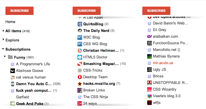
A few days ago, the incredibly talented Roman Komarov posted an experiment of his with pure CSS “scrolling shadows”. If you’re using Google Reader, you are probably familiar with the effect:
In Roman’s experiment, he is using absolutely positioned pseudoelements to cover the shadows (which are basically radial gradients as background images), taking advantage of the fact that when you scroll a scrollable container, its background does not scroll with it, but absolutely positioned elements within do. Therefore, when you scroll, the shadows are no longer obscured and can show through. Furthermore, these pseudoelements are linear gradients from white to transparent, so that these shadows are uncovered smoothly.
When I saw Roman’s demo, I started wondering whether this is possible with no extra containers at all (pseudoelements included). It seemed like a perfect use case for background-attachment: local. Actually, it was the first real use case for it I had ever came up with or seen.
“background-attachment… what? I only know scroll and fixed!”
scroll and fixed were the only values for background-attachment back in the days of CSS 2.1. scroll is the initial value and positions the background relative to the element it’s applied on, whereas fixed positions it relative to the viewport, resulting in the background staying in place when the page was scrolled. As a result of these definitions, when only a part of the page was scrollable (e.g. a <div> with overflow: auto), its background did not scroll when the container itself was scrolled.
In Backgrounds & Borders Level 3, a new value was added to lift this restriction: local. When background-attachment: local is applied, the background is positioned relative to the element’s contents. The result is that it scrolls when the element is scrolled. This is not a new feature, it has been with us since the first drafts of Backgrounds and Borders 3 in 2005 (of course, implementations took some more time, starting from 2009).
If the way it works seems unclear, play a bit with this dabblet that demonstrates all three values (your browser needs to support all three of course):
“Ok, I get it. Back to the scrolling shadows please?”
Basically, the idea was to convert these absolutely positioned pseudoelements into background layers that have background-attachment: local applied. I tried it, it worked and helped reduce the code quite a lot. Here’s the dabblet with it:
The drawback of this is that it reduces browser support a bit. Roman’s original experiment might even work in IE8, if the gradients are converted into images (gradients are not essential for the functionality). When you rely on background-attachment: local, you reduce browser support to IE9+, Safari 5+, Chrome and Opera. Firefox is the most notable absentee of that list, you can vote on bug #483446 if you’re interested in getting them to implement it (edit: Firefox supports this now [2013]).
However, browser support is not that important, since the effect degrades very gracefully. On browsers that don’t support this, you just get no shadow. ;)
